|
|
 Ann Nida
{K:45248} 10/14/2005
Ann Nida
{K:45248} 10/14/2005
|
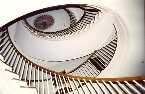
This certainly is an eye catching photo. (pardon the pun) :) How creative to shoot this perspective. Very nice photo. In keeping with my ruthless critiques I would love to fault this but try as I might I just can't. No UFO's in this one ;)
Great lines and flow and very appealing contrasts. Eye enjoy this photo very much. :)
|
|
|
|
 Roberto Arcari Farinetti
 {K:209486} 8/26/2005
|
so great effect of eye-vertigo..
roby
|
|
|
|
|
Nino Z-S
{K:1489} 4/4/2005
|
Bellissimo effetto
|
|
|
|
 Lida Chaulet
{K:3430} 3/13/2005
Lida Chaulet
{K:3430} 3/13/2005
|
Great shot! And of course great title, it really looks like an eye, especially from the thumbnail.
Very well seen and very well composed.
Compliments.
|
|
|
|
|
Bikramadittya G. Roy
{K:7202} 1/26/2005
|
Buddy, someone said, beauty lies in the EYE of the beholder. I say beauty lies in the 'I' of the photographer. I mean who's behind the camera rather than what the camera is. Cheers
|
|
|
|
|
Francesca May
{K:6877} 1/26/2005
|
nice idea!
|
|
|
|
|
Kosmas Lazaridis
{K:943} 1/26/2005
|
great composition and creation but an until ettes blurred.
|
|
|
|
|
Mark Wlaz
{K:4564} 1/26/2005
|
Lily,
I couldn't agree with you more. The fact that there are so many knowledgable (sp?), friendly, members of Usefilm - that are willing to share their expertise so graciously (like Carsten and Michael), is what makes this such a great forum.
Best,
Mark
|
|
|
|
|
Tiger Lily
{K:10966} 1/26/2005
|
Mark, Very smart composition, love how you captured the "eye". Good title, great idea.
I am glad you posted your image which gave us the opportunity to read comments from Carsten Ranke and Michael Kanemoto on how to improve it, because the issues you had with this picture are common problems some of us are struggling with.
I want to thank Carsten and Michael and tell them both that no extra detail goes unappreciated. The steps in Adobe Photoshop are useful to many of us who don't really know how to effectively use this software for improving photographs.
Mark, I don't have the latest version of PS either (I think mine is 5.5). About your stairs, I know a similar place in Chicago downtown with a famous winding staircase which gets photographed a lot.
|
|
|
|
|
Mark Wlaz
{K:4564} 1/26/2005
|
Michael,
Thank you for taking the time to rework my image and to send such a detailed commentary on how to rework and improve it. I particularly agree with your suggestion that masking the very top of the ceiling would facilitate reworking the other portions appropriately. It is people like you that make Usefilm such an enjoyable and rewarding experience. Thank you.
Mark
|
|
|
|
|
Mark Wlaz
{K:4564} 1/26/2005
|
Carsten,
I already thanked you once for your detailed suggestion on how to improve my "Eye" photo. But since your suggestion became today's Critque of the Day, and it afforded me the great honor and pleasure to have one of my images on the Home Page, I thought it only appropriate to once again say a very heartfelt "Thanks".
As well, I feel very good for you, as your work is first class, and having your images on the Home Page is well deserved - and it certainly will be one of many times that your work will be shown there.
Best regards,
Mark
|
|
|
|
|
Roberto Mascellani
{K:13} 1/25/2005
|
Buona idea, concordo con chi ti ha detto che l'immagine renderebbe di più con un maggiore contrasto.
Complimenti per l'idea.
Ciao!
Roby
|
|
|
|
 Michael Kanemoto
{K:22115} 1/25/2005
Michael Kanemoto
{K:22115} 1/25/2005
|
Dang - should have used a calibrated monitor. That looks really yellow. Anyway, hope that that example helps you out.
|
|
|
|
|
Michael Kanemoto
{K:22115} 1/25/2005
|
Mark:
Apart from adjusting the levels in PS to bring out the darks (Image>Adjust>Levels), I noticed that this shot was on the blue side, and wanted to let you know you can correct the colors as well really easily.
Go to Image>Adjust>Color Balance... or Cntl+B, and you can add some yellow and red to counter the cyan and blue tones and add some nice warmth to the staircase.
You can also use the quick mask mode, which is at the bottom of the tool pallette in PS to mask off the very top of the ceiling and use levels and color tones independantly for that dark area to really tweak the shot.
Lastly, after a resize I used a sharpening filter to crisp up the image. Filter>Sharpen>Unsharp Mask.
These should give you a few basic tools.
Lastly, if you had a lot of muted or over bright colors a great tool is the hue and saturation - Image>Adjust>Hue/Saturation or Cntl+U. You can add more vibrancy to your colors or suck all the colors right out of an image. Even more interesting if you mask out certain components of a photo.
|

Eye Remix |
|
|
|
 Vinay Raj
{K:5537} 1/25/2005
Vinay Raj
{K:5537} 1/25/2005
|
Your eye is very good Mark. Thats why you could see it.
|
|
|
|
 Daniel Guerin
{K:7961} 1/25/2005
Daniel Guerin
{K:7961} 1/25/2005
|
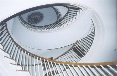
Really great idea, and congratulations on making the front page. I would agree that you could do with a bit of a contrast tweak or two. An interesting thing - the large image above, on my low-res screen at work, it is difficult to see it as an eye, but the eye was the first thing I noticed on the small thumbnail and I thought it was great.
Well spotted, well done.
|
|
|
|
 Maurizio Spadaccino
{K:5132} 1/25/2005
Maurizio Spadaccino
{K:5132} 1/25/2005
|
this is a great picture, nonewithstanding the discussed necessary levels adjustments... those you can do it whenever, but the shot and the intuition were once in a life! 7+++++
Congratulations
Maurizio
|
|
|
|
 Tom Ziegler
{K:585} 1/25/2005
Tom Ziegler
{K:585} 1/25/2005
|
The aye's have it !
Thanks for this shot, I will now attempt to keep my eyes open for ideas like this.
Thomas
|
|
|
|
|
mick ryan
{K:160} 1/25/2005
|
Great composition but I don't like the lighting.
|
|
|
|
 Tahsin Bakr
{K:3298} 1/25/2005
Tahsin Bakr
{K:3298} 1/25/2005
|
This should be pic of the year. Great composition but why you used the flash?
Very good vision, Waiting more from you....
Added to my favorites.
|
|
|
|
|
Maarten Geers
{K:1070} 1/25/2005
|
great composition
|
|
|
|
 ISMAEL MARCOS
{K:10535} 1/22/2005
ISMAEL MARCOS
{K:10535} 1/22/2005
|
GREAT EYE.(PHOTO'S EYE AND MARKS'S EYE ).
REGARDS FROM SPAIN.
ISML.
|
|
|
|
|
Mark Wlaz
{K:4564} 1/21/2005
|
Carsten,
Thanks for walking me through some specifics to adjust the "Eye" image. I don't have the most recent version of PS, but I will try your recommendations. Also, I do have Picture Window Pro, and I agree with you, it is not as powerful as PS, but works well in certain situations, and tends to be easier to use. Thanks again.
Best regards, Mark.
|
|
|
|
 Hugo de Wolf
{K:185110} 1/20/2005
Hugo de Wolf
{K:185110} 1/20/2005
|
Hi Mark, Just read Carsten's comment, and he's got a point, but this is a beautifully composed shot; very dynamic. Impressive.
Cheers,
Hugo
|
|
|
|
|
Carsten Ranke
{K:14476} 1/20/2005
|
 Mark, it is really a great image and worth the effort ! Maybe you have a RAW "negative", then I would work on the RAW with the converter (dont know the sw, cause I`m a Canonian...). Anyway, on RAW or TIF (if possible, 16bit per channel) I would look at the histogram in PS: Image > Adjustments > Levels. Sorry if you know all this stuff, dont know your PS learning curve...) You see a blck slider, try a shift to the right to set the shadows to black. Play around with the grey slider to adjust gamma / contrast). Or, if you have PS 8 / CS try the Image > Adjust > Shadow/ Highlight tool, quite impressive new feature (try low to 0% amount for shadows, higgher for highlights, then finetune with tonal width and midtone contrast). My uploaded try was a "quick and dirty" one with Picture Window Pro 3.5, a very fast, affordable sw I make 60-80% of levels, contrast, resize etc. Not as powerful as PS CS, but works with 16 bit/chan?nel (!) Regards, Carsten
|
|
|
|
|
Mark Wlaz
{K:4564} 1/20/2005
|
Carsten,
Thanks for the suggestion. I have struggled to improve the image within PS. As you may have seen, others have also commented on the positive aspects, but also the fairly consistent recommendation for adding some more contrast to the image.
So, as I mentioned, I have tried a bit, but have not been satisfied with my attempts to fix it. Would you be willing to explain the steps you went through (or would go through if it was your image)?
Thanks.
Mark
|
|
|
|
|
Carsten Ranke
{K:14476} 1/18/2005
|
You have a good eye, yes ;-)
Looks a bit flat for my taste, what about slight levels adjustment ? Just an idea
|

|
|
|
|
|
Mark Wlaz
{K:4564} 1/7/2005
|
James, Thanks for your kind comment and your suggestion on my photo. I'm taking your advice - I'll work on the contrast and try to get the image reposted over the weekend. Cheers, Mark.
|
|
|
|
|
Mark Sherman
{K:15669} 1/6/2005
|
Thats a great shot for a horror film, Hitchcock probably would've eaten that up.
|
|
|
|
 * James *
{K:20200} 1/6/2005
* James *
{K:20200} 1/6/2005
|
mark, when i saw this i thought "what an incredible photo." however, i agree with one other poster that it needs more contrast. i would also clone out those two little spots closer to the bottom. try adjusting it and do a repost. i think it'll be much improved.
warmest regards ~ james
|
|
|
|
 Bahadir k
{K:8825} 1/1/2005
Bahadir k
{K:8825} 1/1/2005
|
you really got the eye
but i agree about other comments about the lighting
i beleive flash u had couldnt really add sthg to the shot.i realise that indoor shots are hard.then maybe we just have to enjoy the superb composition.Ps could help to have a better contrast i think...
regards
bahadir
|
|
|
|
 Mark Julian
{K:36866} 12/30/2004
Mark Julian
{K:36866} 12/30/2004
|
Great stairway shot. saw your comment on A.E.'s shot - couldn't agree more. I see you're into traveling (internationally) That's my main work in Photography - check out my portfolio sometimes. Take care, Mark
|
|
|
|
|
Mohammad Reza Shahrokhi Nejad
{K:7396} 12/5/2004
|
good job.
|
|
|
|
|
Mark Wlaz
{K:4564} 12/4/2004
|
Fabrice, Thanks for the comment. I'll try to adjust the contrast and see if I can strengthen the impact of the photo. Best regards, Mark
|
|
|
|
|
John Wall
{K:45} 12/4/2004
|
Wicked!
|
|
|
|
|
José Vasconcelos Dias
{K:9341} 12/3/2004
|
Fantastic shot!!! Very original and well seen. Congrats
|
|
|
|
|
Khaled Al Harbi
{K:-163} 12/3/2004
|
i like it
|
|
|
|
 Jeanette Hägglund
{K:59855} 12/3/2004
Jeanette Hägglund
{K:59855} 12/3/2004
|
What a capture and what an eye you have got ;)
Jeanette
|
|
|
|
 G G
{K:61359} 12/3/2004
G G
{K:61359} 12/3/2004
|
Nice shot, and good title.. the perspective is great. I would probably add more contrast. Cheers
|
|
|
|
 S K
{K:487} 12/3/2004
S K
{K:487} 12/3/2004
|
successful image...beatiful compo...but there could be use a bit more light...congrats...
|
|
|
|
|
Stefan Engström
{K:24473} 12/3/2004
|
What a great idea. A little more contrast would help but it is impossible to see "the eye"
|
|
|
|
 Fadel J
{K:13974} 12/3/2004
Fadel J
{K:13974} 12/3/2004
|
Very well seen and captured!
|
|
|
|
|
Andre Galante
{K:424} 12/3/2004
|
Pretty cool!
|
|
|
|
|
cindy martin
{K:327} 12/3/2004
|
So nteresting on so many levels...great shot.
|
|


)))))))))))")