|
|
|
sunrise
{K:6651} 6/19/2004
|
I like...but we are always learning...honest i like!
|
|
|
|
 Ursula Luschnig
{K:21723} 6/16/2004
Ursula Luschnig
{K:21723} 6/16/2004
|
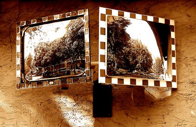
Hi Thilo,die Spiegel sind ein sehr reizvolles Motiv,und erst muss man das mal sehen!Stelle mir das sehr schwierig vor,weil einer immer zu hell ist,oder?Auf jeden Fall ein aussergewöhnliches Photo,der Vergleich mit der Brille passt ganau!
Gefällt mir in sepia,Ursula
|
|
|
|
|
Ahmet Baki Kocaballi
{K:13618} 6/16/2004
|
very good capture Thilo!
creative idea ans composition, tones look well, and also i think tones blue like might work well,
Regards
Baki
|
|
|
|
|
john amore
{K:14015} 6/16/2004
|
bravo original with a super interest level a outstanding composition john
|
|
|
|
 Thilo Bayer
{K:50358} 6/15/2004
Thilo Bayer
{K:50358} 6/15/2004
|
Dear Hugo,
I was sure that you don't feel comfortable with the centered composing ;-)
In fact, I tried a lot of different shots to get more dynamics in here. But I failed. No other shot looked as good as the boring, symmetrical one.
As for the colors: Don't laugh but during rework I really thought about leaving the mirrors in colors. But I rejected the idea. It seemed to be too artificial for me. Probably I'm not yet ready for this kind of rework. baby steps is my religion ;-) but hey: great idea!
thanks for the creative comment, Hugo. Cheers, thilo
|
|
|
|
|
Thilo Bayer
{K:50358} 6/15/2004
|
Dear Pedro,
monitor calibration is VERY important. I learned that since working on pictures at home and at work. My monitor at work is way too dark by hardware so I have to calibrate him using special software. This make a huge difference. cheers, thilo
P.S.: you get the credits for that color rework ;-)
|
|
|
|
|
Thilo Bayer
{K:50358} 6/15/2004
|
Dear Kev, great comparison! didn't think about it until your comment. you're right. cheers, thilo
|
|
|
|
 Hugo de Wolf
{K:185110} 6/15/2004
Hugo de Wolf
{K:185110} 6/15/2004
|
Hi Thilo, Again a very creative shot, but I think you could've made more of this. I think the composition is a bit too centered, removing the dynamism out of this one. The tones are quite alright, but I doubt if a sepia tone is needed. Have you considered the use of selective colour? Maybe only within the mirrors, creating a "new" dimension in this shot. My attention is constantly shifting from one reflection to the other, which is not necessarily a negative thing, as both reflections are very interesting. Good wide DOF, though, and the overexposed sky adds a nice touch too.
Cheers,
Hugo
|
|
|
|
 Angelo Villaschi
{K:49617} 6/15/2004
Angelo Villaschi
{K:49617} 6/15/2004
|
Thilo,
For what it's worth, I think removing the colour is the right decision in this case, as it lets the viewer concentrate on the tones, shapes and textures that illustrate the differences between the two mirrors.
Great eye to spot this, BTW!
|
|
|
|
|
Uwe Bachmann
{K:10222} 6/15/2004
|
schönes motiv in sehr ansprechender bearbeitung. die tonung ist sehr augen(ge)fällig....mehr brauch ich hier gar nicht mehr schreiben.
gruß, uwe
|
|
|
|
|
Carmem A. Busko
{K:48785} 6/15/2004
|
I like it very much, the sepia tones are perfect!
Cheers!
Carmem
|
|
|
|
|
Paolo De Maio
{K:34932} 6/15/2004
|
I think your idea is good and your work has demonstrated exactly your intention.
I like the tones and the images in the squared frames.
Nice perspective and light too.
Paolo
|
|
|
|
|
Carlheinz Bayer
{K:14220} 6/15/2004
|
The tone rocks, bro. Cheers! Carlheinz
|
|
|
|
 Pedro Libório
{K:53861} 6/14/2004
Pedro Libório
{K:53861} 6/14/2004
|
well as you can image I do like this tones, my only regret here is not to be able to read so well as I liked the images on the mirrors ...litle detail ...at least on my screen but I like it a lot!!!
regards.
|
|
|
|
|
Kevin Collier
{K:19076} 6/14/2004
|
All I can say is I feel that the choice you made is the correct one. Love the tone and the composition .. reminds me of a pair of groovey sunglasses -- can I say groovey?? Kev
|
|
|
|
|
Stephen Bowden
{K:64141} 6/14/2004
|
Excellent work Thilo
|
|
|
|
 Roberto Arcari Farinetti
 {K:209486} 6/14/2004
|
ciao Thilo
another great photo..
.. that will go in prize. magnificent tones and idea. a show
cheers
roby
7+
|
|


")


