|
|
|
Tabitha Woods
{K:8650} 4/28/2006
|
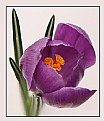
This is nice!, would be nice to see alittle more of it.. great postcard ;O)
|
|
|
|
|
L B.
{K:13965} 2/27/2004
|
Hi James, more photo's from Windsor?? Interesting. The castle of the city, (witch i now know becose of your photo's ;)) looks really nice. The sky is wonderfull, lovely blue colours, it is a very small picture but with mutch information. A interesting picture. Really great!
Greets, Lex
|
|
|
|
|
Richard Thornton
{K:26442} 2/24/2004
|
This image seems to lend itself to the panoramic proportions very well. There is a nice lead in from the bottom.
|
|
|
|
|
Roger Cotgreave
{K:15892} 2/23/2004
|
you were lucky you got any good days in england that is why I left for sunny oz. It looks very english and taken in the right position no castles here. I don't mind what you say rog I find it very refreshing....The aura around her is on the original it just seemed to get more highlighted as I gave it a multiply filter to a copy layer which I then took her back to the original and left him darker. Maybe she is a goddess...ta roger
|
|
|
|
|
Craig Garland
{K:27077} 2/23/2004
|
A wondeful scenic Roger! It's too bad these panoramas only show up on UF as a narrow strip as they are really quite nice. Cheers. Craig
|
|
|
|
 Roger Williams
 {K:86139} 2/23/2004
|
Yeah Keith, Bertram. You're right of course. I can see it's top heavy now... but when you have a panorama camera, hey, everything looks like a panorama, right? I did want to show the tower in its setting, looking over that beautiful garden (the Queen is reputed to exercise the current set of Corgis in it when in residence). Couldn't back any further away, alas, or I'd have been showing the wall around it. Another case where the 30mm lens would have been the better choice, pushing the tower more into the background and enlarging/showing more of the nearer garden. If I ever get a 30mm lens for the TX-1, I promise I'll go back and try again!!
|
|
|
|
|
Keith Naylor
{K:13064} 2/23/2004
|
Roger, Bertram has hit the nail on the head - its too heavy at the top. I didn't see what was wrong, but as always when it's pointed out it is easy to spot.
|
|
|
|
|
The Armed Eye
{K:3563} 2/23/2004
|
Roger, tho it's nice to get this way an impression of the tower's height generally my opinion is that the impression is too narrow. The cut tower makes it even stronger, a bit like lookin' through a arrow slit indeed. And the tower in the upper third makes too much "visual weight" there, like a too big head on a slim body ?
Hope you won't hit me next time we meet :-))
|
|
|
|
|
Antonella Nistri
{K:21867} 2/23/2004
|
Great framing Roger,I really love this cut. In my collection of cameras I was unaware or did not remeber that I have a Rollei with a Schneider Curtagon 30 mm and 24 mm panorama lens. You gave me an idea...I can begin by practicing with that!!! Congrats,Antonella
|
|
|
|
|
Keith Naylor
{K:13064} 2/22/2004
|
Hi Roger,
hmmm, not sure the vertical pano was the best choice here, it feels too restricted, just like lookig out through one of the arrow slits in the wall. Detail is good though.
K
|
|
|
|
 Rob Ernsting
{K:8899} 2/22/2004
|
Excellent use of a panorama camera.Very nice colors and excellent details. Regards, Rob.
|
|


