|
|
|
Robin McAulay
{K:8908} 9/10/2003
|
ouch ouch - too good - you're really setting a standard here - i can only dream on...
|
|
|
|
|
Lucas Macedo
{K:12843} 9/9/2003
|
An excellent creation, Jim! Vibrant colors and well balanced composition. Congrats! ..... Lucas
|
|
|
|
 Katia Cutrone
{K:12940} 9/9/2003
Katia Cutrone
{K:12940} 9/9/2003
|
I don't know if I could describe you Pic indeed like Photo, they are anyway so artistic, I love them.
|
|
|
|
|
Jim McNitt
{K:11246} 9/6/2003
|
Craig:
You hit upon the biggest "palette problem" I'm having with these, which is that once the pictorial space becomes compartmentalized, for some reason, warm and cool tones no longer coexist as comfortably. I had an epic struggle with the sky in the previous post "Approaching New York" and actually ended up solving the problem in the most recent version of "Approaching" by eliminating the sky altogether. The image I'm about to upload, "Place Voges," tackled the problem headon by mixing blue with red, but doing this with a couple of "devices" including some transitional yellow and a red swirl that draws the eye through the blue space. Love to know what you think of that one.
Best, --Jim
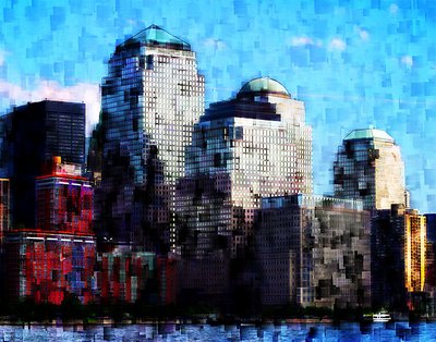
P.S. Yes, if this photo had been taken two years ago, on Sept 06, 2001, it would have been very different.
|
|
|
|
|
Gerhard BuschEFIAP/AFIAP
{K:18382} 9/6/2003
|
Eine sehr subjektive und ausgezeichnete Arbeit.
Sie hebt sich wohltuend von den gefaelligen Sujet anderer User ab.
Gruss Gerhard
|
|
|
|
|
Ronny Van Eeckhoutte
{K:12734} 9/6/2003
|
Fantastic shot. Not just the colors and tones, but the subject and the composition.
|
|
|
|
|
Craig Garland
{K:27077} 9/5/2003
|
Another beauty Jim! 1st, the subject, composition, and lighting are excellent. 2nd, in this one you've mixed a bit of warm color with a mostly cool color picture. I think it works very well-- especially considering the subject. Not being that familiar w/ NYC, I'm assuming from the title that the WTC buildings are missing from this scene. Good title, and excellent work.
|
|
|
|
|
Jim McNitt
{K:11246} 9/5/2003
|
Hi Stefan:
Good point. Using the scale and persceptive controls it's theoretically possible -- on planes, not spheres -- to keep the brushwork aligned and in scale with the underlying elements. My own sense is that what's really important is not so much the precision of brush scaling and alignment, but rather the definition and treatment of the underlying imagery. --Jim
|
|
|
|
|
G C
{K:12204} 9/5/2003
|
This series of images is amazing! Sent you an email, did you receive it (my email's been buggy..) Cheers!
|
|
|
|
 luisa vassallo
{K:28230} 9/5/2003
luisa vassallo
{K:28230} 9/5/2003
|
very good!!!!
|
|
|
|
|
Vlad P.
{K:1477} 9/4/2003
|
Very interesting approach, Jim. Nice abstract.
|
|
|
|
|
Kosmas Lazaridis
{K:943} 9/4/2003
|
good idea and nice Job.
|
|
|
|
|
Stefan Engström
{K:24473} 9/4/2003
|
Your cubist treatment of buildings with a lot of windows poses the unique problem of reconciling the scales of the inherent squarish elements with your brush. I think you did a very good job of solving that in this image. The color highlights of red and gold are also nice here. The sky is just a little too turqouise for my taste, but I am unable to suggest an alternative :-) Thanks for your comments, they are much appreciated.
|
|
|
|
|
Igor L.
{K:7432} 9/4/2003
|
Neverending creativity, Jim! Excellent work!
|
|