|
|
|
Kim Culbert
{K:37070} 8/15/2003
|
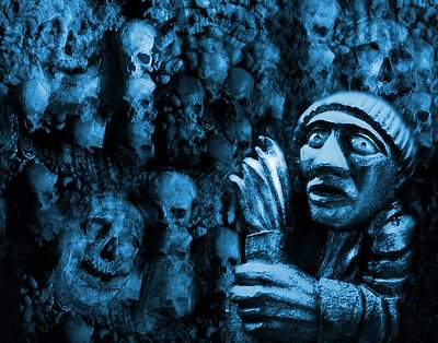
The B&W is nice, but the blue tone is what drew me here in the first place. It gives off a sneaking-in-the-dark-under-a-full-moon kind of look.
Excellent job mergring the photos together... I would have never noticed!
|
|
|
|
|
Naty Z
{K:16436} 7/25/2003
|
I agree with Mary. Blue to me is a relaxing colour, I would have liked to see this kinda red or something. But it's a great work anyway!
|
|
|
|
|
MaryBell
{K:32791} 7/22/2003
|
too silvery and cool - I still want it grittier - how about some grain (I know I am obnoxious).
|
|
|
|
|
Jim McNitt
{K:11246} 7/22/2003
|
Think I kinda go for the blue. U?
|
|
|
|
|
Jim McNitt
{K:11246} 7/22/2003
|
Hi Mary & Dave:
Always on the lookout for a more complicated way to do things in PS, I didn't just destaturate this. Instead, I converted to Grayscale, created a quadtone, used the color picker to select black, white and two shades of gray, then used duotone curves adjustments to jigger the tones. In the end I came up with.... something that's probably visually no different from a simple desat., but involved ever so many fullfilling keystrokes.
|

|
|
|
|
|
Dave M
{K:9043} 7/22/2003
|
Jim, I can sense you are a big fan of blue, but I must concur with Mary here. I'd love to see this in an alternate treatment or perhaps even just a simple b&w. Of course, that's subjective opinion. On its own, the composition is powerful and emotive. Bravo.
|
|
|
|
|
Ronny Van Eeckhoutte
{K:12734} 7/22/2003
|
what a delightful abstract image - made me look twice .
thank you for your feedback and nice words. It means a lot to me. Thank you.
|
|
|
|
|
MaryBell
{K:32791} 7/22/2003
|
The comp is good and the PS work is, of course, outstanding - what I wonder about is the color - blue is a cool color which creates emotional distance imo. How about something less obvious than red? Brownish yellows, muddy oranges and sick (yellowish greens) - controlled and applied variably?
Mary
|
|
|
|
|
Tiro Leander
{K:19060} 7/22/2003
|
Well to me this is scary... amazing work and colors.
|
|
|
|
|
zero kid
{K:94} 7/22/2003
|
:)
|
|
|
|
 Jose Ignacio (Nacho) Garcia Barcia
{K:96391} 7/22/2003
Jose Ignacio (Nacho) Garcia Barcia
{K:96391} 7/22/2003
|
great blues.maybe the composition...?you may look beauty on the streets.
|

|
|
|
|
 Ari A. Alves (alvesari)
{K:7733} 7/22/2003
Ari A. Alves (alvesari)
{K:7733} 7/22/2003
|
I like this. Good composition.
|
|
|
|
|
Terry McCully
{K:9221} 7/22/2003
|
WOW..fear is right..This one is really cool..I like the detail throughout this one. The skulls are simply cool. Like the blues...
|
|
|
|
|
Antonio Trincone
{K:23167} 7/22/2003
|
the composition could be improved by placing the foreground subject a bit on the left; lighting may cause a flattening effect to that give a loss of distance fore/back ground. Very original though, may be blue casting is too much obvious, may be red or purple color should contrast well with the subject of the shot
|
|