|
|
|
john amore
{K:14015} 3/8/2004
|
Jim this should be an award winner well done John
|
|
|
|
|
jake griffin
{K:3439} 8/13/2003
|
lush
|
|
|
|
|
Diana Cornelissen
{K:26437} 8/4/2003
|
Beautiful in blue, my favorite color. I like the contrast between the dark and light area's a lot. Great work in photo-editing, it looks like real ART this way. My compliments.
|
|
|
|
|
Karen Siebert
{K:12076} 7/22/2003
|
Jim - your creative and insightful eye and your expertise at digital editing is just amazing. You, as well as a few others on this site, give me something to strive for. Just wonderful. Blue does good for you. Congratulations on another job well done.
|
|
|
|
|
Alex Belfi
{K:3344} 7/21/2003
|
A dream!
|
|
|
|
|
G C
{K:12204} 7/20/2003
|
Thanks Jim for the walk-through, really a fantastic image resulting from your work! Cheers!
|
|
|
|
|
Gregory Fiedler
{K:15439} 7/19/2003
|
Jim, This is strikingly beautiful! Wonderful!
|
|
|
|
|
peta jones
{K:12615} 7/19/2003
|
Beautiful detail,colour Jim. I like the effect on the stems to the right. Cool title!
|
|
|
|
|
Anna
{K:2994} 7/19/2003
|
I usually love white flowers best... but what YOU have done with this one it?s so beautiful!
|
|
|
|
|
Marion Luijten
{K:6141} 7/19/2003
|
I have to think about this one a bit more...I tend to agree with Mary about the contrast between soft and sharp....
but there is something else about it, but can't say exactly what....
|
|
|
|
|
Richard Blount
{K:8015} 7/19/2003
|
I like your detailed description, I think you have done a remarkable job, the overall effect is very beautiful and the blue tone again looks great. The lighting is very creative and how you have achieved it is clever, a lovely picture Jim, one of your finest I think - Richard.
|
|
|
|
|
Jim McNitt
{K:11246} 7/19/2003
|
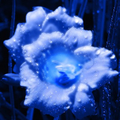
I'll try GC. I littered my Hard Disc with failed projects last night and this morning -- six or seven in all -- which had a distinct plans and objectives which didn't work out. Finally, I opened an image of a pair of flowers and started fooling around, this is what evolved.
Began with destaturation, colorization using the hue and saturation sliders on an adjustment layer positioned as my top layer. Made two duplicates of the image layer. On the first duplicate I ran the diffusion filter, then blended it back into the underlying image with the lighten mode at reduced opacity. To add depth, I duplicated the diffusion layer and ran the filter on it again a second time. I also blended this second layer back into the underlying layer using the lighten mode at a reduced opacity.
To get the blurry/sharp feeling, I ran the radial blur on one layer and used the "fade filter" option to find a level that I liked. I then ran the unsharp mask on the second layer, and faded that until I liked it.
To give a bit more depth to the color, I adjusted the hue/sat of the individual layers directly -- this is in addition to the overall desaturation/colorization that I did with the adjustment layer at the start.
Finally, the center of the foreground flower was in a deep shadow. I remember how yesterday Elizabeth Miller uploaded an Iris (I think, I don't know flowers that well) called "Firefly" which was very eye-catching because of the way the center had been lightened or, perhaps, dodged.
With that in mind, I created a new layer, set it to overlay, sampled a light blue from the image, and used a soft brush to overpaint the shadow, giving it a deep blue glow. I purposely left some of the shadow, however, to frame the central glow area.
That's about it. In this case, everything was done with layers and overall filter applications and blends -- except for the final handpainting.
Best, Jim
|
|
|
|
|
MaryBell
{K:32791} 7/19/2003
|
PS I added some comments to 'renewal' I am interested in your thoughts. I hesitated to post it because it fell a little short of where I wanted it to be but since it is a first effort, I thought I would to get the feed-back.
Suggestions are helpful for things like this. ;)
|
|
|
|
|
MaryBell
{K:32791} 7/19/2003
|
Jim,
Please take into consideration my preference for soft images - this seems a little hyper-sharp to my eyes which takes away from the dreaminess imo.
I do however, very much like how soft the center of the flower is and how the stamens kind of softly nudge their way out...
Mary
|
|
|
|
|
G C
{K:12204} 7/19/2003
|
This image has a major presence- caught my breath when I looked at it the first time. It'd be interesting to walk through the post processing step by step - you've done fantastic work here. Regards.
|
|
|
|
|
cinzia gregorutti
{K:4721} 7/19/2003
|
dear jim this picture is really wonderful! great colours and macro! excellent details!
|
|