|
|
|
David Goldfarb
{K:7611} 8/5/2003
|
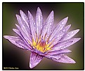
Lovely palette of colors here and effective composition.
I would lose the hokey digital borders though. A simple black line to delineate the frame at most is sufficient. I'd also remove the signature from the image or make it smaller and less obtrusive.
|
|
|
|
|
GP Merfeld
{K:14396} 8/5/2003
|
This really is wonderful, Michael, and to me one of the finest images I have seen in your portfolio so far. Incredible tone, light, texture, treatment and atmosphere. Simple, yet perfectly effective, with a beautiful, painterly feel . Goes into my Favorutes. Outstanding work!
|
|
|
|
|
Ameet Mallapur
{K:1575} 7/9/2003
|
great composition Michael...very well done!!!
|
|
|
|
|
Naren Kunhody
{K:1339} 7/7/2003
|
Beautiful compostion with good details.. Nice job overall
|
|
|
|
|
Ferrell McCollough
{K:577} 7/7/2003
|
Very well done. I rarely give top scores too.
|
|
|
|
|
Marion Luijten
{K:6141} 7/7/2003
|
It's beautiful, Mike! Excellent idea, composition and tones.
:-)
|
|
|
|
 Zelda Zabrinsky
{K:3036} 7/7/2003
|
very very nice
|
|
|
|
 Yutaka Itinose
 {K:22586} 7/7/2003
|
Excellent art!
|
|


