Hi Nick,I could understand very easily your defense of your own POV,and me too will do the same for mine,as every other one. realty is nothing but a fancy dreams,this is right here and there ,but we have to understand it within its own contest in every place it has been said, one thing about photography I heard or read or being thought,that seems to me you have forgotten in your reply, for the photographer the job is finished when he done his click,his POV,concept,and his perfection is ended,when he post the shots for others to view,also his job is ended,and he has to remember very well it is not about him,it is about the viewer,what I have done here as a viewer,is only and very honestly telling you my opinion about the shot you posted and said in your about(I think it is a good idea) and I have said in my first reply :the idea is very good,but there is some pitfalls. what that means to you ? For me it means that I agree with you on half of the idea behind your post,and agree to some extent on the other half,this is forming mathematically about 70% for this particular shot,and I have my own opinion about the other 30%,which is being distinctive of my personality, Yes dear Nick,when we post a shot we have to figure that it is not about us,it is about the others how to perceive the shot, and if I can not convince you with my POV,simply I can not cancel my own POV,either. cheers, and have my best regards and wishes, Saad.
"It is an icon of the world,icons by themselves means nothing in this respect if we do not compare them to the real world".
Here you speak about the real world. In the previous message you told me about reality being a fancy dream. Which of the two statements should I believe?
Still on that, we don't "compare icons to the real world". We compare them to our own interpretation. Even the background could be considered as nothing else than an "icon" (from Greek ikona=image) burned on your retina. So, what could be that icon compared with? Notice that this doesn't eliminate the logical presence of reality. It only eliminates all "comparative" approaches to it.
And still on that: You seem to follow "dictates" just because they stand there, Saad. It is essential to find out *when* they apply. The dictate of comparison, even if taken as valid, doesn't apply at all here. It is photography, a visual representation of something! It is *not* pholosophy and it is *not* cognition theory, and it is even less compliant to your interpretation. The image counts, not the personal wish to induce "meanings". There is no dictate for approaching any kind of specific understanding of some image. There is only your personal wish and interpretation, but it is *no* foundation for photography critiques.
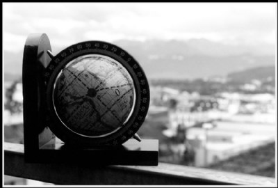
The technical details are a good foundation for that and so we proceed with them. The round frame on the right side is indeed too weakly exposed and doesn't show all details (the coordinates of geographic width). The problem here is that trying to expose longer for getting the numbers there too would overexpose the whole rest of the image too, and so also the globe itself. So what to do? If the globe itself is the main subject then one possibility is to try to get that as well as possible and the rest can be in shadows, as it does here. Or perhaps go for HDR which could work well too in this case.
The vertical stand is completely black, as the horizontal is too. It is wood painted black with a thick layer of color and very glossy in its finish, which is also the reason for the reflections. When it stands in shadows one can't see anything else on it than black. Why should the image show something else there? It is a depiction of visually perceived things, scenes, objects etc. If it is such a descriptive image, like this one is, then it has to show what one would see with the own eyes too.
The same way I see that too. There is no need for anything else if the background remains recognizable as the real world, which then the globe represents in a more "theoretical" way. I am only glad that the the globe itself does look like a spherical object that stands in front of whatever lies behind it, that is.
Thanks a lot for the nice detailed comment, Marcio!
I am completely with you on this one. Without the light to shadow transition it would not be spherical. It would be only round. The good contrast on the contour was another thing that I said to Saad when he talked about a darker background, but he seems to be searching for "symbolical meaning" in images, rather than a good depiction.
it is an icon of the world,icons by themselves means nothing in this respect if we do not compare them to the real world,and this I took from your composition,you have place the small world on a fence at some balcony and show it in contrast to the background which is the real world. it is not enough to represent the world, the BG,is blurred,no any details,and serves here as a huge negative space,if it is a little blurred ,then it would serve as something to look after we view your main object. in your opinion,as you said the it need nothing to compare to,then you should present a detailed main subject,and I have found the round fram of the globe,have burned little less than half,and the perpendicular stand have burned all the surface that faces the viewer, cheers, Saad.
Why do you think that it has to be compared to something? It is an object for itself, isn't it? Or is it somehow "not enough" by itself. I find it is. And I find the contrast of the highlights against the black round frame of the small globe ideal for making it popping out as well as it can be.
About the overshadowed half... what do you mean? I can read almost everything on the dark side of the globe, and the transition makes it look sphärical, not just round. It's going from the highlights to the shadows in a controlled way that reveals the 3D-shape of the object. For plasticity we need shadows and lights, don't we?
I like the idea of your shot, Nick! I think it's easily seen what it represents, the globe against the real world outside your window, at least that's the way I see it. I don't think it's necessary to have the background sharp and clear to get the idea. Dave.
I see it is a good image, the sun covering half the planet Saad said "half of which is overshadowed lost its details" but the world is anyway dark at night and during the day clear.. Important is that the world has all clear and sharp in contour. The image could also be titled"Day and Night"
the idea is very good Nick,put there are some pitfalls, in my opinion,we have to compare this with something else ,the BG here which is a good idea,but it was so white and so much blurred,it needs more darker tone and a less blurring, and the globe itself,half of it is overshadowed and have lost its details,yet it is the main subject of the shot, my regards, Saad.


 creation")


