|
|
 Peter De Rycke
 {K:41212} 6/17/2003
|
Wow, this is even stronger than your colour version !! Very good work.
|
|
|
|
|
Janek Bielicki
{K:133} 6/9/2003
|
looks really like an old figure. Congratulations!
please visit my portfolio.
Regards, Janek.
|
|
|
|
 rory rory
{K:1840} 6/7/2003
rory rory
{K:1840} 6/7/2003
|
Excellent Carole.. very good. bye rory
|
|
|
|
|
John Hatziemmanouil
{K:40580} 6/7/2003
|
Simple stunning photo!
|
|
|
|
|
Naty Z
{K:16436} 6/7/2003
|
beautiful!!
|
|
|
|
|
Dave Deacon
{K:4053} 6/6/2003
|
Sepia works very well too.
|
|
|
|
|
Judy Kessler
{K:6316} 6/6/2003
|
Wonderful choice of color...
|
|
|
|
|
Colin Fitzpatrick
{K:1428} 6/6/2003
|
Carole,,,
Onie said it all,, but I need to just tell you again,,
I think I'll use just two words,, (two word comments are frowned on ya' know),,
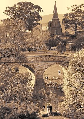
FirstWordLoveTheSepiaItFitsSoWellWithTheOldStoneWorkThatIsInThisPhotoTheCompositionIsFanBloodyTasticTheChurchInTheBackGroundReachingForTheSkyTheTwoGumTreesThatFrameTheChurchReallyMakeThis
SecondWordTheForegroundTreesFrameAlsoGreatPhotoAsAlwaysKeepUpTheGoodWorkOneThingTellUsHowYouGotTheChurchTheBridgeTheRiverThePeopleOntoTheScanner?
|
|
|
|
|
kita mcintosh
{K:18594} 6/6/2003
|
thisis truly lovely, like a print from times gone by
|
|
|
|
|
Kaj Nielsen
{K:15279} 6/5/2003
|
As said before, excellent compoced good tone here, but I do like color ver. better, more appel to me. Regards Kaj Nielsen
|
|
|
|
|
Barry Walthall
{K:5312} 6/5/2003
|
Carole, It is wonderful how the bridge frames part of the subject.Great! Barry
|
|
|
|
|
Vitor Nunes
{K:14} 6/5/2003
|
Beautiful composition!
|
|
|
|
 brian daws
{K:3376} 6/5/2003
brian daws
{K:3376} 6/5/2003
|
I prefer the sepia version Carole...very nice indeed....such wonderful breadth and scale..the chap that one sees through the bridge is perfectly placed, great work, regards, Brian
|
|
|
|
|
Marcio Cabral
{K:12496} 6/5/2003
|
Excellent pic, comp and tones Carole! regards!!
|
|
|
|
 Leonie Fitzpatrick
{K:40551} 6/4/2003
Leonie Fitzpatrick
{K:40551} 6/4/2003
|
Carole...
I'm a little like the others... sepia really does give that 'some time ago' feel and this scene wears it well... it's my fav. of the two versions, but also love the coloured version...
Excellent work... and love the composition and light...
Onie...
|
|
|
|
|
augusto mario cunha
{K:19049} 6/4/2003
|
I am sorry but I cannot make up my mind about which version to prefer. You see, I am old enough to have known sepias as "the modern look" in photos (and I have several professional studio photos of myself in sepia, still in tip top shape).
|
|
|
|
|
Ingrid Mathews
{K:7277} 6/4/2003
|
Both versions are nice. I like the sepia as it fits in with the old time nostalgia of the scene. The color version has alot of different layers going for it and is very pleasing to the eye, so I have to say, you have two winners.
|
|
|
|
|
Alexey Sapa
{K:27174} 6/4/2003
|
WOW! Carole! I like it very much! Perfect composition! Nice tone! Masterpiece! Regards, ALexey. Can I ask you attempt FILTER-Film grain for this photo, I think, it makes this photo in OLD-style as
graphure. Maybe It will need Filter-Poster enges too.
P.S. I'm appreciating your opinion very much , it is very important for me! I am very grateful to you for attention which you look my works with! Thanks!
|
|
|
|
|
Kim kyungsang
{K:14135} 6/4/2003
|
Excellent .
|
|
|
|
 Jim F
{K:8859} 6/4/2003
Jim F
{K:8859} 6/4/2003
|
Nice toning, however IMO, I like the colored version better. For my poor and untrained eye, the colored version has a degree of warmth and emotion that is lost in the monotone version.
|
|
|
|
 Don Loseke
{K:32503} 6/4/2003
Don Loseke
{K:32503} 6/4/2003
|
The sepia works very well for this picture. Nice composition. Don.
|
|
|
|
|
Felipe Rodríguez
{K:9200} 6/4/2003
|
good
|
|
|
|
|
Paco Ferrer
{K:8586} 6/4/2003
|
Beautiful vintage effect!
|
|
|
|
 Massimo Di Maggio
{K:-53658} 6/4/2003
Massimo Di Maggio
{K:-53658} 6/4/2003
|
Nice try, but I think the color version is better. Regards Massimo
|
|
|
|
|
Marco Grandi
{K:16680} 6/4/2003
|
Also beautiful in sepia tone!!
Bye Marco.
|
|
|
|
 Masahiko Shibata
{K:14107} 6/4/2003
Masahiko Shibata
{K:14107} 6/4/2003
|
Beautiful place!!
|
|
|
|
|
Branislav Fabijanich
{K:5453} 6/4/2003
|
Beautiful place. Nice tone & composition!
|
|
|
|
|
Hayri CALISKAN
{K:16195} 6/4/2003
|
Another good versione!
Regards, Hayri.
|
|