|
|
 Nick Karagiaouroglou
 {K:127263} 12/11/2008
|
I also prefer the "absolute" B&W, Stan, but such tints can also be of great help sometimes. It is only how to control them in the sense of getting them only then, when one wants to have them.
Waiting impatiently for your new results in wintetime! B&W and winter... this is something very very special.
Cheers!
Nick
|
|
|
|
 Stan Hill
{K:35352} 12/10/2008
Stan Hill
{K:35352} 12/10/2008
|
Hi Nick, this was processed from the Camera store I bought it at. They use the correct process but I was not aware of the blue gray results until receiving prints. I still liked it but I still prefer the true B/W image. I have a roll of 36 that will be my next project roll. No that it is winter I am doing and old building and farm equipment series.. I will let you know when that is done.
Be well,stan
|
|
|
|
|
Nick Karagiaouroglou
{K:127263} 12/10/2008
|
Hi Stan and thanks a lot for the reply.
Strange, I had that kind of green-blue tint with Ilford sometimes, and sometimes not. I thought it was only my own imperfection but it seems to be a usual behavior of that film. Or does it have to do with the technology with which they process it? I am quite confused with this.
Cheers!
Nick
|
|
|
|
|
Stan Hill
{K:35352} 12/9/2008
|
Hi Nick, the green blue tint probably came from the black and white Ilford-4 being printed on a 5 color printer. All of the images I got from this roll had that cast to them. This was scanned and sized. The only real process was the frame. Just playing with the tools te see what the frames from the action menu looked like. Thanks for the detailed comments today.
be well, Stan
|
|
|
|
|
Nick Karagiaouroglou
{K:127263} 12/8/2008
|
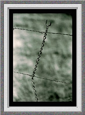
The most essential element is caught extremely well here, the wire! It still retains its plasticity but at the same time has that kind of matte diffuse reflecting behavior that metal exhibits after some time under rain and sun. And I refer to plasticity *and* reflection since many times the reflective behavior of metal tends to introduce wider overexposed "flat" areas that steal much of the plasticity away, simply because they destroy the finer color-luminocity transitions. But here they go hand in hand.
The coloring is quite "metallic" too. It really fits! Almost a B&W but with a subtle touch of greenish-blueish and that's what we call gray-blue steel, isn't it? The background helps very much in defining that. How did you get those tones? The details are great. Good and sharp but no trace of pixelated contours.
The image looks a bit like a window with a fence right in front of it. Any intentions here, Stan?
Cheers!
Nick
P.S.: Thanks for giving me the URL for this one. I kept on overseeing it when I was searching in your portfolio. A pity that the thumb can be passed by so easily.
|
|
|
|
|
Stan Hill
{K:35352} 10/27/2008
|
Thanks Ania, was finishing a roll of black and white and was seeing how good of DOF the telephoto had I was using. Thought this was a good test. Thanks for the great comment and encouragement.
Be well, Stan
|
|
|
|
 Ania Blazejewska
{K:23981} 10/26/2008
Ania Blazejewska
{K:23981} 10/26/2008
|
excellent minimal abstract Stan, very good composition and tones
best regards
ania
|
|
|
|
 Martin .
{K:24957} 10/25/2008
Martin .
{K:24957} 10/25/2008
|
Dad,
This is just perfect the way it is. Not to much, not to little... ;)
Marty
|
|
|
|
|
Stan Hill
{K:35352} 10/25/2008
|
Hi RG, I agree with the others and you as well. Just got carried away with the actions. I actually did nothing in post except size and a slight Gaussian blur around the edges. Of course also the frame in question. Sometimes I get carried away in my youthful enthusiasm. This was printed on a color printer by the lab I used. They wanted a $100 for a 24 roll in the dark room. The times have changed as the film gets put to pasture.
Be well, Stan
|
|
|
|
|
Stan Hill
{K:35352} 10/25/2008
|
Thanks Dave, trying some film stuff for fun. Always a surprise to see what you actually captured when you get it back.
Be well,Stan
|
|
|
|
 Julie Salles
{K:22654} 10/25/2008
Julie Salles
{K:22654} 10/25/2008
|
Hi GG,
I would have to agree with others about the frame taking away from this outstanding image with fantastic post work. I really like this GG :)
Be well.
Julie.
|
|
|
|
 Dave Stacey
{K:150877} 10/25/2008
Dave Stacey
{K:150877} 10/25/2008
|
I like the detail, dof and composition of your shot, Stan!
Dave.
|
|
|
|
|
Stan Hill
{K:35352} 10/25/2008
|
Morning Marty, this is my experiment with some of the PS actions for frames. As Fabio and Sunset Man said it is over done. I thought so too but like I had told you before if I like it I post it. I liked the grain and the soft bokeh of this tele. Can not learn just talking so I am working my way through many tutorials and trial and error. Sometimes heavy on the error!! Thanks for the comment and most for letting me be part of your family as well.
Be well, your Dad
|
|
|
|
|
Stan Hill
{K:35352} 10/25/2008
|
Thanks Fabio, you are right about the frame. I had it done and thought about it, said what the hell, I will see if I get some real critiques.. It worked. I was happy with the focus and DOF with this lens. I bought a Canon T90 film camera for $100 from a fishing guide. I have shot a color roll and this B/W roll. The B/W roll was printed on a color printer and not in a dark room. I was impressed by the image quality from this 1986 camera. A real workhorse of a camera.
Be well, Stan
|
|
|
|
|
Stan Hill
{K:35352} 10/25/2008
|
Hi Sunset Man, I do agree about the frame being overdone. I have been exploring the actions in PS and also have been trying some different size canvas for creating the borders. I just scanned several pictures from this roll of film and missed the dust spot. Was cleaning between scans but must have missed some. I honestly missed it until I looked at it after your and Fabio's comments on them..As far as depth of field I thought that the 5.6 in bright daylight was not bad for a lens I had not used before. This was shot in about a 20 mph wind near a top of a mountain pass so I was glad it came out as good as it did. I think the rework is a definite plus in my eyes. I have not figured out the type yet for signing my images. I have tried to learn something in PS every day but so many tools and so little time!! I appreciate the perspective and time spent on this. Thanks again Doug!
Be well, Stan
|
|
|
|
|
Martin .
{K:24957} 10/25/2008
|
Hey Dad,
Wonderful framing job for sure. Very nice crop and DOF, as well as the subject matter.
I think the grain really sets this one off! ... ;)
Marty
|
|
|
|
|
Fabio Keiner
{K:81109} 10/25/2008
|
sunsetter, it would be better to stick to your propoasal in your own pics, imho
|
|
|
|
|
Fabio Keiner
{K:81109} 10/25/2008
|
your wire still is perfectand very fine... but the frame destroys much its impact!
|
|
|
|
 神 風
{K:10665} 10/25/2008
神 風
{K:10665} 10/25/2008
|
Aloha Stan,
The 'Subject Matter' itself is simple but extraordinary in it's own subjective right, but I think we have a few little problems if I may say so ... Okay?
1. As you state yourself and it was my most imediate concern is that the framing although an 'Experiment :))' is over done imho.
2. Let's together in a coordinated effort really increase the dof accentuating the 'Main Topic'.
3. Remove a couple of dust spots and then finish it off with my 'Signature Framing' :)) and why not some 'Typographical Credits'!
What do you think now?
Best of Regards!
|

Courtesy Rework |
|