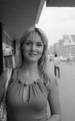
Thank you all for the useful comments and suggestions. You are right about the narrowness of the tonal range.Actually there is no sign of black in the photograph. I tried to increase the contrast and correct this greyness but the result looked to me too artificial.So i posted it just as it is.Besides I liked the soft grey tones that this film produced in coordination with the excisting light conditions. As far as the space above is concerned yes , it looks a bit awkward.Cropping is an option ,removing in the photoshop is another( stamp tool , etc).However ,the cropping option, i think, destroys the original photograph's dimensions and proportions so usually i avoid it.The second option is more "politically correct" these days ,so i would have used it. Finally i believe that cropping should always be done while taking the photograph itself( during composing and framing) and not after. Thank you all three for taking time to comment .
Nice looking model! I agree that the tonal range is too narrow. I also suggest cropping some off of the top, a little below that distracting section of roof in the upper right corner.
Andreas, this is quite a nice portrait but....IMHO it is a little flat (too grey), it needs a little more contrast. You could improve this by using a harder grade of paper or making some adjustments in an editor. No doubt the negative shows a good range of tones but scanning and printing for the web often requires some post processing especially for contrast.