|
|
 Faika Berat Pehlivan
{K:2160} 1/23/2006
Faika Berat Pehlivan
{K:2160} 1/23/2006
|
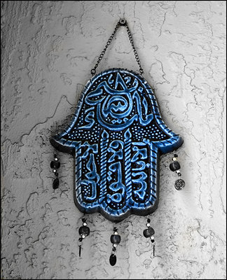
I like the color version because of the contrast and color ...
|
|
|
|
|
Nuwan Setunga
{K:178} 11/1/2005
|
I like this one better, the color highlights the subject.
|
|
|
|
 Ahmed Ismail
{K:19853} 7/20/2005
Ahmed Ismail
{K:19853} 7/20/2005
|
Both are very nice. But the colored one has a bit of more appeal, perhaps because of the contrast. I think this ones better.
|
|
|
|
|
boubekeur boukerma
{K:2623} 7/12/2005
|
nice color indeed.
Boubékeur
|
|
|
|
|
Andrea Harris
{K:2496} 6/25/2005
|
Very pretty, I like the blue popping out amongst the wall!
|
|
|
|
|
avi saar
{K:2728} 6/10/2005
|
the color is part of the charm against evil eye. regards, avi
|
|
|
|
 Ismet Smajis
{K:6911} 6/5/2005
Ismet Smajis
{K:6911} 6/5/2005
|
Nice colors ,i prefer this one
|
|
|
|
 Joggie van Staden
{K:41700} 6/1/2005
Joggie van Staden
{K:41700} 6/1/2005
|
Fantastic colours and texture Kamran - astraight and simple but very effective shot. Well done.
Joggie
|
|
|
|
|
Jimmy Payne
{K:21163} 5/31/2005
|
This color version has more contrast which brings out more details in the design. I vote for this one.
Jimmy
|
|
|
|
|
sindhu rajaram
{K:724} 5/31/2005
|
wow! good one!
|
|
|
|
 Larry Hammond
{K:16631} 5/30/2005
Larry Hammond
{K:16631} 5/30/2005
|
Simple for me Kamran, I love color!! All of my early photograpgs were B/W and worked up through the various stages of color envolving and now I am in no mood to REGRESS!! LOL Although many times B/W looks nice for some things. :-))
Larry
|
|
|
|
|
Khaled Al Harbi
{K:-163} 5/30/2005
|
very nice shot
|
|
|
|
 Rashed Abdulla
 {K:163889} 5/30/2005
|
very nice capture,very good composition and effect,thanks alot for your comments and very best regards my friend
|
|
|
|
 Teunis Haveman
{K:53426} 5/30/2005
Teunis Haveman
{K:53426} 5/30/2005
|
This colour
I like this more for it give more atmosfere
Teunis
|
|
|
|
|
sherif hussein
{K:13815} 5/29/2005
|
I like the colored one because it is supposed to protect you from the evil and bad eyes .Blue colour has a certain meaning in this respect
Nice catch my friend
Sherif
|
|
|
|
|
Galal El Missary
{K:84569} 5/29/2005
|
Very nice shot , well done .
Galal
|
|
|
|
 Ezequiel Lozada
{K:17176} 5/27/2005
Ezequiel Lozada
{K:17176} 5/27/2005
|
Lending a hand means making a friend.
Very nice.
I agree with Ignacio. The world is a world of colors for humans.
Ez
|
|
|
|
 Saeed Al Shamsi
{K:47735} 5/27/2005
Saeed Al Shamsi
{K:47735} 5/27/2005
|
wonderful details of this craft work such a beautiful colour and item. Superb. Saeed
|
|
|
|
 Inji Amer
{K:22997} 5/27/2005
Inji Amer
{K:22997} 5/27/2005
|
I Like this version dear Kamran ,
If God created our world in multi colors , why we brief it in two ?!!!
colors are more lovely & enjoyable !!
nice shot my dear .
Best regards .
Inji Amer
|
|
|
|
 Hanggan Situmorang
{K:37833} 5/25/2005
Hanggan Situmorang
{K:37833} 5/25/2005
|
Great vivid colors, very well saturated, Kamran. Good work, congratulations!
|
|
|
|
 Kamran Bakhtiari
{K:24048} 5/25/2005
Kamran Bakhtiari
{K:24048} 5/25/2005
|
nice shot Kamran,i like the color one,deep blue
indeed
|
|
|
|
 Khaled Mursi Hammoud
{K:54005} 5/24/2005
Khaled Mursi Hammoud
{K:54005} 5/24/2005
|
Very original photo Kamran.... wonderful.
Khaled.
|
|
|
|
|
Del Metheny
{K:25617} 5/24/2005
|
I much prefer this. I think BW fails to show its beauty. Of course I am not a big fan of BW unless it is used to create a feeling, perhaps of sadness etc. But I think for this the color is best. Del.
|
|
|
|
 Manuel Bedoyan
{K:9098} 5/24/2005
Manuel Bedoyan
{K:9098} 5/24/2005
|
Dear Kamran! I thank you my friend from the heart for your honest comment and i am sorry if i had offended you in a comment before. i will try to edit the title;) Thanks for taking the time and looking at my pics.
all the best
manuel
ps Great picture by the way;) hahaa
I love these art works, i have one in my house but never thought of taking a picture of it. Maybe i will:)
|
|
|
|
|
Maria José Barres
{K:11276} 5/24/2005
|
Beautiful color and original shot.
Greetings.
|
|
|
|
|
Ipek ALPAYDIN
{K:4753} 5/24/2005
|
Very very nice shot.
Congrats.
|
|
|
|
|
ellie photos
{K:1583} 5/24/2005
|
I like the color version better, because it makes the hand stand out more against the background, but I like both. I think it would be great to shoot this on a smoother background if possible, because for me the texture of the wall is competing too much with the detail/texture of the hand.
|
|
|
|
|
I g n a c i o D e L a F u e n t e
{K:10518} 5/24/2005
|
Prefiero esta imagen. ?porqué? Porque el mundo es en color
|
|
|
|
 ventrix drogo
{K:65398} 5/24/2005
ventrix drogo
{K:65398} 5/24/2005
|
I like this version, but a good verssiona in b&W.
Very good shot.
Bye.
enrico
|
|
|
|
|
Fabio Giorgi
{K:1874} 5/24/2005
|
I've taken the liberty to alter your photo to better show what I think.
The lighting is uneven ( lighter on the right side, but with not enough contrast to render a more dramatic image). Amulets and "magical objects are a great source of good images, specially if the lighting is used not in a documentary fashion - perhaps some loss of detail may happen, but more mistery is added. About the B&W version, the same can be said, but I like it more than the colour version because of the more intense contrast between the right and left side of the picture.
|

|
|
|
|
|
lavendu ...
{K:4882} 5/24/2005
|
difficult to say, because both of them are very fine.
I prefer the b+w version, because it seems more mysterious to me.
|
|
|
|
|
Deb Mayes
{K:19605} 5/24/2005
|
Both are excellent, Kamran, but I'll vote for the color version. There are really only 3 colors here, and the blue is electric. Well done!
|
|
|
|
|
Marzia Carrada
{K:3225} 5/24/2005
|
I like the two... this one as beautiful colors and "texture"... like if I could touch it ! Maybe I prefere this one, but the B&W is also very good, and it allows me to imagine it in red (in my head it is red, I don't know why !!!)
|
|
|
|
|
Marzia Carrada
{K:3225} 5/24/2005
|
I like the two... this one as beautiful colors and "texture"... like if I could touch it ! Maybe I prefere this one, but the B&W is also very good, and it allows me to imagine it in red (in my head it is red, I don't know why !!!)
|
|
|
|
|
Margaret Sturgess
{K:49403} 5/24/2005
|
I like both very much but the colour has such a colour I think I just prefer this one
Margaret
|
|


")


")

