|
|
Sandra Berry
 {K:8352} 3/8/2005
|
Greetings Alison,
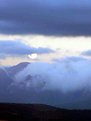
In my humble opnion, i perfer your original, the second is much to grainy and the moon looks overexposed on my screen, the blue white smokey tones are perfect in the first picture, when you edit/photoshop your work, the main key for me is that you should not be able to tell the photo was touch, personal i do not do any color enhancements to my photo, I capture them to the best of my cameras ability. When you start playing with the gamma levels(color chanels)you can acheive some wonederful colors but the reds always look fake and touch, now this is just my humble opnion, best regards, Sandra
|
|
|
|
|
ahmet özkan
{K:7216} 3/4/2005
|
really beautiful..congrats..
|
|
|
|
|
Alison Stroebel
{K:4069} 3/2/2005
|
Is this any better? I tried to do what you said. :-) Thanks
|
|
|
|
|
|
Alison Stroebel
{K:4069} 3/2/2005
|
Hi John
Yes thank you I will try to play with it. Umm so would it be sharpen or unsharpen in photoshop. Am I being blonde :-) Lost you there! What does clip levels mean? Are most images here "edited" "corrected" I thought most were as they were taken!
As I said green behind the ears where this is concerned.
Thanks again for taking the time.
|
|
|
|
|
John White
{K:76} 3/2/2005
|
Nice layers of colours. I would use a sharpen tool to increase the clarity. eg unsharp filter in photo shop. Also the levels may need to be 'clipped' slightly. Hope this helps.
|
|


