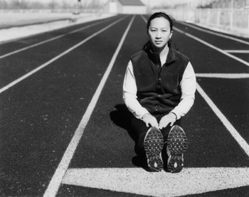
Thanks for the feedback. Everyone seems to notice the perspective. I'm curious if anyone else has opinions about this. I really thought about centering but was afraid to lose the "infinity" perspective, as the lines would be obscured. Although, it does seem that if she's centered properly, without emphasis on the arrow, lines on both sides would accomplish the same effect. Ideas?
It looks like you're heading in the right direction with this shot, but since it mimics similar images produced for nike, etc etc, you have to compete against that style, or break off onto your own idea. To my eyes, this would have been better off smack dab centered, the geometry is gonna work any way u use it here, but i think its most effective centered for this* shot. I'd consider taking measures against the contrast, the light is really killing your detail (shadows are detailess black, it looks* like she's squinting from harsh/direct sunlight). A little more space on the bottorm for that shape to complete itself is a good idea, a higher angle, composed vertically could help sweep the eyes more along the image, but its important to keep in mind that u dont want the setting/BG to compete with the subject, one way to do that would be to tighten your crop. I know it'll sound like im trying to be a smartass, but in reference to the model, shot as is it looks like her waist begins at her feet, all midget-like. For this shot, the idea is probably to make the model look as active and dynamic as possible, pose her that way and im sure the results will please you - great concept and definitely worth a reshoot