|
|
|
Hussain Al-Ahmed
{K:879} 8/18/2009
|
great picture. Composition, colors and point of view.
Cheers
|
|
|
|
 Joe Brown
{K:23213} 9/13/2008
Joe Brown
{K:23213} 9/13/2008
|
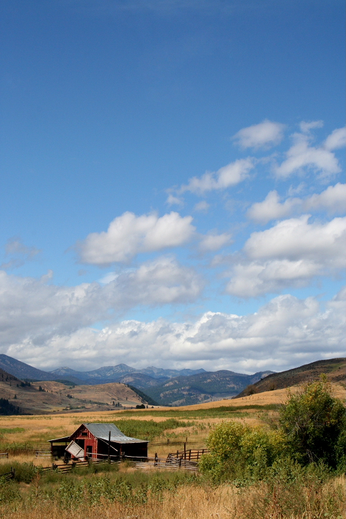
There's not a lot of difference between the two shots Sheila. Personally, I like the second best but both a very good.
Regards,
Joe
|
|
|
|
 Sheila Carson
{K:5924} 9/13/2008
Sheila Carson
{K:5924} 9/13/2008
|
Thanks Leora!
|
|
|
|
|
Sheila Carson
{K:5924} 9/13/2008
|
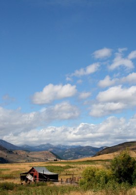
Thank you for your nice comment Gary!
The original shot of this did include more foreground, but I couldn't decide if it took away from the focal points too much or not. In the end I thought it was a tad too distracting so I took it out.
I attached a copy of the original with my reply to Joe. Check it out and let me know what you think.
Thanks!
|
|
|
|
|
Sheila Carson
{K:5924} 9/13/2008
|
Thank you Joe. I really appreciate your suggestion.
The original shot of this did include more foreground, but I couldn't decide if it took away from the focal points too much or not. In the end I thought it was a tad too distracting so I took it out.
I will try to attach it here so you can tell me what you think.
|

|
|
|
|
 Leora Long
{K:11135} 9/12/2008
Leora Long
{K:11135} 9/12/2008
|
Great title and intriguing landscape...well balanced color and design.
Cheers, Leora
|
|
|
|
 Billy Bloggs
 {K:51043} 9/11/2008
|
I disagree with Joe. Sorry Joe! I think the composition is spot on. The lack of foreground and enormous sky gives us a sense of the isolation and wide open space. I shoot very few landscapes but if were standing there, this is how I would frame it.
Regards, Gary
|
|
|
|
|
Joe Brown
{K:23213} 9/11/2008
|
Not much to criticize with this fine shot. I like the low horizon and the big sky with the beautiful clouds. The old building and coral in the foreground provide interest and colour.
I wonder if it would have been a bit more effective if you had got a little lower so as to include a bit more foreground detail.
Regards,
Joe
|
|