|
|
|
sander mijnster
{K:45} 10/20/2003
|
You have a very personal way of making portraits, not by the standards or the books, but very impressive. The way you portrait people in this sense with mostly no eye contact makes your photo's nevertheless more impressive. Great art and you are a great photographer
|
|
|
|
|
Marc Barsoum
{K:1487} 10/11/2003
|
Hey Ronald,
That one's great. Composition, lighting, orginality.
The effect is nice too. I would just try to have the squares appear a little less.
Regards
Marc
|
|
|
|
|
Marco Marongiu
{K:-65} 10/7/2003
|
Hi Ronald!
Thank you very much for your kind comment on my "Insomnia" .. greatly appreciated. You have great works in your gallery .. i really like it.
Keep up the good work!
Marco
|
|
|
|
 Syrie Kovitz
{K:1349} 9/1/2003
Syrie Kovitz
{K:1349} 9/1/2003
|
Oh this would be such a wonderfully strong image without the photoshopped filter!
|
|
|
|
|
Ronald Allen
{K:2934} 5/30/2003
|
dear nate,
this has nothing to do with the matrix, neither do any of my other photos. i undestand what you mean now that i've seen the posters (by the way, the first matrix movie kicked, the 2nd one sucked). this was neither inspired by nor in any way related to the matrix, neither are any of my other photographs. thank you,
-Ronald
|
|
|
|
|
Ben Rasmussen
{K:2130} 5/19/2003
|
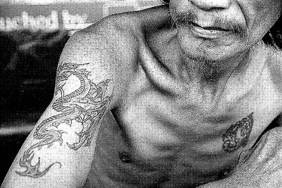
great shot. i love the graininess. it adds to the character of the man and emphasises his tattoos. nice work. and as a man once said (the guy above me) cioa danato
|
|
|
|
 donato r.
{K:16361} 5/18/2003
donato r.
{K:16361} 5/18/2003
|
ottima, magnifico il contrasto!.... grazie per il tuo commento. ciao donato
|
|
|
|
|
Nathan Wilkinson
{K:394} 5/18/2003
|
Very interesting shot ronny. i like the matrix style too bud. Good work, crazy weird effect. Nice
|
|
|
|
|
Ronald Allen
{K:2934} 5/18/2003
|
thank you everyone for your comments. if you like what you see here, please take a look at the rest of my portfolio...
|

|
|
|
|
|
Aiman Nassar
{K:11961} 5/18/2003
|
Excellent Roland... I love the composition (great cropping again), love the tones, the expression.
I like the grain... agree with you it adds another element of the emotional feeling in the photo... yet this is not a typical (what you get from a rough paper in the dark room)... it is kind of symetrical pattern. don't know... but IMO if it was more random, it could have (again IMHO) pushed it futher
regards
a
|
|
|
|
|
Hayri CALISKAN
{K:16195} 5/18/2003
|
Great details.
|
|
|
|
|
Michael Bothager
{K:-8} 5/18/2003
|
What reaaly makes this photo click for me is that his eyes is not in the frame, but the mouth/jawline indicates a "tuff dude".
Also the texture adds to the overall roughness of the shot.
Great work.
|
|
|
|
|
michelle k.
{K:16270} 5/18/2003
|
great. i like the effect.
|
|
|
|
|
Marcin Gorski
{K:12388} 5/18/2003
|
perfect framing, excellent B&W..if not the effect of oversharpness - imo
|
|
|
|
|
Ronald Allen
{K:2934} 5/18/2003
|
personally, murias, i like the grainy effect, it makes the photograph look old and worn out, like the man in it. i guess this is just a personal style choice though. please rate the photograph individually on these guidelines: compositiong, lighting, originality, emotional appeal. not "whether or not you like the effect". should the grainy effect affect composition ratings? no, the composition is the same. lighting? lighting doesn't change with this either. only originality and emotional appeal might be effected by the affect. please take some time to examine each of the photographs qualities and rate accordingly. thank you,
-Ronald
|
|
|
|
Nando Mondino
 {K:14261} 5/18/2003
|
Good portrait!
|
|
|
|
 Nuno Murias
{K:5323} 5/18/2003
Nuno Murias
{K:5323} 5/18/2003
|
I think it would be better wth no effect
|
|