|
|
 Sarah Zand Vakili
{K:2337} 7/20/2006
|
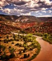
A kind of creative artwork, I like it in this way.. Also think it could be more amazing n confusing if u gradually darken the lower part of the image, So the lightenings in upper & lower part will be different & somehow it seems more to be an strange architecture rather than a digital trick (at least at first sight).
Many tnx for ur comment on my shot dear Carlen..
|
|
|
|
|
Alicja Goździk
{K:3649} 7/20/2006
|
It is very intresting picture...nice effect,
Congratulations,
Alicja
PS.Thank you for comment to my picture:)
|
|
|
|
 Carlen Boersema
 {K:6789} 7/20/2006
|
Yeah, I agree with the straightening. I used a quadrant flip not a mirror image so I think it looks more like a mirror image once you straightened. Btw edit my photos anytime, I don't mind.
Check out the original pic above.
|
|
|
|
 Carlen Boersema
 {K:6789} 7/20/2006
|
Thank you for the constructive criticism.
I guess I should have mentioned the post work. I first did a quadrant flip and then I edited the brightness/contrast, and finally added a sepia filter.
Personally I think the sepia looks horrible compared to sepia straight from the camera (I don't think my camera has a sepia setting but I'll have to double check) but it was better than nothing. Anyway I'll attach the original for comparison.
|

|
|
|
|
 Garold Jennings
{K:2513} 7/20/2006
|
Carlen I think this is a wonderful shot, when you can get viewers to look around and try to see your photograph from different angles you have created interest. I agree the contrast using curves or just by using brightness/contrast levels and a little straightening would enhance the photograph. I will visit your portfolio in the future to see your work. Great job and keep shooting.
|
|
|
|
 Jacob French
{K:6315} 7/19/2006
|
Great job on this image! I like the post work you've done, it really tricks the mind into questioning itself. I found myself wondering which way was up and where my eye should go next.
I think this image would benefit from a curves/levels adjustment to bring out the contrast, and I think if you straightened it a little, it would help, too! I've included my suggestion, I hope you don't mind.
Well done, and keep up the great work!
J
|

|
|
|
|
 Larissa Nazarova
{K:12118} 7/19/2006
|
It's a great angle of view with perspective. Nice shot.
Larissa
|
|
|
|
 Ms. Mel Brackstone
{K:5285} 7/19/2006
|
Very creative imaging Carlen, I like the lines and shadows too. It can probably do with a hit from levels to bring out a bit more contrast, but other than that its great!
Thanks for your comment on my seascape today....all the best
|
|
|
|
 Pablo Dylan
 {K:63918} 7/19/2006
|
Impressive composition. Optimal job.
Pablo
|
|


