Hi Hugo, thankyou I like this one the best also.. I will play with the colour of text.. I do like natural earthy so i guess it would tie in harmoniously with natural earthy landscapes! cheers! Regards :O)
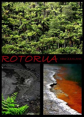
Hi Tabitha, I think this one is, photographically, even stronger than the previous one. Very good saturation and compositions. I'm not too sure about the black frame with the red lettering; to me, it looks a bit intrusive and agressive compared to the sheer beauty of the landscapes. I'd go for something smoother and more natural, if you see what I mean.