|
|
|
sascha jonack
{K:19715} 1/20/2007
|
Very nice still life. I prefer this one from the two. Superb light and great PS work.
Sascha
|
|
|
|
 Michele Carlsen
{K:146013} 1/13/2007
Michele Carlsen
{K:146013} 1/13/2007
|
This is just beautiful..... the colors and tones, and textures are all sooo wonderful together.
I am so glad I got to view your work Ina!!
It's quite different , very unique !!
-Best Wishes,
Michele~
|
|
|
|
|
jacques brisebois
{K:73883} 12/28/2006
|
looks like a Renaissance paint, great ps work
|
|
|
|
 Hugo de Wolf
{K:185110} 4/4/2006
Hugo de Wolf
{K:185110} 4/4/2006
|
Hey Ina, How're you? Long time no see..>:)
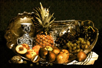
This photo sure has a very strong resemblance to the 17th century Dutch school paintings Petal refers to, but if it were a painting, and if it would've been hanging in my museum, I'd had it cleaned instantly...:) Just kidding, of course. Both tones and classic composition create a very strong remblance indeed, and I think that is extremely well achieved.
Petal has a point about the kiwis, and I also have my doubts about the presence of the pinapple; probably a bit too exotic for the good ol' Dutchlands in the golden age. I know we're way ahead of our time, but not that much...:P
As to the contrasts in this photo, I think it's applied very nicely in the fruits, as well as in the silver tray, but in the china vase as well as in the napkin, I think the contrast is just a wee bit overdone.
The lighting could've been a bit more directional (less ambiant) but that's zooming in on the level of individual artists, and I'm way out of my league there...:)
Great shot, very creative idea. Hope you had a nice time off!
Cheers,
Hugo
|
|
|
|
 Steve Aronoff
{K:18393} 3/20/2006
Steve Aronoff
{K:18393} 3/20/2006
|
Hi, Ina. I haven't read most of the other comments, so I hope I'm not duplicating anything. You have such a wonder way with still lifes. This may be the only one that doesn't work for me. My major concern is with the composition, which to me feels unbalanced, as though there are two still lifes placed side by side, a tall one on the left and a low one on the right. Secondarily, I think there are about seven hot spots of bright white that appear to me to be more or less haphazardly placed.
But my main concern is the unbalanced feel. The separation of the two parts is enhanced by the bright triangular are of platter just to the right of the pineapple. The space feels like it ought to be filled or to at least have the same patina and tone as the other platter areas. It feels like there's a large wedge being driven between the two parts of the image.
The asymmetry is also enhanced by the placement of the dark grapes above the green grapes. The dark grapes tend to blend in with the darkness of their bowl, to almost be lost. This depresses the right side even more. I understand that it's nice to have dark tones on the right that balance the dark of the vase on the left, but I think placing the dark grapes below the light ones will not depress the right side so much (it will lift it up) and will provide a nice diagonal symmetry of color with the vase.
I hope this doesn't sound too harsh. Obviously, you know far more about creating fantastic still lifes than I do. It shows in your portfolio.
Steve
|
|
|
|
 Ace Star
{K:21040} 3/9/2006
Ace Star
{K:21040} 3/9/2006
|
truly classick! u r getting better in still life ... really admire it :)
excellent +7
wish you good luck
|
|
|
|
 Mark Longo
{K:12760} 3/6/2006
Mark Longo
{K:12760} 3/6/2006
|
WOW! This is masterful! Another gorgeous arrangement (and I LOVE that bowl/basket on the right!) and the lighting and color pallette are fantastic. You have really nailed the style here. The post processing on this one is a bit more subdued, and effective, I think than on "Still Life #1" and I think this treatment keeps the look of the lighting a bit softer and perhaps more natural.
One personal observation is that the post processing has sharpened the edges of the objects a little bit I think (pineapple leaves, silver tray, for example). I think the sharpened areas look more painterly in the sliver highlights (bowl edge on right), but less painterly in the pineapple leaf edges. Some selective low opacity blurring along the edges with the blur tool might help. But this is pretty subtle and some might disagree with what I'm seeing here.
Looking at this more, a slightly softer light might help with the 18th century look. One thing to try might be to create a top layer in PS and to use a black-to-tranparent gradient left-to-right and adjust the opacity of that layer to control the amount of effect. This will allow the highlights to show through while darkening the pallette on the left side, away from the light source. Experiment with different lengths of gradient, including starting the gradient from off the left side of the page. I don't know if this will help but I've used it to good effect in the past.
Another possibility is to use the PS lighting effects but with negative values, so that the light source creates dark instead of light. That's a tricky thing and not as controllable as a gradient in some ways, but the results can be both very effective while not being directly noticable (ie: you can't notice the effect).
Anyway, keep doing these Ina, you are dazzling us! Also, if you perfect this technique the results could be very saleable...
Mark
|
|
|
|
 narabia
{K:9563} 3/5/2006
narabia
{K:9563} 3/5/2006
|
You are the master of light and PS :)
It really looks like a paining.
|
|
|
|
 Susie OConnor
{K:34798} 3/4/2006
Susie OConnor
{K:34798} 3/4/2006
|
You are doing so well with this technique Ina. It does look just like a painting. I'm not familiar with the Dutch paintings, but this is really fabulous. Keep up the great work and have some good time off.
Susie
|
|
|
|
 Gustavo Scheverin
 {K:164501} 3/4/2006
|
Maravilloso!
Felicitaciones!
|
|
|
|
 Karina Brys
{K:16541} 3/3/2006
Karina Brys
{K:16541} 3/3/2006
|
Hello Ina. Wonderful impression once again.
Enjoy your trip! Your comments will be missed :-)
|
|
|
|
 Gorilla K
{K:17526} 3/3/2006
Gorilla K
{K:17526} 3/3/2006
|
a real Rembrand;-)....very nice still life with nice composition of the fruits...great lighting and warm tones...well done,Ina!!!
best regards,
Winfried
|
|
|
|
 Robert Kocs
{K:89085} 3/3/2006
Robert Kocs
{K:89085} 3/3/2006
|
Another beauty still life, looks like a really old oil painting! Congratulations dear my friend! HUgs!
Cheers dear Ina!
Robert
|
|
|
|
 Ina Nicolae
{K:44481} 3/3/2006
Ina Nicolae
{K:44481} 3/3/2006
|
Hi Gabriela and thanks for your visit & comment.
I believe what you see is a texture experiment in the background, it's not a fabric, but PS. I'm going to be buying some fabrics to use as backgrounds, until then, these are plain color tablecloths textured in PS. I'm still in the experimental stages, but every time I feel more in control of what I'm aiming for.
Best regards, Ina
|
|
|
|
 stingRay pt.4 .
{K:250401} 3/2/2006
stingRay pt.4 .
{K:250401} 3/2/2006
|
Hi again Ina...just a quick note before I settle into bed. I rarely give individual thank-yous myself...only to people who are commenting for the first time or to answer any questions raised. So you and I are like minded along with a few others as well. I hope your 'break' is one of an enjoyable nature, 'see' you soon my dear. Best wishes as always....
|
|
|
|
|
Ina Nicolae
{K:44481} 3/2/2006
|
Thanks very much Jeanette, I'm learning :)
This one is still from the outdoors batch from the balcony. I will set up an indoor proper studio with lamps - as you suggested - and better control the lighting.
What's different here is the object colors, they were all "low-key" no more reds and bright orange. I'm going to buy some traditional fabrics to have two in the background draped on the vertical and running down below the trays. Shooting outside in winter is tricky, the wind is blowing 99% of the time, I had to secure the tablecloth with pins, and kept moving the entire still life around after the sunlight.
Not the easiest thing to do. But the plus is that I could use ISO 100, which indoors will have to be increased.
Best regards, and thanks for the encouragement, Ina
|
|
|
|
|
Ina Nicolae
{K:44481} 3/2/2006
|
Ha-ha-ha Petal! I don't understand a word of Dutch, but it was so funny reading this! The kiwi is something they wouldn't have used :) I should look for some beautiful tulips next time - LOL!
Here is one (see picture attached) for you with a KLM house :) Best regards, Ina
|

Still Life with Leyden House |
|
|
|
|
Ina Nicolae
{K:44481} 3/2/2006
|
Thanks very much Ray for your visit and both comments! I'm going to be away from UF for a few days, and will not be posting "thank you" messages as I used to, I hope to get more done by visiting more pages, I hope you don't mind if I don't write you a Thank You note every time, because I mean it anyway :) Of course I will still reply to any questions, etc.
Hope you are feeling better, wish you all the best, Ina
|
|
|
|
|
stingRay pt.4 .
{K:250401} 3/2/2006
|
Another great addition to this series my dear Ina and I love the postwork you are employing to create a 'painting'. Wonderful details and colours in this latest one that contains so many contrasting elements. The previous posting is still my favourite because of it's simplistic composure, superb lighting and the closest representation of a painting that I can ever remember seeing. Having said that.....I still think this one is wonderful...Oh, please keep this series going Ina...it is going to be just the best. Very fond regards....Ray
|
|
|
|
 Gabriela Tanaka
{K:16594} 3/2/2006
Gabriela Tanaka
{K:16594} 3/2/2006
|
Ohhhhhh!!! This is SUPERB! A magnificent creation, dearest Ina!Love those silver plates/trays, even a basket(?). They give an old shine to the fruits. The grapes and pears look extraordinarily painterly, with other words if we cut a diagonal from the half-kiwi upwards, I'd say the right side is perfect! There is something with the background, the material you made use of had some patterns in it(?) 'cause the black is not smooth, at least on my computer.
Just because it is no longer a photo shot somewhere, in the park or such, but your own creation, it makes it by far more valuable! Please, continue the experimentation! I for one look forward to see more.
Love from Gabriela
|
|
|
|
 Petal Wijnen
{K:50989} 3/2/2006
Petal Wijnen
{K:50989} 3/2/2006
|
Prachtig stilleven, heel mooi, bijna zeventiende eeuws!!! Ooooooh sorry, thought you were Dutch too... LOL!! Sure looks like you've got it cracked... it almost does look like a seventeenth century still life/painting... well done!!! BTW nice objects, but the kiwi... I don't think it was around back then... LOL!!
|
|
|
|
 Jeanette Hägglund
{K:59855} 3/2/2006
Jeanette Hägglund
{K:59855} 3/2/2006
|
Here imust S U P E R B Ina, i´m impressed. The light is smooth and nice, the yellow perfect - as i wanted it to be ;)) .... and the still, how you created it, is so excelent.
Full point!
Jeanette
|
|
|
|
 eleonora frago
{K:2472} 3/2/2006
eleonora frago
{K:2472} 3/2/2006
|
Ina, wow!
you are improving your technique in still.life more and more and more.
this is indeed beautiful, it has one delicious good atmosphere.
eleonora
|
|
|
|
|
Alicia Popp
{K:87532} 3/2/2006
|
Bellísima iluminación, colores, composición.Felicitaciones Ina, me encanta!
|
|
|
|
 Dave Stacey
{K:150877} 3/2/2006
Dave Stacey
{K:150877} 3/2/2006
|
Very well done, Ina! I like the look you've achieved here very much, in that you've use PS without seeming to have used it.
Dave.
|
|
|
|
|
Ina Nicolae
{K:44481} 3/2/2006
|
Hi Eb, thanks for the comment! I think it's going to have to move to "a studio" indoors eventually - as my balcony has provided bright lighting, but not even lighting. I have improvised so far, and seeing what can be achieved, I'd like more control over the lighting. The sun is tricky - since I don't have any parasols, it hits directly on the objects, and I keep moving them around to avoid blown highlights, but they still happen, and strong shadows. But with every experiment I know better what I'm aiming for :) Best regards, Ina
|
|
|
|
 Eb Mueller
{K:24960} 3/2/2006
Eb Mueller
{K:24960} 3/2/2006
|
Ina, this motif is certainly improving with practice! The tones on the grapes are superb. the backdrop texture and tones are working very well, indeed! Some of the highlights will need to be subdued for the painterly effect you are trying to achieve. I am unsure whether you can take the overall tones and contrast any further without resorting to medium which has more latitude (large format film) and/or studio lighting.
Eb
|
|
|
|
 Kathy Hillard
{K:25721} 3/2/2006
Kathy Hillard
{K:25721} 3/2/2006
|
I think you nailed this one, Ina! It looks very much like a Dutch still life painting! Well done!
I think it's great that you aren't going to thank each comment individually. Saves a lot of time and lets you view more images!!! :) I hope you have a great time away!
Kathy
|
|
|
|
|
Ina Nicolae
{K:44481} 3/1/2006
|
Thanks Rina :) In the high res still lifes, the main criticisms were about the cropping, and the lighting, some were about not having a painted look - no patina, and bright colors.
So I didn't crop this one - therefore less detail.
I did eliminate the bright colors, and added a number of textures for patina.
Still I feel it needs a stronger background, a combination of two drapery fabrics, one dark and one with a light pattern, and I will go and invest in some expensive brocade, because my tablecloths are too plain :) Cheers, and thanks again! Ina
|
|
|
|
 Caterina Berimballi
{K:27299} 3/1/2006
Caterina Berimballi
{K:27299} 3/1/2006
|
Well in that case, I think you've achieved your objective with removing the strong colours to give it a more realistic 'painter's palette'. I wouldn't say you've PSd this to death as such. Infact, in all honesty, the texture you've applied here is more subtle than in your previous. Meaning, the 'painted' look is not as strong and so still comes across as a photo. However, as far as my reaction to it is concerned, my first thought was - striking. And that's BECAUSE of the blowouts, details and desat. The arrangement is pleasing and well balanced too. I'd encourage you to keep at it until you get the look you're happy with, rather than just going back to high-res images. Try this one again, but perhaps using the same degree of texture filter as on the previous. Not sure if that would negate the Dutch still life objective though...
Cheers Ina. Have a great week and I'll pop in often to read what others have to say about it as well...
Rina
|
|
|
|
|
Ina Nicolae
{K:44481} 3/1/2006
|
Thanks Tracey, I'll go visit your new posts, I'll be also away for a few days, I'm going to stop writing Thank You notes, to save time, I prefer to write critiques - so if you don't hear from me, it's because of this - I hope you don't mind,
Best regards, Ina
|
|
|
|
|
Ina Nicolae
{K:44481} 3/1/2006
|
Hi Rina, They were blowouts :-) I processed this one so much, you can't tell it from the original anymore. I eliminated the strong colors from the arrangement: bright reds, bright greens, etc, no red apples and no green peppers.
I P.S.'d it to death, this is my first generation attempt at adding textures, I have just started and these are experimental. In these two, I didn't want the picture to look like a photo anymore, neither like one of the recognizable PS filters.
I'm interested in the reaction and criticism :)
I may go back to hi-resolution photos :)
Hugs, Ina
|
|
|
|
|
Caterina Berimballi
{K:27299} 3/1/2006
|
Not familiar at all with Dutch still life, but after absorbing your work, I'm keen to find out more. Love the brilliant white you've achieved in the contrast without losing detail in the shadows. Were they originally blowouts or have you masterfully added them in? Geez, I'm full of questions today huh? :))
Cheers
Rina
|
|
|
|
 Tracey Main
{K:7290} 3/1/2006
Tracey Main
{K:7290} 3/1/2006
|
Wow Ina very classy I love this, I had 5 minutes to spare so I posted and now having a quick look at what I have missed these past days and to no suprise to me Ina's wonderful work stands out, very beautiful still life excellent work and light love what you have used in this one, I enjoyed your others but this is my favorite, take care until next time I'm on very busy at the moment regards Tracey..
|
|
|
|
 Laura Haw
{K:2696} 3/1/2006
Laura Haw
{K:2696} 3/1/2006
|
very nice tone and composition.
|
|