|
|
Critique By:
Leo Régnier Я£ (K:67696)
11/23/2006 2:01:44 AM
Nice picture my friend!!!! Congrats,
Leo :) :) :)
|
| Photo By: John William
(K:775)
|
|
|
Critique By:
Wayne Harridge (K:18292)

11/12/2006 11:20:42 AM
Good close cropped shot. Excellent b&w tones too.
...Wayne
|
| Photo By: John William
(K:775)
|
|
|
Critique By:
James Cook (K:38068)
11/12/2006 9:42:10 AM
Really? Wild. Maybe you'll be able to post a normal version of the whole poster to this thread for comparison. This shot is pretty impressive. I was thinking it was perhaps some sort of built structure. I couldn't quite parse the image.
|
| Photo By: John William
(K:775)
|
|
|
Critique By:
Dan Wilson (K:21104)
11/11/2006 11:20:16 PM
Really wonderful photo idea. Something to me doesn't look right with the framing though.
Great tonal range, nice pose.
|
| Photo By: John William
(K:775)
|
|
|
Critique By:
John William (K:775)
11/11/2006 11:04:33 PM
Thanks James. This is a close up shot of a black light poster (under black light conditions). The shot was then processed in sepia.
|
| Photo By: John William
(K:775)
|
|
|
Critique By:
James Cook (K:38068)
11/11/2006 11:02:41 PM
This is really cool. What are we looking at?
|
| Photo By: John William
(K:775)
|
|
|
Critique By:
John William (K:775)
11/7/2006 6:59:24 AM
Thank you so much.
|
| Photo By: John William
(K:775)
|
|
|
Critique By:
Sam Kh (K:19017)
11/7/2006 6:42:34 AM
cute-frame and beautiful color
well done
|
| Photo By: John William
(K:775)
|
|
|
Critique By:
John William (K:775)
10/27/2006 3:16:27 AM
Thanks Rachel.
|
| Photo By: John William
(K:775)
|
|
|
Critique By:
Rachel Leah (K:26110)
10/27/2006 12:14:14 AM
Great shot! I love teh angle you took this at, just great! She's going high! I love the swings, so this shot makes me happy! haha... I lkove the lighting, coloring, contrast, and everything else too! Excellent work :)
~Rachel~
|
| Photo By: John William
(K:775)
|
|
|
Critique By:
John William (K:775)
10/23/2006 5:06:48 PM
Thank you Gianes.
|
| Photo By: John William
(K:775)
|
|
|
Critique By:
John William (K:775)
10/23/2006 5:05:25 PM
I too have seen this. I actually tried various settings within TIFF and NEF (Raw for Nikon). The program that seems to work best for me is the Nikon Picture Project. Adobe and Nikon Capture in Raq conversation to 400K really messes up some images.
|
| Photo By: John William
(K:775)
|
|
|
Critique By:
John William (K:775)
10/23/2006 5:01:50 PM
Thank you. I had to watch her boots as she nearly kicked me on the return...
|
| Photo By: John William
(K:775)
|
|
|
Critique By:
Gianes Ma (K:26069)
10/23/2006 1:45:45 PM
The low angle of camera exalts the flight of the child. Is Fantastic!
|
| Photo By: John William
(K:775)
|
|
|
Critique By:
G G (K:61359)
10/23/2006 6:21:00 AM
Great capture, nice tones andd good crop gor a beautiful composition.
Cheers
|
| Photo By: John William
(K:775)
|
|
|
Critique By:
Paul Sanders (K:744)
10/23/2006 5:30:43 AM
It definitely has something to do with the photo being digitized and scanned. I'm not too competent and patient with scans, etc. It actually discouraged me from posting or making a webpage for such a long time. The prints I made myself especially the 16 x 16 are so much better. Shame.
|
| Photo By: John William
(K:775)
|
|
|
Critique By:
John William (K:775)
10/23/2006 4:05:58 AM
Thanks Paul. I added sephia and pulled the tone down....too much I suppose. By the way, I like your San Miguel image. I noticed that the outside edges are distorted somewhat. Is that from knocking the pixels down to 400K? (or smaller)
|
| Photo By: John William
(K:775)
|
|
|
Critique By:
Paul Sanders (K:744)
10/23/2006 4:00:41 AM
Nice capture! Always loved these kinds of photos. There are many criteria for what constitutes a good photo. Sometimes a photo can evoke an emotional response. This photo does that. I think I'll go hop on a swing now...The only critique I have is maybe the photo should be a tad darker or have more contrast? Nice.
|
| Photo By: John William
(K:775)
|
|
|
Critique By:
John William (K:775)
10/23/2006 3:59:06 AM
Thanks for the words Mary. This group was fun to shoot and I guess I wanted to quickly mix them. (My wife actually created the collage) The pictures were cropped from color. I have a habit of making the backgrounds blacker then what is recommended. This collage maker is a cheap product (non Adobe CS), but the expression still remains....fun and laughter. These pics were taken while setting up my lights and testing out the wireless remote. I was trying to tickle my daughter's neck and she of course hated it...NOT!
Again - thank you for your comments.
|
| Photo By: John William
(K:775)
|
|
|
Critique By:
John William (K:775)
10/23/2006 3:52:00 AM
Thanks for your comment. The color was just to contrast the B&W.
Best regards.
|
| Photo By: John William
(K:775)
|
|
|
Critique By:
Mary Brown (K:71879)
10/23/2006 3:05:38 AM
This definately shows the love betwen these two. That makes it a pleasure to view. For me, the coloured one draws my eye there and I find it hard to go back to the others and enjoy the wonderful expressions that are there. The crisp edges are okay as there are mostly contrasts between the edges of the joining pictures. The place this does not work is between the large top left and the large middle pictures. As both have his skin tones right to the edges in the one part, it makes the transition from one to the other less distinct and so not as pleasing. However, overall it is a glorious expression of love and makes me smile.
MAry
|
| Photo By: John William
(K:775)
|
|
|
Critique By:
Rachel Leah (K:26110)
10/22/2006 8:26:16 PM
Great pic! I like the cropping, unusual, but effective for this shot! Cute pose and moment captured here... and the lighitng, contrast, angle and everything just looks great! Nice work :)
~Rachel~
|
| Photo By: John William
(K:775)
|
|
|
Critique By:
Rashed Abdulla (K:163889)
10/22/2006 7:43:50 PM
very great image, wonderful moment and very great contrast and tone
1million&1regards my friend
|
| Photo By: John William
(K:775)
|
|
|
Critique By:
John William (K:775)
10/22/2006 7:35:55 PM
Thanks for your comments. I actually turned down the suggested contrast and to me it seemed there was too much light. I guess I was worried it would blow out the skin tones.
Thanks for the imput.
|
| Photo By: John William
(K:775)
|
|
|
Critique By:
Gail Solvang (K:314)
10/22/2006 7:22:54 PM
How touching! What precious moments! But the contrast could be better. The color photo is too distracting for this collage. And the collage is put together a little too 'choppy'. The sharp overlap of a couple of the pictures onto the next image is kinda sloppy to me, and does not compliment the collage that way. But the tight shot of your faces really emphasizes the "close relationship" between father and daughter, which makes each portrait so fantastic.
|
| Photo By: John William
(K:775)
|
|
|
Critique By:
evershine evershine (K:324)
10/22/2006 5:34:26 PM
Nice collection.. I think the contrast of the black and white is not enough.
|
| Photo By: John William
(K:775)
|
|
|
Critique By:
Maurizio Massetti (K:30463)
10/22/2006 5:27:02 PM
Interesting composition, maybe better all in black and white...
|
| Photo By: John William
(K:775)
|
|
|
Critique By:
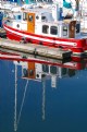
Alicia Popp (K:87532)
10/12/2006 3:15:46 AM
Hummmmmmmm... me encanta... es como que invita a dar un tranquilo paseo. Felicitaciones por la captura! Una maravilla!
|
| Photo By: John William
(K:775)
|
|
|
Critique By:
Massimo Gandossi (K:372)
10/11/2006 8:22:28 AM
Rilassante e morbida, da l'idea dell'attesa.
complimenti.
Massimo.
|
| Photo By: John William
(K:775)
|
|
|
Critique By:
Alicia Popp (K:87532)
10/11/2006 5:37:50 AM
Qué estupendo retrato en el cristal de la lente... felicitaciones!!
|
| Photo By: John William
(K:775)
|
|