|
|
Critique By:
Tania Falowski (K:247)
7/23/2003 11:30:47 AM
Its a beautiful picture, at first I thought the chairs were flourescent.
In PS you might want to try the healing brush if you need to do any touch ups. Still great composition.
|
| Photo By: Jamie
(K:530)
|
|
|
Critique By:
Ed Dalton (K:280)
3/9/2003 10:31:31 PM
I would have taken from the centre front, and yes I would have cropped closer and taken the corner off altogether.
|
| Photo By: Jamie
(K:530)
|
|
|
Critique By:
Jake Sieg (K:673)
5/31/2002 5:48:54 PM
i dont even know how to start with this(in a good way) it just sets a really deep mood.
|
| Photo By: Jamie
(K:530)
|
|
|
Critique By:
Who Kares (K:224)
2/3/2002 1:29:16 PM
This is one cool shot! I like the crop as well. Adds to the composition. Great job overall. Looks like iChair by Apple :-)
|
| Photo By: Jamie
(K:530)
|
|
|
Critique By:
natalie nadozirny (K:40)
1/17/2002 10:12:45 PM
Let's see some broccoli next time. Complement the orange(s) with green.
|
| Photo By: Jamie
(K:530)
|
|
|
Critique By:
. . (K:2743)
1/17/2002 11:37:09 AM
i think the bottom left corner is fine..completes the vignetting effect
|
| Photo By: Jamie
(K:530)
|
|
|
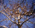
Critique By:
Steve Kompier (K:4629)

1/17/2002 11:32:30 AM
Geez...Jamie...Where's the light leaks? Where's the vignetting? Nice pic.
I like the yellow-tan of the tree against the blue sky. The only minor distraction, is the lower left branch.
|
| Photo By: Jamie
(K:530)
|
|
|
Critique By:
. . (K:2743)
1/15/2002 12:11:23 PM
nice..and painterly...
you may like this one too..
http://www.usefilm.com/showphoto.php?id=4689
|
| Photo By: Jamie
(K:530)
|
|
|
Critique By:
. . (K:2743)
1/7/2002 8:36:22 PM
k, will look forward
if its too red..you could use color balance..in photoshop to color correct it..
|
| Photo By: Jamie
(K:530)
|
|
|
Critique By:
natalie nadozirny (K:40)
1/7/2002 5:39:40 PM
Sai -- I have a lot from this series that picked up some of the pre-sunrise colors, but they were scanned very red. I'm still trying to figure out how to fix them. Yes, I was shooting with a tripod. --Jamie
|
| Photo By: Jamie
(K:530)
|
|
|
Critique By:
. . (K:2743)
1/7/2002 1:10:34 PM
hey jamie,
i like how the breaking wave cuts the sun reflection.
do you use a tripod? if you do you could also..shoot..before the sun rises..when the light is low and catch some really nice colors..
|
| Photo By: Jamie
(K:530)
|
|
|
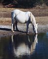
Critique By:
Debbie Groff (K:9569)
1/4/2002 8:57:33 AM
I've looked at this one several times and each time I've wanted to comment something but couldn't quite figure out what coz I do like it and sometimes "good" words are hard to come by Anyway, this would make for a cool framed picture in a truck stop or cafe in my opinion. Or even just in the office of this motel. Anyway, this would make for a cool framed picture in a truck stop or cafe in my opinion. Or even just in the office of this motel.
|
| Photo By: Jamie
(K:530)
|
|
|
Critique By:
Jamie (K:530)
1/4/2002 6:25:40 AM
Debbie -- I mourn the loss of your film. I might've been the first to post a horse reflection (maybe), but there's still room for a good horse reflection. This picture received a lot of comments. I was well aware of the problems, but posted it because someone wanted to see what an Assateague Pony looked like. I think it works well as a travel photo. At least, it reminds me of a moment in my travels where I felt the world is still capable of peace. Thanks to eveyone who posted a constructive comment. --Jamie
|
| Photo By: Jamie
(K:530)
|
|
|
Critique By:
Debbie Groff (K:9569)
1/3/2002 8:17:01 PM
What I meant to say was it got wound all the way out of the cannister. I had it in my vivitar manual camera and went to far when rewinding.
|
| Photo By: Jamie
(K:530)
|
|
|
Critique By:
Debbie Groff (K:9569)
1/3/2002 3:36:02 PM
Well darn! I hadn't seen a horse reflection posted on this site yet and I saw two horses and their reflections in a pond the other day and took several pictures thinking I was going to be the first! Alas the film got wound all the way out of the camera and I had to throw the whole roll away! Now I won't be the first.
Anyway I'm looking at comments and will know what to and not to do when I go back Sai,,,you're not harsh at all! You made a comment as I see it just as the others did!
What I do want to know is how did you get the water to be so blue? Was the sky really blue this day? I had some blue skies and clouds in my reflection but the water was brown. Can you guess what I may have come up with if I had been able to have saved these and had them developed jamie?
|
| Photo By: Jamie
(K:530)
|
|
|
Critique By:
Steve Kompier (K:4629)
1/3/2002 7:55:44 AM
Jamie,
I agree with Alisa. Very tranquil shot, but the back of the horse is a little hot and if you were to burn it in a little, it would bring out the detail more. I like the reflection.
|
| Photo By: Jamie
(K:530)
|
|
|
Critique By:
al shaikh (K:15790)
1/2/2002 11:01:37 PM
One way for this shot to be improved would be to use a aperture of 2.8 or 4.0 It would make your subject stand out more and throw the background out of focus.
|
| Photo By: Jamie
(K:530)
|
|
|
Critique By:
Jamie (K:530)
12/26/2001 9:02:40 PM
Awesome!! I like both versions! Keep up the good work, and keep 'em coming! --Natalie
|
| Photo By: Jamie
(K:530)
|
|
|
Critique By:
Anne Brown (K:833)
12/26/2001 10:08:12 AM
Cool Jamie. I liked the uncropped version best. The blown out area in upper left doesn't bother me. The yellow house/barn puts things in context and that behind the trellis makes yet another interesting component to look at.
Anne
|
| Photo By: Jamie
(K:530)
|
|
|
Critique By:
. . (K:2743)
12/26/2001 10:01:49 AM
I really like the concept on this one Jamie..may be slightly longer startrails (or no trails..just stars) and lil more brightness...but nice concept..
|
| Photo By: Jamie
(K:530)
|
|
|
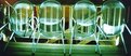
Critique By:
Bob Jarman (K:3145)
12/26/2001 9:47:47 AM
Pretty cool Jamie. I really like the tranluscent chairs.
Too me the stair railing going down is a bit of a distraction, and the chairs on the far right seem to be a bit soft. It almost looks like the focus point was the wall behind the chairs. But the idea is neat and the effect is pretty cool.
Thanks for posting and Keep it up!
|
| Photo By: Jamie
(K:530)
|
|
|
Critique By:
Jamie (K:530)
12/26/2001 9:32:22 AM
|
| Photo By: Jamie
(K:530)
|
|
|
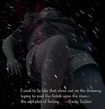
Critique By:
Scott Jones (K:1093)
12/23/2001 10:55:22 AM
Very Nice! and I like the text on the photo and how the photo is so dark and murky. I can't decide whether I would like to see that text centered or kept the way you have it slightly to the right. Hmmm...
Scott
|
| Photo By: Jamie
(K:530)
|
|
|
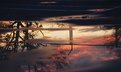
Critique By:
Christian Simms (K:235)
12/20/2001 8:41:05 AM
Great shot Jamie. I've always been a fan of motel neon, and this photo captures its mystique wonderfully. PS - Thanks for your kind words!
|
| Photo By: Jamie
(K:530)
|
|
|
Critique By:
Debbie Groff (K:9569)
12/16/2001 3:02:07 PM
Well a person could turn this upside down or right side up and either way could make for the way it should be type of image. Quite an interesting "reflection".
|
| Photo By: Jamie
(K:530)
|
|
|
Critique By:
Anne Brown (K:833)
12/16/2001 8:43:15 AM
Really nice mood here Jamie. There is alot to take in. It makes you think.
|
| Photo By: Jamie
(K:530)
|
|
|
Critique By:
Danny Provost (K:812)
12/12/2001 4:56:39 PM
Jamie, I agree with Arthur about the DOF. I like the composition and the black background. Welcome to Usefilm.
|
| Photo By: Jamie
(K:530)
|
|
|
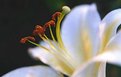
Critique By:
Arthur John Grossman III (K:1214)
12/12/2001 11:07:00 AM
Jamie...creative difference here...I would like to see more DOF so the whole flower is in focus, or at least the front half. It's difficult for my eyes to determine the exact point of focus, so I get lost in the image.
|
| Photo By: Jamie
(K:530)
|
|
|
Critique By:
Toni Martin (K:5092)
12/11/2001 10:13:39 PM
I like this image a lot Jamie. I would take a half inch off of the right. I wish you had shot it on Velvia as it would give the image much more punch.
|
| Photo By: Jamie
(K:530)
|
|
|
Critique By:
Anne Brown (K:833)
12/11/2001 8:07:54 PM
Jamie, I just wanted to note I like this one alot. Lots to look at. It feels like I could just drive right up. Though I don't think I'd like to stay there.
|
| Photo By: Jamie
(K:530)
|
|