|
|
Critique By:
painsama (K:4902)
5/6/2006 1:31:00 PM
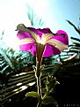
Very nice composition and lighting. Though I think you can improve it a bit by moving a bit to the right, trying to cover the sun with the flower. But by revealing the sun a little bit you can make the picture feels "hot", isn't it?
Bile pulak ko balik Kedah ni...
Regards.
|
| Photo By: Capin the Fourth
(K:117)
|
|
|
Critique By:
painsama (K:4902)
4/7/2006 1:42:53 AM
Very nice picture. I would opt for a B&W approach in this picture but it's okay the way it is.
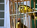
The problem with this picture is the presence of two contrasting themes which, for me, I find quite distracting. The hungry bird in the lower part of the frame and the lonely bird staring at the outside world from which he is "caged" are the themes that I can extract from the picture. I'd focus on one of the theme rather than mixing both in the same picture. Though you can interpret this picture something like: the hungry bird down there is hungry and the other bird is ignoring him since the fact of being "caged" when it is so obvious that it is futile to cry for food.
I'd suggest focusing on any of the theme you want to highlight; if it is to express the feeling of loneliness I'd suggest a horizontal framing with more negative space on the left handside of the frame with the bird staring in that empty space, and at the same time trying to exclude the other bird down there; OR if you opt to give a sense of hopelessness and hunger, I'd suggest a vertical framing to include both of the birds, while keeping the space on the left to minimum, that's how I think you can improve this picture.
By the way, nape dah tak ambik gambar portrait? Bila ko ambik gambar portrait memang power, terutama sekali yang B&W. Ni ko tgh buat remedial banyak jer mase terluang nak ambik gambar.
My best regards. 
|
| Photo By: Capin the Fourth
(K:117)
|
|
|
Critique By:
Rashed Abdulla (K:163889)

4/4/2006 11:25:30 AM
very great image, wonderful colors and details , all of the best my friend
|
| Photo By: Capin the Fourth
(K:117)
|
|
|
Critique By:
painsama (K:4902)
2/22/2006 4:42:24 AM
I find the best things about this picture are that it looks grainy, and the color (pale soft color) that adds up to the mood and ambience to this picture. Very well composed and presented too. Excellent my friend.
|
| Photo By: Capin the Fourth
(K:117)
|
|
|
Critique By:
Capin the Fourth (K:117)
2/21/2006 8:53:34 AM
first of all, i really appreciate your compliments.. as to get it from a person who won several awards from this site, it really meant much to me... in fact, i just only this recent involve myself in photography... well, do teach me more about the art of photography and editing them. thanx
|
| Photo By: Capin the Fourth
(K:117)
|
|
|
Critique By:
CiccioBa Mammola (K:1907)
2/20/2006 9:10:18 AM
as strong as interesting...I think it's very original picture also idea...
|
| Photo By: Capin the Fourth
(K:117)
|
|
|
Critique By:
Jim Goldstein (K:21230)
2/20/2006 7:57:40 AM
This is certainly a different type of photo I'm accustomed to seeing posted here. Your "About" description helps put this into context. Its rather abstract with out that added information. Well composed and presented. I'm sure most people wouldn't apply such a fine touch to their composition in such a situation.
|
| Photo By: Capin the Fourth
(K:117)
|
|
|
Critique By:
Sidney Chan (K:404)
9/27/2005 2:14:01 PM
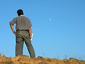
Great fun!! I love the composition. The man seems really looking at the moon! Moreover, I love the song "fly me to the moon"!
|
| Photo By: Capin the Fourth
(K:117)
|
|
|
Critique By:
painsama (K:4902)
7/27/2005 3:02:45 AM
This is certainly a good picture. I love this kind of picture in which there are moving objects with static foreground (the stairs and the women). Considering the clarity of this night shot picture, I would say very well done.
|
| Photo By: Capin the Fourth
(K:117)
|
|
|
Critique By:
Trish McCoy (K:15897)
7/20/2005 10:37:58 PM
beautiful. makes me want to jump on and ride it.
|
| Photo By: Capin the Fourth
(K:117)
|
|
|
Critique By:
painsama (K:4902)
4/27/2005 10:30:47 PM
Nice panning
|
| Photo By: Capin the Fourth
(K:117)
|
|
|
Critique By:
Pnar Yazicioglu (K:7607)
4/26/2005 6:45:07 AM
great movement!
|
| Photo By: Capin the Fourth
(K:117)
|
|
|
Critique By:
Capin the Fourth (K:117)
4/25/2005 9:35:43 AM
Zuzana ler...
|
| Photo By: Capin the Fourth
(K:117)
|
|
|
Critique By:
painsama (K:4902)
4/25/2005 7:14:00 AM
Very well done. It really brings out the subject on the right through selective coloring. And the picture really looks smooth and dreamy.
p/s ni kat mane ni? Tak leh nak cam la...
|
| Photo By: Capin the Fourth
(K:117)
|
|
|
Critique By:
Kshitiz Anand (K:4848)
4/25/2005 6:02:09 AM
Beautiful!!
Nicely done this one..!!
|
| Photo By: Capin the Fourth
(K:117)
|
|
|
Critique By:
painsama (K:4902)
4/22/2005 8:01:54 AM
Try Black & White. Tapi aku rasa kalau subject tu in focus lepas tu convert B&W nampak classic sikit.
|
| Photo By: Capin the Fourth
(K:117)
|
|
|
Critique By:
painsama (K:4902)
4/18/2005 5:02:27 AM
Nice reflection. Water-like reflection.
|
| Photo By: Capin the Fourth
(K:117)
|
|
|
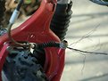
Critique By:
CAGATAY ATASAGUN (K:21564)
4/14/2005 12:22:57 PM
Somebody should fix otherwise somebody (who rides this) may hurt himself (herself)
I would say "warning photo" for this one.
Best wishes,
CAgatay
|
| Photo By: Capin the Fourth
(K:117)
|
|
|
Critique By:
Pawel Kwasnicki (K:9651)
4/13/2005 12:06:05 PM
very nice composition and colors, I only think you should use some higher aperture to get greater depth of field- if possible, good work anyway, best regards, Pawel
|
| Photo By: Capin the Fourth
(K:117)
|
|
|
Critique By:
Roberto Okamura (K:22851)
4/11/2005 2:56:11 PM
Beautiful night capture Capin!!
Well done!
Best regards!
Roberto.
|
| Photo By: Capin the Fourth
(K:117)
|
|
|
Critique By:
painsama (K:4902)
4/11/2005 6:35:29 AM
keling tak marah ke ko gi amik gambar kat situ?
|
| Photo By: Capin the Fourth
(K:117)
|
|
|
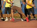
Critique By:
Kursat Oner (K:1580)
4/11/2005 5:28:03 AM
an action picture ! i liked that with shining shoes.. especially the red one is like just saying "i'm here !" , congrats !
|
| Photo By: Capin the Fourth
(K:117)
|
|
|
Critique By:
painsama (K:4902)
4/6/2005 1:21:23 AM
Posing nampak...
|
| Photo By: Capin the Fourth
(K:117)
|
|
|
Critique By:
Todd Miller (K:16464)
4/6/2005 1:13:02 AM
utterly fantastic! title is perfect, as is the image. a favorite...........
cheers,
todd
|
| Photo By: Capin the Fourth
(K:117)
|
|
|
Critique By:
painsama (K:4902)
4/5/2005 2:03:52 AM
May be you need to turn it into sephia or B&W mode if you want to make it looks classic. But I think sephia would make the picture look better.
|
| Photo By: Capin the Fourth
(K:117)
|
|
|
Critique By:
Capin the Fourth (K:117)
4/5/2005 1:00:02 AM
purposely i have to reduce the saturation.... the original color was TOO vibrant... it lloks more classic like this doesn't it?
|
| Photo By: Capin the Fourth
(K:117)
|
|
|
Critique By:
painsama (K:4902)
4/5/2005 12:57:28 AM
Good angle. I like the reflection. But I think you need to make/edit the picture to make the color more vibrant Especially the wall.
|
| Photo By: Capin the Fourth
(K:117)
|
|
|
Critique By:
painsama (K:4902)
4/1/2005 6:08:16 AM
Another perspective of a commonly seen game.
|
| Photo By: Capin the Fourth
(K:117)
|
|
|
Critique By:
C.A. Mikulice (K:13300)
4/1/2005 5:21:51 AM
Great shot, Capin. Love the tension of the legs-- wondering which way the person is going to cut.
Unusual perspective for a game, but I really like it.
--christine
|
| Photo By: Capin the Fourth
(K:117)
|
|
|
Critique By:
Capin the Fourth (K:117)
3/30/2005 10:05:53 AM
well.. frankly, i just want to finish off my battery before recharging it... ijust took pictures of everything that i came across that day... actually the nail was from my friend's room, i just snap on it... really didn't think that it'll come out this way
|
| Photo By: Capin the Fourth
(K:117)
|
|