|
|
Critique By:
Andreas Wolkerstorfer (K:5090)
9/4/2003 11:25:00 AM
cool concept
|
| Photo By: Luis Farrolas
(K:25)
|
|
|
Critique By:
Malin Kristinadottir (K:956)
9/4/2003 9:52:04 AM
yes, I like to look at your n/t?s!! colours & choice of motives!!! /Malin
|
| Photo By: Luis Farrolas
(K:25)
|
|
|
Critique By:
B:)liana (K:30945)
9/3/2003 7:23:42 AM
Interesting contrast and composition.
|
| Photo By: Luis Farrolas
(K:25)
|
|
|
Critique By:
Hakan Aker (K:14146)
9/3/2003 5:49:19 AM
Very nice shot...Regards,H.
|
| Photo By: Luis Farrolas
(K:25)
|
|
|
Critique By:
João Figueiredo (K:7674)
9/2/2003 3:25:14 PM
...good!!!!!
|
| Photo By: Luis Farrolas
(K:25)
|
|
|
Critique By:
Malin Kristinadottir (K:956)
9/2/2003 8:47:50 AM
yes, my eyes like this!!! /Malin
|
| Photo By: Luis Farrolas
(K:25)
|
|
|
Critique By:
Mário Sousa (K:16985)
4/10/2003 2:36:41 PM
Excellent
|
| Photo By: Luis Farrolas
(K:25)
|
|
|
Critique By:
Autumn Ruhe (K:993)
9/4/2002 7:27:02 PM
this is beautiful, i dont see/mind a lack of definition- what have you here really works. great composition, very strong tones. i really think it's amazing.
|
| Photo By: Luis Farrolas
(K:25)
|
|
|
Critique By:
William Wilson (K:380)
5/25/2002 8:16:47 AM
Stunning picture! texture and form both immaculate.
|
| Photo By: Luis Farrolas
(K:25)
|
|
|
Critique By:
Koen B (K:3279)
4/30/2002 8:57:38 AM
Simple, and very effective ! Perfect !
|
| Photo By: Luis Farrolas
(K:25)
|
|
|
Critique By:
sean slavin (K:3488)
1/22/2002 9:50:34 PM
amazing... it looks so real that i feel like i could reach out and touch it. then again, it doesn't look real at all. where did you find this spot?
|
| Photo By: Luis Farrolas
(K:25)
|
|
|
Critique By:
Anne Brown (K:833)
11/28/2001 8:01:42 AM
I love it.
|
| Photo By: Luis Farrolas
(K:25)
|
|
|
Critique By:
Anne Brown (K:833)
11/28/2001 7:58:13 AM
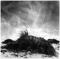
I'm new to this site today. Glad I found it! I really like this. I take alot of "beach" photos myself. I love the angle. The sky is amazing. The mounds of grass are very symetrical which I usually don't care for but I like it very much here. The symetry combined with the abstract sky make for an interesting contrast.
|
| Photo By: Luis Farrolas
(K:25)
|
|
|
Critique By:
Ray Wearn (K:1052)
11/28/2001 2:05:58 AM
I agree with Peter and Chris - and I see detail in the forground/mound. It probably has more detail in the original and loses a bit through compression for this site. If you can't see any detail, calibrate your monitor!
Yes, Altaf, I really like this - and, like Peter, have found it difficult to take my eyes off it (or the thumbnail).
The more I look at it, the more I like it - but I find it difficult to explain why. Keep posting, Luis!
|
| Photo By: Luis Farrolas
(K:25)
|
|
|
Critique By:
Chris Whaley (K:3847)
11/28/2001 1:57:04 AM
Very interesting....looks like a sand storm going on but I'm sure its clouds. I see detail in the bush here. I think he has a shallow depth of field here as well as the wind looks like its blowing a bit. I like it....keep em coming Luis!
|
| Photo By: Luis Farrolas
(K:25)
|
|
|
Critique By:
Petros Stamatakos (K:12101)
11/28/2001 1:24:15 AM
This is one of those images that you'd either really like, or simply not care much for.
I don't think I can point out one thing I like or dislike about it... But... I can't get my eyes off of it! So, I guess it's an image that I'll have to view again and again b/f I can make up my mind. Hence, great job Luis! (Hope I made sence here...)
|
| Photo By: Luis Farrolas
(K:25)
|
|
|
Critique By:
Jeremy Tavan (K:32)
11/28/2001 12:25:45 AM
It's a great sky, but the whole lower half lacks form and definition. Shadow detail would be a place to start, but I think the foreground really needs some more form to it as well.
|
| Photo By: Luis Farrolas
(K:25)
|
|
|
Critique By:
al shaikh (K:15790)

11/28/2001 12:19:42 AM
Anyone have a comment on this work, I really like it and wanted to know what the rest of you think.
|
| Photo By: Luis Farrolas
(K:25)
|
|
|
Critique By:
al shaikh (K:15790)
11/26/2001 11:43:14 PM
I like the idea luis, but it seem a bit muddy. I think it needs a little more black separation for it to really work.
|
| Photo By: Luis Farrolas
(K:25)
|
|
|
Critique By:
Debbie Groff (K:9569)
11/24/2001 6:01:19 AM
Well this abstract is QUITE INTERESTING!
|
| Photo By: Luis Farrolas
(K:25)
|
|
|
Critique By:
al shaikh (K:15790)
10/10/2001 5:59:24 AM
I like the unorthodox approach to the composition, it adds a lot of visual interest. I don't necessarily think it was photoshop marcus, it could just be a break in the clouds. I like the abstract nature of the photograph luis.
|
| Photo By: Luis Farrolas
(K:25)
|
|
|
Critique By:
Ryan T Kern (K:4)
10/8/2001 9:22:52 PM
xcellent midtones..symmetry works well. good eye.
|
| Photo By: Luis Farrolas
(K:25)
|
|