|
|
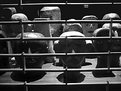
Critique By:
Marinos Meimaris (K:246)
12/1/2004 11:56:42 AM
try turning it into B&W, and don sth with the background. You have a lot of choices
|
| Photo By: Bon Igor
(K:62)
|
|
|
Critique By:
Marinos Meimaris (K:246)
12/1/2004 11:54:05 AM
Very sentimental and successful, well done
|
Photo By: Warren Simons
(K:741)

|
|
|
Critique By:
Marinos Meimaris (K:246)
12/1/2004 11:46:46 AM
I think it would make a good advertisement. You could make some corrections so that the white appears uniform and flawless, but I don't know if you would like that
|
| Photo By: Gabrielle Willson
(K:7978)
|
|
|
Critique By:
Marinos Meimaris (K:246)
12/1/2004 11:45:22 AM
A true beauty. I don't know if it's possible, maybe you could try to enhance the end of the leaf which is a bit out of focus
|
| Photo By: ADAM ORZECHOWSKI
(K:7957)
|
|
|
Critique By:
Marinos Meimaris (K:246)
12/1/2004 11:40:29 AM
High quality! But maybe it needs something more artistic. Why don't you try to 'multiply blend' in a different photo (a portrait maybe) inside the red part
|
| Photo By: Walt McNeil
(K:2146)
|
|
|
Critique By:
Marinos Meimaris (K:246)
12/1/2004 11:38:06 AM
The colours are good, but the photo needs another way of expression.. Try desaturating selectively (either the head or the background).
|
| Photo By: Ozgur Abaci
(K:0)
|
|
|
Critique By:
Marinos Meimaris (K:246)
12/1/2004 11:34:34 AM
A bit schitzophrenic, I like it. But I wish it had better quality
|
| Photo By: Tugce Gül Baran
(K:5115)
|
|
|
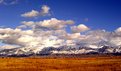
Critique By:
Marinos Meimaris (K:246)
12/1/2004 9:01:46 AM
This would make a fine poster. Try blurring the blue of the sky so that the colour looks more uniform.
|
| Photo By: Jeffrey Dodenbier
(K:902)
|
|
|
Critique By:
Marinos Meimaris (K:246)
11/30/2004 3:15:57 PM
I haven't seen anything like this before. Most well done.
|
| Photo By: A-Ra Macaw
(K:128)
|
|
|
Critique By:
Marinos Meimaris (K:246)
11/30/2004 3:02:43 PM
Good effort, I like this kind of graphic
|
| Photo By: Tolga Ferhatoglu
(K:853)
|
|
|
Critique By:
Marinos Meimaris (K:246)
11/30/2004 3:00:55 PM
B&W would have been more artistic, but too dark
|
| Photo By: A-Ra Macaw
(K:128)
|
|
|
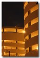
Critique By:
Marinos Meimaris (K:246)
11/30/2004 2:57:00 PM
Professional quality & brilliant colour. What if you could remove the street light?
|
| Photo By: Steve Rosenbach
(K:8338)
|
|