|
Featured Critiques by Photographer
1
|
|
Critique By:
Mark Hamilton (K:8387)
1/10/2005 11:54:32 AM
What's too much.
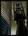
The hardest thing in photoshop is learning when enough is enough. It's so easy to give images that one last tweak which inevitability becomes their downfall.
I think the PS treatment to accentuate your vision here is damn fine. But I find the image looking a bit pasted. I don't know if they were seperate layered images but it looks like they could do with a touch of defringing as they appear to be suffering from that not so nice halo effect or perhaps that was your intent.
I like the juxtapostion of the two elments the smooth rounded lines of the building on the left is an interesting contrast to the harsh geometric shapes found on the crane.
I like it.
Mark
|
| Photo By: Manu
(K:13082)
|
|
1
|