|
|
Critique By:
Kyle Miller (K:127)
4/9/2007 3:24:12 AM
I should probably donate again so I can post more than one image a day.
Thanks!
|
| Photo By: Kyle Miller
(K:127)
|
|
|
Critique By:
Kyle Miller (K:127)
10/19/2006 3:54:50 AM
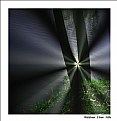
I've been working with the smudge tool in PS, trying to develop the effect. Thanks!
|
| Photo By: Kyle Miller
(K:127)
|
|
|
Critique By:
Kyle Miller (K:127)
10/19/2006 3:51:44 AM
Good texture. The picture might even work in B&W!
|
Photo By: Dave K
(K:-171)

|
|
|
Critique By:
Kyle Miller (K:127)
4/4/2006 4:55:13 AM
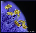
I'm actually, not quite so sure this is an iris. If anyone knows for sure I would appreciate the tip!
|
| Photo By: Kyle Miller
(K:127)
|
|
|
Critique By:
Kyle Miller (K:127)
4/4/2006 4:52:25 AM
Thanks, I really appreciate your comment!
|
| Photo By: Kyle Miller
(K:127)
|
|
|
Critique By:
Kyle Miller (K:127)
11/1/2005 5:29:59 AM
Thanks!
|
| Photo By: Kyle Miller
(K:127)
|
|
|
Critique By:
Kyle Miller (K:127)
10/23/2005 7:12:46 AM
I appreciate your comments!
It is the bark of a sycamore tree.
Best, Kyle
|
| Photo By: Kyle Miller
(K:127)
|
|
|
Critique By:
Kyle Miller (K:127)
10/22/2005 9:46:42 PM
Crisp colors and nice shadows with the bench on the foreground. Though it seems there are two pictures here; the empty bench and the peopled bench. Which is more important?
|
| Photo By: altur .
(K:6087)
|
|
|
Critique By:
Kyle Miller (K:127)
10/22/2005 9:43:01 PM
Lovely interplay of light and shadow
|
| Photo By: Anna Brady
(K:914)
|
|
|
Critique By:
Kyle Miller (K:127)
10/5/2005 10:48:31 PM
Dear Douglas and Mohsen,
Thank you for your kind comments and advice!
Best, Kyle
|
| Photo By: Kyle Miller
(K:127)
|
|
|
Critique By:
Kyle Miller (K:127)
9/12/2005 3:19:48 AM
Excellent protrait!
|
| Photo By: Janet B
(K:16139)
|
|
|
Critique By:
Kyle Miller (K:127)
9/12/2005 3:17:27 AM
Ditto! Great image!
|
| Photo By: Mark Longo
(K:12760)
|
|
|
Critique By:
Kyle Miller (K:127)
9/12/2005 2:57:44 AM
This is beautiful! Great colors and texture. I also liked the comments.
|
| Photo By: Le Tuan Anh
(K:84)
|
|
|
Critique By:
Kyle Miller (K:127)
8/27/2005 8:00:19 AM
v. good!
|
| Photo By: David Skoumal
(K:-29)
|
|
|
Critique By:
Kyle Miller (K:127)
8/25/2005 8:55:19 AM
Thanks for dropping by my site. I like your images of the City; esp. the Brooklyn Bridge and this one.
Best,
Kyle
|
Photo By: Craig Nisnewitz
(K:625)

|
|
|
Critique By:
Kyle Miller (K:127)
8/25/2005 8:53:18 AM
Hi Carolyn,
I like the way you're going with the crayon drawing stuff. Keep it up!
Kyle
|
| Photo By: Carolyn Wheeler
(K:1007)
|
|
|
Critique By:
Kyle Miller (K:127)
8/24/2005 9:01:58 PM
Super!
|
| Photo By: Javier Escudero
(K:3)
|
|
|
Critique By:
Kyle Miller (K:127)
8/24/2005 8:56:42 PM
Great colors, neat vantage, and focus. I like it!
|
| Photo By: Blake Heiss
(K:2197)
|
|
|
Critique By:
Kyle Miller (K:127)
8/24/2005 8:54:15 PM
I usually hate flash, but I really like how it worked here.
|
| Photo By: Andreas Just
(K:23)
|
|
|
Critique By:
Kyle Miller (K:127)
8/23/2005 7:33:41 AM
Very peaceful. Lovely DOF. Good tones.
|
| Photo By: Bryan Jarmain
(K:11941)
|
|
|
Critique By:
Kyle Miller (K:127)
8/23/2005 7:18:14 AM
Thanks for your comments. The photo was from a fun night, I'm glad you liked it!
|
| Photo By: Kyle Miller
(K:127)
|
|
|
Critique By:
Kyle Miller (K:127)
8/18/2005 3:40:03 PM
Thanks for your comment. It's a pity that we're limited to 800 x 800 pixels, as the original image was ~ 8000 x 800 and I thought looked pretty cool. But, on the other hand it is often the limitations of a system that drive a new way of presentation!
|
| Photo By: Kyle Miller
(K:127)
|
|
|
Critique By:
Kyle Miller (K:127)
8/18/2005 3:34:43 PM
Thanks Jeff for your kind comment.
|
| Photo By: Kyle Miller
(K:127)
|
|
|
Critique By:
Kyle Miller (K:127)
8/18/2005 12:46:00 AM
Nice point of view...
|
| Photo By: Jeff Cartwright
(K:52046)
|
|
|
Critique By:
Kyle Miller (K:127)
8/17/2005 10:57:57 PM
So what is the guy in the picture shooting with?
|
| Photo By: Darlene Boucher
(K:15739)
|
|
|
Critique By:
Kyle Miller (K:127)
8/11/2005 3:28:42 AM
Dear Billy,
I really like the coffee cup series. The swirls of creamer are beautiful and serene.
Best regards,
Kyle
|
| Photo By: Billy Houck
(K:2725)
|
|
|
Critique By:
Kyle Miller (K:127)
8/10/2005 4:10:24 AM
Nice effect!
|
Photo By: Jason v.d.Meer
(K:2019)

|
|
|
Critique By:
Kyle Miller (K:127)
8/10/2005 4:02:50 AM
I really like this photo. The balance overall is nice, but the upper right hand corner seems a little weak. A tighter crop might work?
|
| Photo By: jerry katz
(K:406)
|
|
|
Critique By:
Kyle Miller (K:127)
8/10/2005 3:50:43 AM
Beautiful effect!
|
| Photo By: Todd Deery
(K:41)
|
|
|
Critique By:
Kyle Miller (K:127)
8/7/2005 6:26:28 AM
Dear Susie,
The main effect was to take a greyscale image of the photo, then to dodge and burn it in photoshop to create an even and rich texture. A copy of this was then pasted into the black channel in CMYK mode.
The blurred effect in the background was produced during shooting by using a narrow depth of field.
The image was taken when I was shooting images of pairs of objects as a theme working on the idea of 'couples'.
The image reminded me of an elegant elderly woman who had lost her life time soulmate. The twisting vine seemed to futher suggest the impending doom of the ravishes of age. Thus the title. There was another play of words in that the pair of flowers was in fact on my door step and I had passed it many times during the summer. Thank you for the comment on the background. I will consider seriously your suggestion.
Many thanks,
Kyle
|
| Photo By: Kyle Miller
(K:127)
|
|


