|
|
Critique By:
John Marsh (K:193)
10/13/2004 10:11:49 PM
Very "angelic" lighting. Sometimes we try to capture too much in Autumn colors. Your photo captures just enough with great contrast of classic architecture. Well done! John
|
| Photo By: Chris Spracklen
(K:32552)
|
|
|
Critique By:
John Marsh (K:193)
10/11/2004 4:40:32 PM
Beautiful and ethereal. To answer your question, I would not add any grain to this picture. It has a quality of old 4x5 or 8x10 sharpness combined with the beautiful creamy rich softness. This photo reminds me of very early Ansel Adams or Stieglitz. The quality is hard to define, but go back in time and you will realize what you have achieved. Gorgious!
|
| Photo By: Evangelos Koutsavdis
(K:379)
|
|
|
Critique By:
John Marsh (K:193)
10/11/2004 4:14:35 PM
Beautiful soft effect. How did you achieve the delicate softness? I suspect you may have used in-camera softness setting and possible post process manipulation? Would appreciate feedback.
Thanks, John
|
Photo By: Paul Harrett
(K:791)

|
|
|
Critique By:
John Marsh (K:193)
9/13/2004 3:56:11 AM
Ama, I would like to offer a critique on this beautiful photograph. The comments of others have rightly recognized the impact of this photo, but have not explained to others why it "works so well". The composition is excellent, but to me what's more important is how it is driven from the context of the frame. This near square format provides a "window" to the scene. It keeps the viewer at bay, but more importantly it consolidates elements in the scene to the minimal. A correlation to this type of composition (and obvious atmospheric lighting) can only be found in stage art direction. Notice how the viewer is drawn into the scene by cobble stones, past closed doorways and a street that bends into mystery. The road dominates with buildings "compressed" within the view of the window. The tint and grain only add to this mystery. This is not so much a photograph, but a story that each viewer will make up his or her mind as to what the outcome will be. Notice also, as in stage lighting, there are no lights visible, only ethereal light on the "subjects" of this "play"! This is an outstanding piece of art and I applaud you. Brava Ama!! John Marsh
|
| Photo By: ama tor
(K:1432)
|
|
|
Critique By:
John Marsh (K:193)
6/24/2004 2:51:39 AM
Love the impressionism and "old feel". Looks like an albumen print vis a vis Steiglitz. I use a lot of "eges" myself, but I am not sure about this one for this print. Think I would like a simpler, more randum one, say AF027.AFX or AF039.AFX or similar. Any thoughts?
|
| Photo By: Mitchell Miller
(K:3009)
|
|
|
Critique By:
John Marsh (K:193)
4/22/2004 3:42:34 PM
Daithi, This is an excellent shot reminiscent of photos of the 20's. What I mean is that it combines hard metallic with a soft quality atmosphere. The strong metal highlights are in contrast to the whispy clouds that surround it. Lenses of the 20's and before were soft. Our new modern lenses are too sharp to give you this quality. But the softness of IR film restores this quality and gives that metallic glow its real beauty. Perhaps a bit of fine tuning could be achieve in post processing to tone down the highlights (blown out) and balance the contrast. But, again, the beauty of this picture is not just the composition, it is really that soft tonalty of IR that works here. Best regards, John
|
| Photo By: Daithí O' Donoghue
(K:838)
|
|
|
Critique By:
John Marsh (K:193)
4/22/2004 3:25:02 PM
Daithi, No I have not used the Ilford, but was contemplating it for use with medium format. I guess that I am am pursuing a more digital course at this time. If I was to remain in a true "wet" darkroom, both Konica and Ilford would be films I would try. But, alas, I'm pretty much now resigned to the "computer" darkroom and have left my two beautiful Durst enlargers to the "ages". Of course scanning is also an alternative and I may still try this route. What I've read about SXF200 is interesting, but it is not as dynamic as regular IF such as Kodak. As above, it has some intrinsic beauty in the 120 format though. I just have not launched the IR digital yet, waiting for hotter weather (here in Wisconsin USA). I've been busy the past six months with trying to paint with PS7 and Corel Painter 8. I love impressionism and always see the world in that way. So it's natural that IR will continue to be part of that vision. I guess now for me, digital is the way for me, at least for a while, but I don't think I will ever abandon film- I have too much equipment and too much knowledge to let that magic die in me. I do believe you really need to obtain a good computer with lots of RAM (I use 1.5 gigs) and get PS. You will love it! Regards, John
|
| Photo By: Daithí O' Donoghue
(K:838)
|
|
|
Critique By:
John Marsh (K:193)
4/22/2004 2:28:03 PM
Daithi, (what a beautiful name) I've been shooting IR over the years (mostly Kodak HS B/W) and find it aways a challenge to print it well. The whites are usually too white and blacks too black. I've not used Konica, but believe it has a little more control than Kodak. What I would try to do to improve this photo is work with the contrast. I've found working in Photoshop 7, that turninig it into RGB and working with Selective Color control (white, neutral, and black) helps a lot. Also, tinting it (duotone) might give it some new interest. I'll be switching to Digital now which has much more control right in the camera. As per other suggestions, bracket shots and possibly blend adjustment layers in PS to balance blacks and whites. Best regards, John
|
| Photo By: Daithí O' Donoghue
(K:838)
|
|
|
Critique By:
John Marsh (K:193)
4/21/2004 3:09:33 AM
Dear Ken, I do not have any images on this site. I just tripped over it a couple weeks ago. I am reluctant due to reasons already expressed i.e. too small of an image. I might though just for fun. As for Painter 8, it's vastly improved over earlier versions, but it also has a long learning curve, although just for manipulating pictures, it's not too hard. I'm still trying to perfect PS 7 and haven't yet tapped P8's full potential. It does offer some pretty powerful computer painting tools for pure painting. I guess if you like impressionist art, it may be of value, but that said you may want to learn the full potential of PS first. Regards, John
|
| Photo By: ken krishnan
(K:19102)
|
|
|
Critique By:
John Marsh (K:193)
4/20/2004 4:05:49 PM
Dear Ken, this is a rather complex formula depending on the original image. Important points are to resize picture to low resolution or effects are not dramatic enough. Of couse then resize to print resolution 200-300. Use Art History brush to effect by History snapshot and try a varity of brushes. Use layers or variations to blend effects. Re-levels or curves to maintain contrast and use Saturation and Selective color to boost colors. Don't over sharpen. For filters, I like the Dry Brush and Fresco. Also, Glowing Edges can have great effect if reverted and then blended with original.
Also, I use Corel Painter 8 which offers some very realistic painting options. Good Luck. Just continue to experiment. Important: Record work flow to document what works well. Best regards, John
|
| Photo By: ken krishnan
(K:19102)
|
|
|
Critique By:
John Marsh (K:193)
4/20/2004 3:30:41 PM
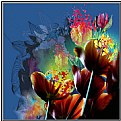
Very colorful and lush. I do a lot of digital hand paint and can confirm that the small sizes do not do justice to these types of images. You need to see them in very large sizes to fully appreciate them. Continued success.
|
| Photo By: ken krishnan
(K:19102)
|
|
|
Critique By:
John Marsh (K:193)
4/20/2004 3:19:55 PM
Nice composition. Beautiful example of neon glow with soft muted back ground.
|
| Photo By: Dwight Parker
(K:253)
|
|
|
Critique By:
John Marsh (K:193)
4/20/2004 3:10:59 PM
Nice abstract real life. Good composition. Slightly soft on left. Muted green lacks impact. Good eye.
|
Photo By: Roberta Elena Dragan
(K:345)

|
|


