|
|
Critique By:
Paulo Gama (K:5067)
5/2/2003 9:41:06 AM
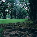
Good shot.
|
| Photo By: Mike Scott
(K:1817)
|
|
|
Critique By:
Larry Billinger II (K:236)
5/2/2003 9:29:02 AM
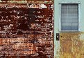
As a graphic designer I can tell you I love how you captured a lost but effective design like this on the wall. Overall, It's not just the composition I like but darkness it shows and portrays exactly what my mind would see if I were to want to photograph the same thing. You can definatly see the historic appeal in this photo, and would like to see what it looks like in black and white.
|
| Photo By: Mike Scott
(K:1817)
|
|
|
Critique By:
j ruz (K:1043)
5/2/2003 8:45:07 AM
very nice shot. great depiction of a worn but historic area. i wish the person in the doorway was a little more prominent. and watch your DOF towards the top - doesn't really bother me but noticed it gets blurred. nice work, Mike. (c:,'
|
| Photo By: Mike Scott
(K:1817)
|
|
|
Critique By:
Nick Pernisco (K:625)
5/2/2003 8:37:55 AM
Great color tones. I love it.
|
| Photo By: Mike Scott
(K:1817)
|
|
|
Critique By:
Erkan Gokce (K:1414)
5/2/2003 8:20:03 AM
excellent composition!
|
| Photo By: Mike Scott
(K:1817)
|
|
|
Critique By:
ileana barigelletti (K:3571)
5/2/2003 8:18:06 AM
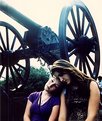
Very very romantic!! Bye! Ileana.
|
| Photo By: Mike Scott
(K:1817)
|
|
|
Critique By:
Joe dos Santos (K:3682)
5/2/2003 8:14:11 AM
Very sentimental shot. Well framed. good impact
|
| Photo By: Mike Scott
(K:1817)
|
|
|
Critique By:
Valter de Castro (K:4079)
5/2/2003 8:00:34 AM
very nice composition
|
| Photo By: Mike Scott
(K:1817)
|
|
|
Critique By:
Smoky Pollack (K:86)
3/27/2003 11:40:19 PM
Maybe using the word aesthetic was a bad choice. I have no problem with the picture itself and I agree that it fits perfectly in the Journalism category. I just felt that the tone of the "about" section was a little antagonistic. Maybe I am a little touchy. Emotions run high on both sides of this debate. I totally agree with all your comments about the strong points of this photo but I took the title to mean "equal time" of exposure on this site. I agree also that every story on this war has its point of view and maybe that is my problem with it. Journalism presents you with the facts and assumes you are intelligent enough to come to your own conclusions. I think your photo would be stronger with less explaination. Your photo tells the whole story. Why diminish the impact with words?
|
| Photo By: Mike Scott
(K:1817)
|
|
|
Critique By:
Beverly Gustafson (K:1572)
3/27/2003 7:25:58 PM
Great Image, even better sentiment! Thanks for posting this.
|
| Photo By: Mike Scott
(K:1817)
|
|
|
Critique By:
Renee Robinson (K:2112)
3/27/2003 4:56:06 PM
One addition -- if you are a member of the AP Mike, in anyway, with a newspaper, whatever -- this should be submitted to them.
|
| Photo By: Mike Scott
(K:1817)
|
|
|
Critique By:
Renee Robinson (K:2112)
3/27/2003 4:55:24 PM
Beyond being just a photo of something that happened, this does have a nice look to it and good composition. What is neat is how the guy is turning around looking at the camera and everyone else is looking other directions. Take away what it says on the sign if you think it is a comment on whatever and just look at the overall photo. The overall photo is a good one and that is what this site is about. I think Smoky's comments simply showed that he is making this more about political views instead of a good photo -- you read what you want to into a photo, i guess, but this one is a good one -- regardless of what the poster says. Personally, I'm marking this is a favorite because I like the composition here and the unique capture.
|
| Photo By: Mike Scott
(K:1817)
|
|
|
Critique By:
Matt Hardy (K:474)
3/27/2003 4:47:06 PM
Though this does convey a view (which I happen to agree with). It has alot of emotion. I think it shows more emotion than most os the protest images I have viewed. Thanks for posting this shot.
|
| Photo By: Mike Scott
(K:1817)
|
|
|
Critique By:
Shawn Kellogg (K:454)
3/27/2003 4:09:03 PM
Way to go! Thank you--Shawn
|
| Photo By: Mike Scott
(K:1817)
|
|
|
Critique By:
Mike Scott (K:1817)
3/27/2003 3:49:51 PM
I?d like to respectfully disagree with you, Smoky. There are certainly legitimate purposes for photography other than aesthetics ? use of image making to sell a product, tell a story or express a point of view for instance. After all, I posted this photograph in the Journalism category, not Photoart.
This protest was organized in response to the anti-war protests, hence the title. The information included is there to complete the story ? this was not a rally of right wing Republicans. The difference of opinion in the US over this war does not fall along political lines.
If I had simply reproduced one of the statements shown on the posters and uploaded it to simply state that opinion you?d certainly have a reason to criticize my misuse of this site, but this is a photograph of an event posted in the Journalism category. Look at the all of print and television images and stories on this subject ? each and every one comes with its point of view.
|
| Photo By: Mike Scott
(K:1817)
|
|
|
Critique By:
Smoky Pollack (K:86)
3/27/2003 10:05:29 AM
Your title and comments makes me think the motivation for posting this is more than aesthetic reasons. There are plenty of websites out there to express your political views. I realize there are probably a few others posted for the anti-war side. They could follow the same advice.
|
| Photo By: Mike Scott
(K:1817)
|
|
|
Critique By:
Mike Scott (K:1817)
2/28/2003 5:34:32 PM
Verna & Ricky-
I'd like to see one of my pictures hanging on that wall too - this image was taken in the Boston Museum of Fine Arts!! : ) It would be funny to hang a print of this image there - kind of a picture in picture thing.
Cemal - hi'ya neighbor. Drop me a line @ m_w_scott@yahoo.com if you want to compare notes on where to find the best cup of RI chowda... : )
|
| Photo By: Mike Scott
(K:1817)
|
|
|
Critique By:
Ricky Hirshfield (K:832)
2/28/2003 3:56:14 PM
Been looking at your work Mike and this one leapt out at me. I like the idea of one of your pictures framed on the wall - a strong B&W image would be a good contrast to the orange wall. Or alternatively take a photo from the top of the stairs looking down and make a mirror to hang on the wall....
|
| Photo By: Mike Scott
(K:1817)
|
|
|
Critique By:
AJ Haselwood (K:2148)
2/14/2003 1:31:50 PM
Thanks Mike, the texture is great!
aj
|
| Photo By: Mike Scott
(K:1817)
|
|
|
Critique By:
Chris Lauritzen (K:14949)
2/14/2003 1:09:45 PM
Mike,
That works... now B&W...just kidding.... keep up the good work!
|
| Photo By: Mike Scott
(K:1817)
|
|
|
Critique By:
Chris Lauritzen (K:14949)
2/14/2003 12:22:09 PM
Mike,
Better but still closer...
|
| Photo By: Mike Scott
(K:1817)
|
|
|
Critique By:
Chris Lauritzen (K:14949)
2/14/2003 12:21:27 PM
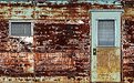
Mike,
Interesting shot but I think the better one is closer to the trailer and get some of the texture in the rust.
|
| Photo By: Mike Scott
(K:1817)
|
|
|
Critique By:
AJ Haselwood (K:2148)
2/14/2003 10:06:10 AM
I like it, wish there was a bit more detail. Nice.
aj
|
| Photo By: Mike Scott
(K:1817)
|
|
|
Critique By:
heather martino (K:3648)
2/9/2003 5:45:06 PM
...oops - well he does look like a nice guy really! ;-))
|
| Photo By: Mike Scott
(K:1817)
|
|
|
Critique By:
Mike Scott (K:1817)
2/9/2003 8:35:17 AM
Watch those stereotypes, Heather! ;^) You jumped from Insurance to ?Salesman? ? he?s a Claims Executive and a very nice guy? this is no illusion, just him (though I did capture his personality well, if I do say so myself).
|
| Photo By: Mike Scott
(K:1817)
|
|
|
Critique By:
heather martino (K:3648)
2/9/2003 5:32:31 AM
I'd say you did a fantastic job here Mike of making an insurance salesman look like a human being.
"An artist makes an illusion look as truth"
H
|
| Photo By: Mike Scott
(K:1817)
|
|
|
Critique By:
Verna Absolutestockphoto (K:2836)
1/29/2003 2:08:52 PM
Here we have "Nothing but Something" that is going on here....(suggestion) would be to add one of your photos as framed art in the center of the wall at the top of the stairs...then we would really have something ..... good job!
|
| Photo By: Mike Scott
(K:1817)
|
|
|
Critique By:
Theunis Stofberg (K:203)
1/29/2003 1:58:08 PM
mike. great symmetry and i love the warm colours. Great shot, great eye. Happy to see other people who also dont have the money for digital slr's . ps. Thanks for the comment on my photo (the bicycle)
|
| Photo By: Mike Scott
(K:1817)
|
|
|
Critique By:
AJ Haselwood (K:2148)
1/29/2003 6:48:17 AM
Simple concepts are often the best. Fantastic colors as well. Superb job.
aj
|
| Photo By: Mike Scott
(K:1817)
|
|
|
Critique By:
Cemal Ekin (K:2309)
1/28/2003 8:17:07 PM
Nice stairs Mike. It reminds me of a pair of arms with hands opend up to the sky. Try to bring your hands that way you will see what I mean. Good symmetry creating a formal lcomposition.
You are the second Rhode Islander I met here at Usefilm. Hi neighbor.
Cemal
|
| Photo By: Mike Scott
(K:1817)
|
|