|
|
Critique By:
Mike Scott (K:1817)
7/1/2003 8:39:17 AM
Reminds me of the Talking Heads song "Nothing but Flowers" - "There was a shopping mall, now it's all covered with flowers..." If only they would clear the waste away and let nature take it back.
|
| Photo By: Chuck Freeman
(K:13616)
|
|
|
Critique By:
Mike Scott (K:1817)
7/1/2003 8:21:04 AM
Cool image, but the sky seems strange. Is this a composite?
|
| Photo By: LIM CH
(K:1605)
|
|
|
Critique By:
Mike Scott (K:1817)
7/1/2003 8:08:13 AM
Nothing like a pretty girl with attitude - and in a uniform too...
Wish you would rethink the title tho'
|
| Photo By: Marcelo Bruno Cechenello
(K:2)
|
|
|
Critique By:
Mike Scott (K:1817)
7/1/2003 7:56:05 AM
You sure that guy isn't dead? Just cross the legs in a casual pose when you dump the body and it'll be hours before anyone notices...
|
| Photo By: Christian Gennert
(K:964)
|
|
|
Critique By:
Mike Scott (K:1817)
7/1/2003 7:52:17 AM
All you need is an older style shutter curtain for that oval tire effect you usually see in vintage photos of these racers...
|
| Photo By: Mark Scheuern
(K:1428)
|
|
|
Critique By:
Mike Scott (K:1817)
7/1/2003 7:43:28 AM
You really nailed the moment - not just the wheelie, but also the placement of the boy between the windows. The red shirt pops right off the wall and the shadow is great too. Might need a little work in PS to pump up the contrast a bit by adjusting the levels and maybe some unsharp mask.
Was this set up, or did you just happend to grab the shot?
|
| Photo By: josé carvalho
(K:10)
|
|
|
Critique By:
Mike Scott (K:1817)
7/1/2003 7:34:33 AM
Agree with Mary about crop on the left.
Love the "NO" - forbidden love?
|
| Photo By: Christian Wettergren
(K:1333)
|
|
|
Critique By:
Mike Scott (K:1817)
7/1/2003 7:29:57 AM
I don't mind the car - almost looks like a toy. Red pops nicely too. Great clouds. Wonderful image of a child at play... the innocence of youth. Could be a stock image.
|
| Photo By: Tomm Hansen
(K:46)
|
|
|
Critique By:
Mike Scott (K:1817)
6/19/2003 9:03:57 AM
I agree with Christopher - choose all color or B&W. The shirt is now a distraction, pulling the viewer's eyes away from the subject of the portrait.
|
| Photo By: Carina Claesen
(K:32)
|
|
|
Critique By:
Mike Scott (K:1817)
6/3/2003 6:23:01 PM
Appreciate the info. Chris - it really is a beautiful image in every way... good for me that I get to enjoy it and learn something from you as well. Thanks.
|
| Photo By: Chris Blaszczyk
(K:610)
|
|
|
Critique By:
Mike Scott (K:1817)
6/3/2003 8:01:45 AM
This is stunning. I'm trying to guess from the catch lights how you lit her - can you explain?
|
| Photo By: Chris Blaszczyk
(K:610)
|
|
|
Critique By:
Mike Scott (K:1817)
6/3/2003 7:19:03 AM
Love the dress, the pose, the flowers, the hands/gloves... don't like the distractions in the background.
|
| Photo By: Vincent Mo
(K:857)
|
|
|
Critique By:
Mike Scott (K:1817)
5/22/2003 1:05:04 PM
You posted this image in the journalism category, so I'll comment on it as an image with a story to tell rather than comment on the message of the banner.
The banner would have made a good background. Placing the person way back there seems to take away from her (not sure if it's a man or woman actually) impact to the story you're trying to tell. Now, bring her up to the foreground, improve the lighting with some fill flash and place the banner over her shoulder in the background and you might have something. Here you have a decent image of the graphics displayed and a poor likeness of whoever that is back there.
|
| Photo By: Stuart Boyle
(K:1505)
|
|
|
Critique By:
Mike Scott (K:1817)
5/22/2003 8:53:46 AM
Nice, very nice. Care to discuss your lighting on this one? I'd guess maybe 3 or 4 lights, but I'd like to know some of the details...
|
| Photo By: Marcelo Bruno Cechenello
(K:2)
|
|
|
Critique By:
Mike Scott (K:1817)
5/13/2003 6:23:53 AM
Nice subject, but the composition feels off to me - looks like a decapitated head floating in a box. Think you could frame a little more loosely to include her shoulders or really push in for more of an extreme close-up. I?d also suggest that you try an off center composition. Her nose is a dead center bull?s-eye.
Hope I don?t come across as harsh here? She?s a lovely model and you obviously have good photographic skills ? these are just my honest observations.
|
| Photo By: Quinn Jacobson
(K:199)
|
|
|
Critique By:
Mike Scott (K:1817)
5/13/2003 6:12:58 AM
This is great. I love the look of photobooth strips, but they're difficult to find these days. Where exactly is this booth located?
|
| Photo By: Andrew Caldwell
(K:18307)
|
|
|
Critique By:
Mike Scott (K:1817)
5/3/2003 8:43:05 AM
Beautiful girl. Like the tight crop on top, left and right, but seems like too much has been taken off the bottom.
|
| Photo By: Brendan Bhagan
(K:531)
|
|
|
Critique By:
Mike Scott (K:1817)
5/3/2003 8:40:33 AM
lol @ tasteful nudes... I assume these would be done with the lights off and the lenscap on
|
| Photo By: Alan Orr
(K:9671)
|
|
|
Critique By:
Mike Scott (K:1817)
4/18/2003 8:08:39 AM
Of your demonstration photos, this is my favorite. His message is clear and you can see the determination in his eyes. I?ve seen many images that are more about the sentiment being expressed ? this one is about an individual with the courage of his convictions. Well done.
|
| Photo By: Mário Sousa
(K:16985)
|
|
|
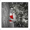
Critique By:
Mike Scott (K:1817)
4/10/2003 6:09:34 PM
Funny. In the thumbnail I thought there was a person hiding in there...
|
| Photo By: Lachlan Rex
(K:159)
|
|
|
Critique By:
Mike Scott (K:1817)
4/10/2003 11:08:09 AM
Nice to see you Emily ? looks like you are your own best model?
In looking through your self portraits, it seems most are out of focus. I am not familiar with your camera, but I think there?s a good chance that it?s focusing on the empty scene when you press the shutter to start the self ?timer (in this case focusing on the wall behind you). You might try to place something in the spot where you?ll be for the camera to focus on, then in the 10 seconds or so before the shutter trips toss it aside and stand/sit in that spot. I?ve had luck fooling cameras in this manner?
|
| Photo By: Emily Enderes
(K:192)
|
|
|
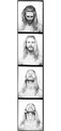
Critique By:
Mike Scott (K:1817)
4/10/2003 10:54:21 AM
Four portraits for the price of one? Don't think I like the addition of the bottom... preferred seeing the piano innards.
|
| Photo By: Javed Rassi
(K:8223)
|
|
|
Critique By:
Mike Scott (K:1817)
4/9/2003 11:41:29 AM
BTW, forget what I said about the background with this image; it works quite well here. In your two most recent images, Sidewalk & Anxiety, the environment seems a little more distracting...
|
| Photo By: Autumn Ruhe
(K:993)
|
|
|
Critique By:
Mike Scott (K:1817)
4/9/2003 11:32:35 AM
Autumn,
I love street photography and admire your nerve to get close to your subjects. These seemingly ordinary scenes can become extraordinary photographs, especially with the passage of time. I love the work of someone like Walker Evans, whose images capture a time and place so well. Many of the photos in your portfolio document present-day New York in this manner.
If I was going to suggest anything, it might be to point out that overall your backgrounds are a little busy and recommend that you sometimes try to simplify the surroundings. The details of the environment can work to your benefit, but they can distract from the subject as well.
You might have a look at Jeff Spirer?s New York 2002 gallery on his site, http://www.spirer.com, for some excellent street shooting. He contributes to the forums on photo.net ? if you search for 'street photography' you will find him. He?s also commented in the Philosophy forum here on Usefilm.
Like I said, I admire that you?re out on the street shooting, something I?m working on building the courage and confidence to do more of myself. I look at Jeff?s images (and yours too) as inspiration to get out there and do it more?
|
| Photo By: Autumn Ruhe
(K:993)
|
|
|
Critique By:
Mike Scott (K:1817)
4/8/2003 6:14:48 AM
The pitch looks a little high - would guess a strike, foul or ground ball... Good timing, catching ball in frame, but from your vantage point I'd rather see a lefty hitter, so his face is visible.
|
| Photo By: Steve Mark
(K:45)
|
|
|
Critique By:
Mike Scott (K:1817)
4/7/2003 3:36:27 PM
Think you either need to isolate her or include the people in the background so we can see their reaction. The feet/legs/bike distract and ruin the image.
|
| Photo By: Asli Yolcu
(K:394)
|
|
|
Critique By:
Mike Scott (K:1817)
4/7/2003 9:13:29 AM
Like the use of flash to illuminate the scene and darken the color of the sky. Though you captured their sign well, you?re showing us the backs of three heads. For this reason it?s not a very strong image?
|
| Photo By: Arek Halusko
(K:211)
|
|
|
Critique By:
Mike Scott (K:1817)
4/4/2003 5:42:33 AM
Here's another vote for love the image but lose the border...
|
| Photo By: Samuel Downs
(K:7290)
|
|
|
Critique By:
Mike Scott (K:1817)
3/29/2003 4:42:27 AM
She?s a beautiful young lady and this is a marvelous portrait. Love the way the color of her dress pops off the color of the wall ? really draws attention to her figure. I imagine this image might scare the hell out of her dad. :-)
|
| Photo By: Karen Dove
(K:763)
|
|
|
Critique By:
Mike Scott (K:1817)
3/29/2003 4:35:55 AM
She?s a beautiful young lady and this is a marvelous portrait. Love the way the color of her dress pops off the color of the wall ? really draws attention to her figure. I imagine this image might scare the hell out of her dad. :-)
|
| Photo By: Karen Dove
(K:763)
|
|