|
|
Critique By:
Jose Ignacio (Nacho) Garcia Barcia (K:96391)
3/24/2004 10:12:20 PM
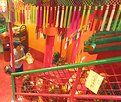
marvelous tones and great composition.
|
| Photo By: Ray Wearn
(K:1052)
|
|
|
Critique By:
Francesca May (K:6877)
1/12/2004 6:53:01 AM
Really nice& original!
|
| Photo By: Ray Wearn
(K:1052)
|
|
|
Critique By:
Kala Wlodarczyk (K:2567)
12/18/2003 9:24:19 AM
heh. ktos wyrzucil do smieci calkiem dobrego kota... 
|
| Photo By: Ray Wearn
(K:1052)
|
|
|
Critique By:
A Bayg (K:160)
12/3/2003 12:09:49 PM
intresting composition!
|
| Photo By: Ray Wearn
(K:1052)
|
|
|
Critique By:
Mário Sousa (K:16985)
8/7/2003 6:00:21 AM
beautiful
|
| Photo By: Ray Wearn
(K:1052)
|
|
|
Critique By:
Mário Sousa (K:16985)
8/6/2003 7:02:37 AM
excellent momment photojournalism
|
| Photo By: Ray Wearn
(K:1052)
|
|
|
Critique By:
Jamie Ferguson (K:6284)
7/1/2003 6:27:11 PM
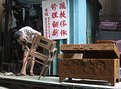
This is very funny Ray! I love the title. The way Ronald is posed it looks just like that. Interesting to know too how many restaurants there are there too.
|
| Photo By: Ray Wearn
(K:1052)
|
|
|
Critique By:
ahmed lotfy (K:1487)
6/11/2003 11:44:24 AM
Very colorful,
|
| Photo By: Ray Wearn
(K:1052)
|
|
|
Critique By:
David Goldfarb (K:7611)
5/16/2003 9:51:58 AM
I like this. The crop makes very effective use of the corners of the frame and the edges to anchor the jagged rectangular shadow. There is some play here between the three-dimensionality of the scene and the two-dimensionality of the image, but the inclusion of the bit of rail in the upper left corner is enough to let the viewer know what is going on.
It might be interesting to see how it would work without the railing, perhaps from another angle, so the viewer would be completely disoriented.
|
| Photo By: Ray Wearn
(K:1052)
|
|
|
Critique By:
Steven Pumford (K:121)
5/10/2003 4:55:33 PM
Well!! I remember Wanchai Market when I lived in Hong Kong, looks just the same as the last time I was there. Nice photo.
|
| Photo By: Ray Wearn
(K:1052)
|
|
|
Critique By:
Mário Sousa (K:16985)
5/5/2003 3:58:20 PM
fantastic momment
|
| Photo By: Ray Wearn
(K:1052)
|
|
|
Critique By:
Mário Sousa (K:16985)
4/20/2003 2:40:58 PM
Beautiful work
|
| Photo By: Ray Wearn
(K:1052)
|
|
|
Critique By:
Mário Sousa (K:16985)
4/20/2003 1:05:35 PM
excellent
|
| Photo By: Ray Wearn
(K:1052)
|
|
|
Critique By:
Mário Sousa (K:16985)
4/17/2003 4:23:00 PM
dramatic
|
| Photo By: Ray Wearn
(K:1052)
|
|
|
Critique By:
Aiman Nassar (K:11961)
4/13/2003 4:39:40 PM
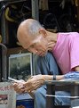
Wonderful expression, and great street shot Ray...
|
| Photo By: Ray Wearn
(K:1052)
|
|
|
Critique By:
Surajit Mukerji (K:3889)
4/13/2003 11:56:10 AM
I love cat
|
| Photo By: Ray Wearn
(K:1052)
|
|
|
Critique By:
Nando Mondino (K:14261)

3/5/2003 12:02:52 AM
Fantastic shot!
|
| Photo By: Ray Wearn
(K:1052)
|
|
|
Critique By:
Kim Culbert (K:37070)
2/20/2003 2:35:04 PM
The tight crop works well here to make this image bursting with birds! love the one yellow guy in the middle of everything.
|
| Photo By: Ray Wearn
(K:1052)
|
|
|
Critique By:
Koen B (K:3279)
11/15/2002 2:00:59 AM
Simple and effective
|
| Photo By: Ray Wearn
(K:1052)
|
|
|
Critique By:
Kim Culbert (K:37070)
5/24/2002 8:55:03 AM
Wow. What beautiful colour and detail here. A very nice job to make this flower come alive!
|
| Photo By: Ray Wearn
(K:1052)
|
|
|
Critique By:
Ray Wearn (K:1052)
5/7/2002 7:43:19 AM
Thanks for your comment, Shary. Long time since I had a chance to look at this site, let alone take any pics.
A tip on converting colour to b/w. Don't use the Greyscale option in Photoshop - see my article in Chapter 7 on this site about getting better monochrome results from colour pics.
|
| Photo By: Ray Wearn
(K:1052)
|
|
|
Critique By:
Shary Shary (K:428)
5/7/2002 6:59:53 AM
A very good image. I usually use B/W film for this type of photography. You can also gray scale this image in Photoshop to see the difference, as the colors are usually distracting in such interesting images. Here the subject's behaviour is more important than the colourfull objects surrounding her.
|
| Photo By: Ray Wearn
(K:1052)
|
|
|
Critique By:
Shary Shary (K:428)
4/17/2002 11:08:42 AM
Very nice composition and impressive facial expression. The face is a bit dark. I would have spot metered it for the man's face. However, I understand that in such situations the photographer may not have time for spot metering, as I photograph homeless myself. I would have used black and white film for it. Or, I would have gray scaled this image on my PC. Please see the homeless image on my web site (members.rogers.com/sharyrafitari)and give me a critique if you have time. Thanks, Shary
|
| Photo By: Ray Wearn
(K:1052)
|
|
|
Critique By:
Kim Culbert (K:37070)
3/6/2002 2:02:17 PM
This is why I don't eat fish!!! You've captured the SMELL in this photo, and the fly hanging out add to the atmosphere!
|
| Photo By: Ray Wearn
(K:1052)
|
|
|
Critique By:
Kristupa Saragih (K:1031)
2/11/2002 1:21:10 AM
Good pic
The reflection in the lower part is a little bit "busy". IMHO if the guy's feet weren't cut, this pic might be better
|
| Photo By: Ray Wearn
(K:1052)
|
|
|
Critique By:
Anne Brown (K:833)
1/17/2002 10:41:14 PM
I should have said M.A. Mora's elequoent comments, sorry.
|
| Photo By: Ray Wearn
(K:1052)
|
|
|
Critique By:
Anne Brown (K:833)
1/17/2002 10:39:11 PM
Wow, just wanted to bring this one back up to the top and Ray's very eloquent comments.
|
| Photo By: Ray Wearn
(K:1052)
|
|
|
Critique By:
Petros Stamatakos (K:12101)
1/11/2002 8:56:19 AM
Just poped in randoms. Nicely taken, although a tad too busy for me. Don't know where to look first. The metalic table is a bit of a distraction... Have you tryed cropping?
|
| Photo By: Ray Wearn
(K:1052)
|
|
|
Critique By:
Anne Brown (K:833)
12/9/2001 9:41:42 PM
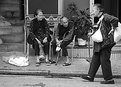
Love this one. The story that came to me when I first looked at this was that these old woman were intently comparing their aches and pains. Got love em though, they keep on going!
|
| Photo By: Ray Wearn
(K:1052)
|
|
|
Critique By:
Toni Martin (K:5092)
12/9/2001 8:41:13 PM
Very good capture, Ray. Love the intense expressions.
|
| Photo By: Ray Wearn
(K:1052)
|
|