|
|
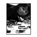
Critique By:
Wouter van Noort (K:4369)
9/24/2006 9:46:54 PM
Great moment, well captured. I also liked the B&W version.
|
| Photo By: mustafa Ozen
(K:40)
|
|
|
Critique By:
Wouter van Noort (K:4369)
9/24/2006 9:14:19 PM
I understand the difficulty and think it's a good try. The only thing i can image to get more seperation from the background is to make two images in stead of one. That would allow you to zoom in closer, and together with the largest aperture possible, would throw the background out of focus.
|
Photo By: Roger Williams
(K:86139)

|
|
|
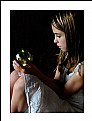
Critique By:
Wouter van Noort (K:4369)
9/24/2006 9:05:15 PM
Well seen, good composition. I like the frame within a frame. IMO you could have cropped a little tighter to remove the part of the fence at the bottom left. Also, i think the image is a bit too light and there is a bit to much yellow in the skintone (although the white of the eyes apprears to be correct). Still a very good portrait.
|
| Photo By: Jeroen Krol
(K:3085)
|
|
|
Critique By:
Wouter van Noort (K:4369)
9/24/2006 8:37:58 PM
Strong composition and nice contrast. I like the choice of focus point. I only have have the feeling that the point of focus is litte "off". Also, the reflected light on the face is a bit distracting. But otherwise a very good image.
|
| Photo By: AdindA Gosal
(K:803)
|
|
|
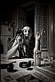
Critique By:
Wouter van Noort (K:4369)
9/21/2006 9:27:00 PM
Food for thought, both in the image and the about. There is a lot to see, but it isn't evident how it is related: a can of beer and wine glasses, the expression on the face and the newspaper exposing remarkable facts.
And technically: good composition and contrast. Interesting image.
|
| Photo By: Galeota
(K:919)
|
|
|
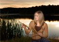
Critique By:
Wouter van Noort (K:4369)
9/21/2006 9:05:33 PM
That's a name that suits the image: the surroundings, the color of her hair and clothes. I like the subtle colors.
|
| Photo By: Phillip Filtz
(K:1792)
|
|
|
Critique By:
Wouter van Noort (K:4369)
9/20/2006 9:48:28 PM
Sure the light is beautifull, it suits the mood. IMO, the image is a little dark and some exposure correction could have helped (but maybe i should blame my monitor).
|
| Photo By: Bubamara
(K:11030)
|
|
|
Critique By:
Wouter van Noort (K:4369)
9/20/2006 9:37:09 PM
Nice composition/pose, the tight crop is effective. Good exposure leaving just enough details in the shadows. A very good portrait.
|
| Photo By: barefoot Photography
(K:289)
|
|
|
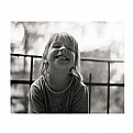
Critique By:
Wouter van Noort (K:4369)
9/19/2006 9:55:20 PM
Well composed, great DoF, and funny, it makes me smile.
|
| Photo By: Radek Slachta
(K:15)
|
|
|
Critique By:
Wouter van Noort (K:4369)
9/19/2006 9:45:27 PM
A little sad, breakable expression - a reminder that we should protect and care for the children of this world. Also a beautiful picture with a nice balance and soft lighting.
|
| Photo By: Jennifer Jones
(K:-505)
|
|
|
Critique By:
Wouter van Noort (K:4369)
9/19/2006 9:30:24 PM
Great use of light and the dark background. I also like the tight crop.
|
| Photo By: Tina baker
(K:870)
|
|
|
Critique By:
Wouter van Noort (K:4369)
9/19/2006 9:25:49 PM
Nice portrait. I like the toning.
|
| Photo By: serdar koc
(K:577)
|
|
|
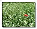
Critique By:
Wouter van Noort (K:4369)
9/19/2006 9:15:56 PM
Nice composition and colors. the light part below and the blue patch above add lots of interest to the image.
|
| Photo By: Hanna Segal
(K:13469)
|
|
|
Critique By:
Wouter van Noort (K:4369)
9/19/2006 9:07:50 PM
Great color contrast in a nice abstract view.
|
| Photo By: Hanna Segal
(K:13469)
|
|
|
Critique By:
Wouter van Noort (K:4369)
9/19/2006 8:43:59 PM
Interesting series. I like this (and the previous one) the most. Normally you only see sepia tones for landscapes and portraits but it works for animals as well.
|
| Photo By: Peter De Rycke
(K:41212)
|
|
|
Critique By:
Wouter van Noort (K:4369)
9/19/2006 8:24:24 PM
Although i like the arrangement of the teapots and the way you framed them, i think you don't got the result you were after. Probably because of the disturbing background. It would have been nice if the background was much darker and the lightest part of the image the highlights on the teapots.
|
| Photo By: David Lockwood
(K:977)
|
|
|
Critique By:
Wouter van Noort (K:4369)
9/19/2006 8:01:54 PM
Great composition and colors. I like the way the kid is balanced against the two out of focus people on the right.
|
| Photo By: Giulio Rotelli
(K:28441)
|
|
|
Critique By:
Wouter van Noort (K:4369)
9/7/2006 11:00:11 PM
Impressive in all its details and dramatic atmosphere. Great work.
|
| Photo By: KEVIN TEMPLE
(K:8657)
|
|
|
Critique By:
Wouter van Noort (K:4369)
9/7/2006 10:55:51 PM
Nice simple composition. I like the way the darker top of the image balances with the ducks.
|
| Photo By: Gene Zonis
(K:6949)
|
|
|
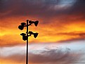
Critique By:
Wouter van Noort (K:4369)
9/7/2006 10:51:03 PM
Nice mystical mood. The panoramic format works well. I agree with Mark on the brightness of the moon, but i do think you should only reduce the brightness of the moon, not removing it completely.
|
| Photo By: Weston Dru
(K:3243)
|
|
|
Critique By:
Wouter van Noort (K:4369)
9/7/2006 11:59:17 AM
Well captured. Great expression. It makes me want to get out and play too...
|
| Photo By: Larry Fosse
(K:66493)
|
|
|
Critique By:
Wouter van Noort (K:4369)
9/7/2006 11:49:33 AM
That's what i like: all unneccesary elements are left out, but the image speaks even more.
|
| Photo By: Roberto Arcari Farinetti
(K:209486)
|
|
|
Critique By:
Wouter van Noort (K:4369)
9/6/2006 10:43:26 PM
I am glad Francisco noticed it, so i am able to send the comment to the rightfull owner:
Remarkable image. I like the tight crop and strong contrast.
|
| Photo By: Lara Coton
(K:27)
|
|
|
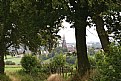
Critique By:
Wouter van Noort (K:4369)
9/6/2006 10:12:27 PM
Nice use of the trees to create a frame and interesting details like the fence leading into the image. I only think there is too much foreground and cropping some of the left and right should improve the image.
|
| Photo By: Jaap Poot
(K:7926)
|
|
|
Critique By:
Wouter van Noort (K:4369)
9/6/2006 10:01:26 PM
Very nice image. I like the way the colors of the animal and the background match. Only the shade on cheetah's chin looks a bit too blue to me (or should i calibrate my monitor?).
|
| Photo By: Joggie van Staden
(K:41700)
|
|
|
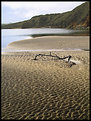
Critique By:
Wouter van Noort (K:4369)
9/6/2006 9:48:13 PM
Nice composition. I like how the branch and sand patterns interact together.
|
| Photo By: Joe Johnson
(K:8529)
|
|
|
Critique By:
Wouter van Noort (K:4369)
9/6/2006 9:40:08 PM
Scarecrows are rare nowadays (at least here in Holland). They are replaced with electronic devices using sound. So its good to see a decent portrait of this endangered species.
|
| Photo By: Joe Johnson
(K:8529)
|
|
|
Critique By:
Wouter van Noort (K:4369)
9/5/2006 10:02:36 PM
Yes, now i can see. Must have been because i'am biassed by having two winx club addicted daugthers.
|
| Photo By: Frank Verheij
(K:734)
|
|
|
Critique By:
Wouter van Noort (K:4369)
9/5/2006 9:48:56 PM
I like the colors and the feeling of motion. Very good.
|
| Photo By: Chris Sitter
(K:2345)
|
|
|
Critique By:
Wouter van Noort (K:4369)
9/5/2006 9:33:11 PM
Very nice child portrait. Beautiful colors and great skintone. Composition could have been stronger if there was a little more space to the left (or alternative: a tighter crop on the right side).
|
| Photo By: Christopher Jamison
(K:1230)
|
|