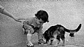
|
|
Critique By:
Wouter van Noort (K:4369)
5/4/2007 9:18:24 PM
I say, this is a very good pet portrait. I can imagine you like this dog.
|
| Photo By: Marion Luijten
(K:6141)
|
|
|
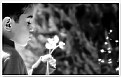
Critique By:
Wouter van Noort (K:4369)
5/4/2007 9:06:57 PM
I like the colors and the composition (esp. the way the edges of the petals lead the eye to the center). Simply beautiful.
|
Photo By: Joe Johnson
(K:8529)

|
|
|
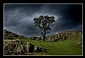
Critique By:
Wouter van Noort (K:4369)
5/4/2007 8:54:49 PM
The absence of objects in the foreground seems to make this image stronger. I also like the band of light around the trees. Good work!
|
| Photo By: Momento Eterno (Carmen Spitznagel)
(K:1177)
|
|
|
Critique By:
Wouter van Noort (K:4369)
5/3/2007 10:22:59 PM
Interesting flower, good details and good DoF. The only thing that bothers me is that there too much color in the background. May be using a colored sheet of paper could have been placed between the flower and the other elements.
|
| Photo By: Tomasz Szymczak
(K:7875)
|
|
|
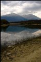
Critique By:
Wouter van Noort (K:4369)
5/3/2007 9:54:39 PM
I like the cool atmosphere of the image and reflections in the water. The image can be cropped tighter to make it stronger (see the attached image).
|
| Photo By: Brian Griffiths
(K:255)
|
|
|
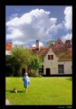
Critique By:
Wouter van Noort (K:4369)
5/3/2007 9:43:38 PM
You are right: without the sheep it would only been a very good landscape. Now, it's amazing.
|
| Photo By: Danny Brannigan
(K:19523)
|
|
|
Critique By:
Wouter van Noort (K:4369)
5/3/2007 9:37:28 PM
I like the symmetry in the image. A nice detail are the poppy flowers. Very well seen.
|
| Photo By: Reza Rabbani
(K:1548)
|
|
|
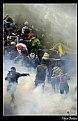
Critique By:
Wouter van Noort (K:4369)
5/3/2007 9:31:18 PM
A real eyecatcher. Dramatic, great color and a composition that brings the action to life. Well done.
|
| Photo By: Ugur Bektas
(K:239)
|
|
|
Critique By:
Wouter van Noort (K:4369)
5/3/2007 9:24:31 PM
Subtle colors, nice composition. I like the way the way the image is divided in layers.
|
| Photo By: Simone Tagliaferri
(K:28180)
|
|
|
Critique By:
Wouter van Noort (K:4369)
5/3/2007 9:19:43 PM
Beautiful image because of the fine balance and the simplicity.
|
| Photo By: ali shokri
(K:1611)
|
|
|
Critique By:
Wouter van Noort (K:4369)
5/3/2007 9:11:30 PM
Nice shot, great use of color contrast.
|
| Photo By: Edward Tan
(K:234)
|
|
|
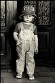
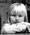
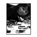
Critique By:
Wouter van Noort (K:4369)
5/1/2007 9:45:39 PM
The kid doesn't seem to have decided yet to come forward or retreat - and that's the decisive moment to take the shot. Well captured, good details and contrast. Deserved the BIP.
|
| Photo By: Pablo Dylan
(K:63918)
|
|
|
Critique By:
Wouter van Noort (K:4369)
4/30/2007 10:30:14 PM
Can't believe this is really accidental. I like the pose and the expression. Background is nicely out of focus.
I think i should either prefer a square format (cropping the top of the image) or some more space around her.
|
| Photo By: Jacek Mysliborski
(K:2854)
|
|
|
Critique By:
Wouter van Noort (K:4369)
4/30/2007 10:06:07 PM
Beautifull composition. I like the alternating layers and the balance in the composition.
|
| Photo By: sarel van staden
(K:287)
|
|
|
Critique By:
Wouter van Noort (K:4369)
4/30/2007 9:49:19 PM
Great moment. Good capture with nice composition.
|
| Photo By: Arda Teker
(K:216)
|
|
|
Critique By:
Wouter van Noort (K:4369)
4/26/2007 8:55:55 PM
I am not sure which one of the series i like best. This one, or the Yellow Tullip II. But they share the good DoF and strong colors.
|
| Photo By: Michael de Wijn
(K:1648)
|
|
|
Critique By:
Wouter van Noort (K:4369)
4/25/2007 10:48:56 PM
Normally, it would not yield interesting images putting your subjects in a straight line, but you succeeded in creating powerfull and dramatic image. It suits the sport.
|
| Photo By: Dierk Kruse
(K:315)
|
|
|
Critique By:
Wouter van Noort (K:4369)
4/25/2007 10:41:02 PM
Stands out because of the colors (and the eyes of course).
|
| Photo By: steven carter
(K:2140)
|
|
|
Critique By:
Wouter van Noort (K:4369)
4/25/2007 10:32:39 PM
Contrast and tight crop make this work. Very good.
|
| Photo By: Mohammad Porooshani
(K:20765)
|
|
|
Critique By:
Wouter van Noort (K:4369)
4/25/2007 10:27:40 PM
Good composition. You can see he is having fun. I only think because the image do not have much contrasting colors, you should convert it to B/W and enhance the contrast.
|
| Photo By: Michal P.
(K:604)
|
|
|
Critique By:
Wouter van Noort (K:4369)
4/25/2007 10:12:18 PM
runner up in the miss Forest elections....
Well seen. The way the light emphasizes the form is great.
|
| Photo By: Ralf Walkenhorst
(K:278)
|
|
|
Critique By:
Wouter van Noort (K:4369)
4/25/2007 10:03:12 PM
Everything is in place, nice glow. I like this very much...
|
| Photo By: Violetta Tarnowska
(K:24497)
|
|
|
Critique By:
Wouter van Noort (K:4369)
4/25/2007 9:46:35 PM
I like the contrasts in the image; between the hard lines of the wallpainting and the blurry lines of the car and also between the color of the car and woman's hair.
There are some little distractions. The ones i can pinpoint are: the top of the wallpainting is not exactly horizontal. Also, the window on the left just breaks through the line of the windscreen.
|
| Photo By: Barry Fox
(K:464)
|
|
|
Critique By:
Wouter van Noort (K:4369)
4/25/2007 9:29:21 PM
Nice fresh colors, good contrast from the background. Background on the left side is perfect: out of focus, non-intrusive. On the right-hand side it's a bit dull. I think you can cut off part of it to get a stronger image.
|
| Photo By: Shahyad Rohani
(K:974)
|
|
|
Critique By:
Wouter van Noort (K:4369)
9/24/2006 10:06:54 PM
Super colors. I like how the blue of the sky comes back in the blue of the womans' coat.
|
| Photo By: Orkun Kumkale
(K:117)
|
|
|
Critique By:
Wouter van Noort (K:4369)
9/24/2006 9:46:54 PM
Great moment, well captured. I also liked the B&W version.
|
| Photo By: mustafa Ozen
(K:40)
|
|
|
Critique By:
Wouter van Noort (K:4369)
9/24/2006 9:14:19 PM
I understand the difficulty and think it's a good try. The only thing i can image to get more seperation from the background is to make two images in stead of one. That would allow you to zoom in closer, and together with the largest aperture possible, would throw the background out of focus.
|
| Photo By: Roger Williams
(K:86139)
|
|
|
Critique By:
Wouter van Noort (K:4369)
9/24/2006 9:05:15 PM
Well seen, good composition. I like the frame within a frame. IMO you could have cropped a little tighter to remove the part of the fence at the bottom left. Also, i think the image is a bit too light and there is a bit to much yellow in the skintone (although the white of the eyes apprears to be correct). Still a very good portrait.
|
| Photo By: Jeroen Krol
(K:3085)
|
|
|
Critique By:
Wouter van Noort (K:4369)
9/24/2006 8:37:58 PM
Strong composition and nice contrast. I like the choice of focus point. I only have have the feeling that the point of focus is litte "off". Also, the reflected light on the face is a bit distracting. But otherwise a very good image.
|
| Photo By: AdindA Gosal
(K:803)
|
|
|
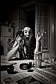
Critique By:
Wouter van Noort (K:4369)
9/21/2006 9:27:00 PM
Food for thought, both in the image and the about. There is a lot to see, but it isn't evident how it is related: a can of beer and wine glasses, the expression on the face and the newspaper exposing remarkable facts.
And technically: good composition and contrast. Interesting image.
|
| Photo By: Galeota
(K:919)
|
|