|
|
Critique By:
Wouter van Noort (K:4369)
6/22/2007 8:01:44 PM
Can't add much to the other comments: it's the colors (the eyes, the skintone, clothes) that 'make' this image. I only think the white background of UF don't do the image justice. It either needs a frame, or a darker background.
|
| Photo By: Melanie Reynolds
(K:9096)
|
|
|
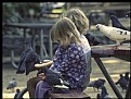
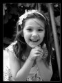
Critique By:
Wouter van Noort (K:4369)
6/22/2007 7:53:47 PM
Nice candid. I like the expression of the girl at front. Like she is a little nervous about whether the the pigeons will peck her while feeding...
|
| Photo By: Sheryl Phillips
(K:2728)
|
|
|
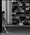
Critique By:
Wouter van Noort (K:4369)
6/22/2007 7:46:21 PM
Very well seen. I also like the way you cropped it (compared to the original). And the conversion to B/W is appropriate.
May be you can crop even more from the top. I noticed the one white tile at the top is a bit distractive.
|
| Photo By: James Arendell
(K:604)
|
|
|
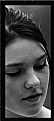
Critique By:
Wouter van Noort (K:4369)
6/16/2007 9:29:54 PM
Yes, really a dramatic portrait. Good pose, contrast and great composition. I'd only preferred a cooler toning to match her expression.
|
| Photo By: steven carter
(K:2140)
|
|
|
Critique By:
Wouter van Noort (K:4369)
6/16/2007 9:22:03 PM
I must say, at first i skipped these series of images thinking 'Not another set of photoshop cut and past work', but i'll have to admit it is more...
|
| Photo By: Ian McIntosh
(K:42997)
|
|
|
Critique By:
Wouter van Noort (K:4369)
6/14/2007 10:32:45 PM
An absolutely gorgeous image. I think the composition is very good, only i wished it was not so dark. As i was curious how it would look if the contrast was stronger and the image lighter, i did a quick edit in PS. I used levels to enhance the contrast and shift the midtones. I also increased the saturation of the blue channel a little.
|
Photo By: Tony Smallman
(K:23858)

|
|
|
Critique By:
Wouter van Noort (K:4369)
6/13/2007 9:50:15 PM
I can imagine that changing the frame and less cropping would change the impact. For some reason i can't explain they add a 3D feel to the image. I like the expression and the overall mood of the image.
The problem with the small width has probably a lot to do with the white space around it. If i were able, i would move to the left on my screen. so my suggestion is to make the border larger. See the attached image - i also added your about to the image itself. See i you like it...
|
| Photo By: April the 1st
(K:24)
|
|
|
Critique By:
Wouter van Noort (K:4369)
6/13/2007 9:08:13 PM
I am a little ambiguous about this image. The colors and the simple layered composition are fantastic, but i'm not so sure about the blur. It creates an artificial point of interest, but the image size is too small (even the 'large' version) to be able to give a fair judgement.
|
| Photo By: Linda See
(K:1672)
|
|
|
Critique By:
Wouter van Noort (K:4369)
6/13/2007 8:57:21 PM
Nice composition and beautiful light. I like the combination of the vertical lines of the trees and the horizontal lines formed by the shadows.
|
| Photo By: Fernando Tasca
(K:1995)
|
|
|
Critique By:
Wouter van Noort (K:4369)
6/13/2007 8:52:05 PM
bluegrass? a bluethroat from very close? the fur of some other animal that got the blues? I give up...
|
| Photo By: Tomasz Szymczak
(K:7875)
|
|
|
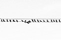
Critique By:
Wouter van Noort (K:4369)
6/11/2007 10:22:02 PM
I like the rhythm and the clarity of this image - it looks as if it's designed on the drawing board. (minor note: the wires are not exactly horizontal). Great series.
|
| Photo By: giovanni guido marchi
(K:27040)
|
|
|
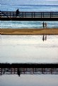
Critique By:
Wouter van Noort (K:4369)
6/11/2007 10:00:53 PM
Almost an abstract. well spotted and a clever composition. I like the way the cyclist and the two persons on the beach break the monotomy of the horizontals.
|
| Photo By: Barbara Corvino
(K:4452)
|
|
|
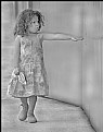
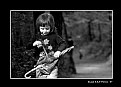
Critique By:
Wouter van Noort (K:4369)
6/11/2007 12:04:55 PM
Good composed candid. I like the way the position of her feet shows she moves.
|
| Photo By: James Arendell
(K:604)
|
|
|
Critique By:
Wouter van Noort (K:4369)
6/11/2007 11:37:22 AM
Well seen, i like the symmetry, the strong lines and the blue/orange contrast. In contrast with Avi's suggestion, mine would be to crop less, showing a little bit more of the tree and use a square format.
|
| Photo By: Jan Hoffman
(K:39467)
|
|
|
Critique By:
Wouter van Noort (K:4369)
6/9/2007 9:50:06 PM
Oh, that's great. Fantastic moment, well captured.
|
| Photo By: Antonio Torkio
(K:5592)
|
|
|
Critique By:
Wouter van Noort (K:4369)
6/7/2007 10:19:05 PM
I like the soft glow and the blurred background. Nicely toned B/W.
|
| Photo By: gina lowthert
(K:707)
|
|
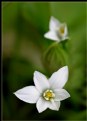
|
Critique By:
Wouter van Noort (K:4369)
6/7/2007 10:16:33 PM
Terrific color. Works great against the all white background.
|
| Photo By: Jennifer Carroll
(K:122)
|
|
|
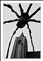
Critique By:
Wouter van Noort (K:4369)
6/7/2007 10:08:37 PM
Interesting composition - i like the way the spider is shown as silhouette against the details of the church tower.
|
| Photo By: Peter De Rycke
(K:41212)
|
|
|
Critique By:
Wouter van Noort (K:4369)
6/7/2007 9:57:28 PM
Pixel, Is that the name of dog? Nice pet portrait!
|
| Photo By: Jacek Mysliborski
(K:2854)
|
|
|
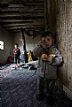
Critique By:
Wouter van Noort (K:4369)
6/7/2007 3:31:53 PM
The theme of image is too sad to call it beautiful but it's a strong image, with subtle tones and mood. Makes me curious about the story behind it.
|
| Photo By: Karadag Metin
(K:2939)
|
|
|
Critique By:
Wouter van Noort (K:4369)
6/7/2007 3:18:05 PM
Nice composition and toning. I like the balance and the atmosphere of the image.
|
| Photo By: milot krasniqi
(K:517)
|
|
|
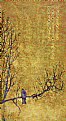
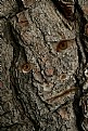
Critique By:
Wouter van Noort (K:4369)
6/7/2007 3:10:31 PM
I'm curious why you added this to the 'Children' category because to me, it looks like an angry old tree. The effect is interesting, but i do think the edges around the eyes do need a more 3D effect to make them appear a real part of the tree.
|
| Photo By: Stephen Gledhill
(K:1232)
|
|
|
Critique By:
Wouter van Noort (K:4369)
6/6/2007 10:44:40 PM
The music fades away and the main character disappears into the myst... Beautiful image, well done.
|
| Photo By: Violetta Tarnowska
(K:24497)
|
|
|
Critique By:
Wouter van Noort (K:4369)
6/6/2007 10:31:22 PM
This feels like a still from a major blockbuster movie production like Narnia or Harry Potter. I like this very much.
And thanks for providing the explanation of the lighting setup.
|
| Photo By: Shirley D. Cross-Taylor
(K:174199)
|
|
|
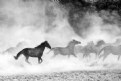
Critique By:
Wouter van Noort (K:4369)
6/6/2007 10:11:35 PM
Impressive image, full of motion. The single dark horse in balance with the other 'grey' horses.
|
| Photo By: Karol Machalski
(K:132)
|
|
|
Critique By:
Wouter van Noort (K:4369)
6/6/2007 9:58:40 PM
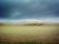
Good compostion, full of drama. I like the contrast between the red and white parts of the house and the dark blue sky.
|
| Photo By: Zelda Zabrinsky
(K:3036)
|
|
|
Critique By:
Wouter van Noort (K:4369)
6/6/2007 9:55:08 PM
Good use of shallow DoF and color contrast. Simply beautiful.
|
| Photo By: Robin W
(K:16308)
|
|
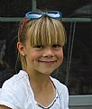
|
Critique By:
Wouter van Noort (K:4369)
6/6/2007 9:42:48 PM
Great expression, well timed.
|
| Photo By: Ian Miller
(K:9190)
|
|
|
Critique By:
Wouter van Noort (K:4369)
6/5/2007 11:05:06 PM
She looks like a professional actress. Details are very nice due to the positioning of the lights. I like the little lights in the background.
|
| Photo By: Shirley D. Cross-Taylor
(K:174199)
|
|
|
Critique By:
Wouter van Noort (K:4369)
6/5/2007 10:58:10 PM
A portrait that makes you smile....
|
| Photo By: James Smith
(K:193)
|
|