|
|
Critique By:
Wouter van Noort (K:4369)
2/19/2010 10:14:54 PM
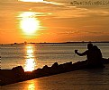
Good composition. I like the reflections and the lines on the pavement.
|
Photo By: Tony Smallman
(K:23858)

|
|
|
Critique By:
Wouter van Noort (K:4369)
2/19/2010 10:04:23 PM
Nice candid; i like how the pose of the woman at the front, matches that on the display at the back.
|
Photo By: Robert Delgadillo
(K:3509)

|
|
|
Critique By:
Wouter van Noort (K:4369)
2/19/2010 9:33:30 PM
Nice image, will also look good in B/W. I think, removing a part of the left side of the photo will improve the composition.
|
| Photo By: Amitabha Gupta
(K:3)
|
|
|
Critique By:
Wouter van Noort (K:4369)
9/20/2007 9:55:37 PM
Well composed, good timing. The light is beautiful too.
|
| Photo By: Thomas Stoffaneller
(K:342)
|
|
|
Critique By:
Wouter van Noort (K:4369)
9/20/2007 9:45:33 PM
You seem to have an eye for these kind of images. It's funny and wel executed.
|
| Photo By: Fabio Keiner
(K:81109)
|
|
|
Critique By:
Wouter van Noort (K:4369)
9/20/2007 9:28:27 PM
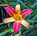
I like the bold colors and the way you composed the image. It's not exactly something you put in your garden and go sit next to it, drinking tea. But i think it will be great near a modern office building.
|
Photo By: Jim Budrakey
(K:24393)

|
|
|
Critique By:
Wouter van Noort (K:4369)
9/20/2007 9:14:41 PM
Stunning shot, perfect match between architectural study and human interest. Really the decisive moment.
|
| Photo By: Kiarang Alaei
(K:49415)
|
|
|
Critique By:
Wouter van Noort (K:4369)
9/18/2007 10:32:25 PM
Although i can't read much of Visar's comments, i like to see this image with his suggestions applied since it is already very good...
(because of the composition and the great timing)
|
| Photo By: Edlira Voges
(K:6410)
|
|
|
Critique By:
Wouter van Noort (K:4369)
9/18/2007 10:23:55 PM
The toning add a very antique feel to the image. It is like you found it in an old shoebox at your parents house. And yes, Avi is rigt: the perspective is great. Well done.
|
| Photo By: D e b
(K:9399)
|
|
|
Critique By:
Wouter van Noort (K:4369)
9/18/2007 10:15:09 PM
I see what you mean about the empty space, but that would have been a little hard...
|
| Photo By: Wouter van Noort
(K:4369)
|
|
|
Critique By:
Wouter van Noort (K:4369)
9/18/2007 9:59:56 PM
Amazing image. Nice symmetric composition and great colors. I also like how you dimensioned the frame.
|
| Photo By: Paolo Bergamelli
(K:687)
|
|
|
Critique By:
Wouter van Noort (K:4369)
9/18/2007 9:49:08 PM
Remarkable image, especially the eyes...
|
| Photo By: arda aydin
(K:1570)
|
|
|
Critique By:
Wouter van Noort (K:4369)
9/18/2007 9:42:32 PM
You can also put in the 'minimalist' category. Well balanced and good use of the fence to provide a strong diagonal element.
|
| Photo By: Fred Cunningham
(K:105)
|
|
|
Critique By:
Wouter van Noort (K:4369)
9/18/2007 9:36:12 PM
Great scene and good treatment of the image; the toning suits the subject well. Only a little more vissible surroundings would have been nice to supply some context.
|
| Photo By: Fiorella Lamnidis
(K:3947)
|
|
|
Critique By:
Wouter van Noort (K:4369)
9/18/2007 9:27:18 PM
Well composed, good documentary style image. A faster shutterspeed would have been nice, but i guess that was impossible given the circumstances.
|
| Photo By: Antonio Torkio
(K:5592)
|
|
|
Critique By:
Wouter van Noort (K:4369)
9/18/2007 9:21:00 PM
Good and intense portrait. I like the contrast and the grain effect.
|
| Photo By: Baerbel Braun
(K:26)
|
|
|
Critique By:
Wouter van Noort (K:4369)
9/3/2007 9:58:40 PM
Mooie gedaan zo: symmetrisch, maar door de spelende kinderen niet statisch. Ook mooie verdeling van donker en licht.
|
| Photo By: Dirk Noort
(K:9683)
|
|
|
Critique By:
Wouter van Noort (K:4369)
9/3/2007 9:55:13 PM
Het is inderdaad in Lelystad en gelukkig nog steeds niet volgebouwd.
Groeten, Wouter
|
| Photo By: Wouter van Noort
(K:4369)
|
|
|
Critique By:
Wouter van Noort (K:4369)
8/29/2007 10:22:08 PM
Good B/W. True journalism.
|
| Photo By: joey herman
(K:426)
|
|
|
Critique By:
Wouter van Noort (K:4369)
8/29/2007 10:16:50 PM
To be honest i liked the previous untitled image much better than this one. Most of that attributes to the composition. This image is rather static, due to the symmetrical composition. The more diagonal composition of the previous image was much more dramatic. I think, cropping this image to the right will immediately improve the impact of the image. An alternative would be to crop the top of the image, creating a square format. I also noticed that the subjects' right arm and leg caught to much direct sunlight. In case of the right leg, this results in too little seperation from the background.
What i like in the image is the pose of the model, the way she mimics the lines of the tree behind her. I also like the strong lines and contrast in the image.
|
| Photo By: Hanggan Situmorang
(K:24833)
|
|
|
Critique By:
Wouter van Noort (K:4369)
8/29/2007 9:30:48 PM
I rarely comment on bird pictures, but this one catched my attention. Great sense of motion and nice contrast. It's very good.
|
| Photo By: Lokesh Pandey
(K:15)
|
|
|
Critique By:
Wouter van Noort (K:4369)
8/29/2007 9:27:06 PM
Apart from the harsh light on the face, this is a wonderful portrait. I like the pose and the composition. The tilted horizon is no problem, it even adds to the dynamics of the image.
|
| Photo By: Clyde Koa Wing
(K:-133)
|
|
|
Critique By:
Wouter van Noort (K:4369)
8/20/2007 11:25:30 AM
Nice B/W; good composition and contrast. Well done.
|
| Photo By: Marcelo Berraz
(K:12906)
|
|
|
Critique By:
Wouter van Noort (K:4369)
8/16/2007 10:59:46 PM
It's not quite a portrait in a usual style, but it tells more about who this boy is. Well composed, good B/W.
|
| Photo By: Sandip Aine
(K:5008)
|
|
|
Critique By:
Wouter van Noort (K:4369)
8/16/2007 10:43:30 PM
Incredibly gone. Funny image, Good conversion to B/W (especially the hair and skintone).
|
| Photo By: Larry Fosse
(K:66493)
|
|
|
Critique By:
Wouter van Noort (K:4369)
8/16/2007 10:34:03 PM
Interesting approach. I like the resulting colors and atmosphere. In some area's the effect is a little too strong. My approach would be to duplicate the original image to a new layer, apply the edges filter to the duplicate and select an opacity less than 100%.
|
| Photo By: Kathleen Royles
(K:451)
|
|
|
Critique By:
Wouter van Noort (K:4369)
8/16/2007 10:17:33 PM
Interesting object, well placed in the frame. I like the small part of the path is visible. The green edges add color to the image.
|
| Photo By: Tomasz Szymczak
(K:7875)
|
|
|
Critique By:
Wouter van Noort (K:4369)
8/16/2007 10:07:39 PM
A very pleasing image. The limited range of colors suits the composition very well. I also like the blurry figure on the stairs.
|
| Photo By: Koray Degirmenci
(K:23)
|
|
|
Critique By:
Wouter van Noort (K:4369)
8/16/2007 10:01:54 PM
Impressive sky in a simple effective composition. Well done.
|
| Photo By: Esin Toprak
(K:123)
|
|
|
Critique By:
Wouter van Noort (K:4369)
8/16/2007 9:58:43 PM
Fantastic image. I like the composition, the nice details, and above all the beautiful light. Thanks for sharing the info about your approach. An example for us all.
|
| Photo By: Ian Cameron
(K:1163)
|
|


![Photograph By Nelson Moore [Kes] - Photograph By Nelson Moore [Kes] -](http://thumbs.imageopolis.com/images/6/0/0/5/6005/1537290-tn.jpg)


![Photograph By Nelson Moore [Kes] - Photograph By Nelson Moore [Kes] -](http://thumbs.imageopolis.com/images/6/0/0/5/6005/1537290-tn.jpg)


