|
|
Critique By:
ken osborn (K:2997)
8/6/2004 2:58:02 AM
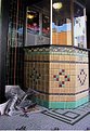
Thank you Rachel. It was a bit of serendipity as I did not see the 'Dracula' sign until after I took the shot. I was focused on the papers which swirled in the wind around the kiosk and gave a sense of foreboding to the shadowed corner. Mister Ken
|
| Photo By: ken osborn
(K:2997)
|
|
|
Critique By:
Rachel Leah (K:26110)
8/6/2004 2:46:50 AM
Very nice shot! I love the lighitng and contrast... it adds to the mood very well! The clarity looks perfect... great idea, nice work 
~Rachel~
|
| Photo By: ken osborn
(K:2997)
|
|
|
Critique By:
ken osborn (K:2997)
7/29/2004 1:32:44 AM
Egad, Christine, you are so right! It's a good thing I didn't get any closer or I might not have able to post this image. Thanks for stopping by. Mister Ken
|
| Photo By: ken osborn
(K:2997)
|
|
|
Critique By:
Peggy Christine Skinner (K:26936)
7/28/2004 3:12:55 PM
If you go back to look at the thumbnail, what is extraordinary is that the crumpled newspaper totally resembles a man in a gray suit, arms and legs in front, head against the green tile. Dracula has indeed been here.
|
| Photo By: ken osborn
(K:2997)
|
|
|
Critique By:
Gabriella Carta (K:22879)
7/26/2004 9:05:27 PM
original effect, good job. regards by Gabry
|
| Photo By: ken osborn
(K:2997)
|
|
|
Critique By:
Rebecca Raybon (K:26654)
7/26/2004 1:37:40 AM
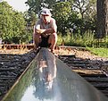
Beautiful! Perfect in every aspect. Bravo!
|
| Photo By: ken osborn
(K:2997)
|
|
|
Critique By:
Rebecca Raybon (K:26654)
7/26/2004 1:33:53 AM
Amazing image! The thumbnail does no justice at all to this one. Wonderful earthy tones. Great contrast and dof.
|
| Photo By: ken osborn
(K:2997)
|
|
|
Critique By:
Maria Luisa Vial (K:36017)
7/12/2004 5:54:15 PM
Hi Ken...
Really a great capture... Lovely colors...
Cheers,
Maria
|
| Photo By: ken osborn
(K:2997)
|
|
|
Critique By:
Peter De Rycke (K:41212)

7/11/2004 1:04:07 PM
Hehe well seen ! regards, Peter
|
| Photo By: ken osborn
(K:2997)
|
|
|
Critique By:
Peter De Rycke (K:41212)
7/11/2004 1:00:04 PM
What a scene .. well presented with high contrasts ! Regards, Peter
|
| Photo By: ken osborn
(K:2997)
|
|
|
Critique By:
Alison DuFlon (K:36566)
7/11/2004 12:32:50 PM
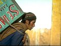
Great story, I really like this photo, I love how the back lighting is so strong which really gives the mans face incredible feeling. Great composition and mood. Alison
|
| Photo By: ken osborn
(K:2997)
|
|
|
Critique By:
Paul's Photos (K:35235)
7/11/2004 5:50:05 AM
wow.. outstanding image.. great capture.. love the colors.. sounds like an interesting story as well
|
| Photo By: ken osborn
(K:2997)
|
|
|
Critique By:
Peter De Rycke (K:41212)
7/10/2004 10:26:47 PM
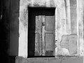
Good work .. bit more cropping from the left dark part... and the doorframe shadow is too dark .. focussing on doors has to reveal all
detail, shadow or light ..
This is "Door 5".. where is your door 1-4 .. can't find them in your portfolio (interested in door/window pictures, i was on holidays in Crete lately, and saw this kind of scenes daily, so got interested) .. regards, Peter
|
| Photo By: ken osborn
(K:2997)
|
|
|
Critique By:
Peter De Rycke (K:41212)
7/10/2004 10:21:36 PM
This looks like beautiful artwork .. little more cropping from the left thought (yes, cut that back post in 2, the focus of your picture is in the foreground) .. regards, Peter
|
| Photo By: ken osborn
(K:2997)
|
|
|
Critique By:
Peter De Rycke (K:41212)
7/10/2004 10:19:20 PM
Well captured.. hard labour indeed .. regards, Peter
|
| Photo By: ken osborn
(K:2997)
|
|
|
Critique By:
Peter De Rycke (K:41212)
7/10/2004 10:17:55 PM
Don't know what you did, but i see a lot of noise in the picture, and the bee is not sharp .. compared to other picture in your portfolio, this one is really bad .. regards, Peter
|
| Photo By: ken osborn
(K:2997)
|
|
|
Critique By:
Katrin Aasa (K:740)
7/2/2004 5:33:39 PM
It's beautiful.Maybe a bit tight crop...Color and details are great.
|
| Photo By: ken osborn
(K:2997)
|
|
|
Critique By:
ken osborn (K:2997)
6/29/2004 1:05:40 AM
?
|
| Photo By: ken osborn
(K:2997)
|
|
|
Critique By:
ken osborn (K:2997)
6/29/2004 1:01:12 AM
Thank you for the comments, Michele. I like your cropping, though I had originally cropped this for a square format printing. You are, of course, correct regarding gardening. I shot this through a fence on top of a retaining wall and was limited in the perspectives available. There were others, but they gave no emphasis to the cabbage which intrigued me because of the way the light played on the edges and textures. That darn building in the background, though, just kept getting in the way - perhaps a PS blur might help make it less distracting, though I do like a hint as it provides a context (gardens in Mission District San Francisco?). Meanwhile, the attached is a bumblebee on a Penstemon from my garden and more tightly cropped than the cabbage. Thanks again, Mister Ken
|
| Photo By: ken osborn
(K:2997)
|
|
|
Critique By:
Michele Pesta (K:256)
6/28/2004 8:12:09 PM
Hello Ken, nice cabbage you got here. I noticed that you haven't received any comments on this shot, so I hope you don't mind if I give you my take on your photo.
I have learned through many people telling me over and over again, plan your shot. Check the background, do some gardening if the shot is outside. Look at it from all angles.
Well, what I see in your shot is to many distractions. I think a different angle might have helped, but then I'm not there to know for sure.
I captured your shot and in PS gave it a real tight crop, then I used my burn tool and selectively burned some of the background that was left. I also used color balance to bring up the blue in the cabbage.
Great attempt, and hopefully, like me, you will learn something from every shot you take. Keep clicking.
|
| Photo By: ken osborn
(K:2997)
|
|
|
Critique By:
Marcio Janousek (K:32538)
6/25/2004 2:55:06 AM
you are very artistic, you have a great eye for the original.
my regards
|
| Photo By: ken osborn
(K:2997)
|
|
|
Critique By:
Marcio Janousek (K:32538)
6/25/2004 2:52:26 AM
Excellent work...Interesting subject !!
|
| Photo By: ken osborn
(K:2997)
|
|
|
Critique By:
ken osborn (K:2997)
6/22/2004 1:42:42 AM
Thank you Kshitz. I tried leaving comments on two of your paintings with light abstractions, but could not upload to your Usefilm page. If the poetry project is yours, you may use the Bay Roots image. Regards, Mister Ken
|
| Photo By: ken osborn
(K:2997)
|
|
|
Critique By:
ken osborn (K:2997)
6/20/2004 3:03:04 AM
Thank you Kshitz for your comment. I had not noticed the old man in the tree, but when I visit this area below my home I sometimes get a feeling that I'm not alone. Now I know why! What is the Poetry in Pictures project? If it is your project and you'd like to use my photograph, you may. Regards, Mister Ken
|
| Photo By: ken osborn
(K:2997)
|
|
|
Critique By:
Kshitiz Anand (K:4848)
6/20/2004 2:51:18 AM
Hey .. isnt there five of them!!
one white and four black!
nice compositions.. I like the diagonal balance.
Also the play of negative and positive space between the first two cats looks interesting.!
chaares.
kshitiz
|
| Photo By: ken osborn
(K:2997)
|
|
|
Critique By:
Kshitiz Anand (K:4848)
6/20/2004 2:46:39 AM
Hi Ken..
A nice picture.
I dont know if you noticed this, but i kinda like looking at optical illusions. At the very first instance that I saw the picture a saw an optical illusion of a thirsty person wanting to drink water. Metaphorically speaking the patches on his face show the pain he is in ( due to his thirst).. also his hair is all messed up ... Look at the attached picture if you can still not figure out why....I am a designer so i look at such things. Lemme know if you agree!
This could well go into the Poetry in pictures project!
Nice picture though!
|
| Photo By: ken osborn
(K:2997)
|
|
|
Critique By:
Kees and Carolyn (K:15193)
6/9/2004 2:38:26 AM
Beautiful, lovely photo! A lot to see! Wonderful tones and designs!
Carolyn
|
| Photo By: ken osborn
(K:2997)
|
|
|
Critique By:
Juin Hoo (K:661)
6/6/2004 9:39:42 AM
great document and wonderful color
|
| Photo By: ken osborn
(K:2997)
|
|
|
Critique By:
Kees and Carolyn (K:15193)
6/5/2004 7:50:27 PM
Incredible! Great photo!
Carolyn
|
| Photo By: ken osborn
(K:2997)
|
|
|
Critique By:
sunrise (K:6651)
6/5/2004 3:46:26 PM
going for my favortes
|
| Photo By: ken osborn
(K:2997)
|
|