|
|
Critique By:
Andy Jones (K:536)
6/10/2005 12:29:26 PM
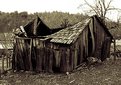
that's great. I'd have cropped the thin sliver of film rebate off the top though... This is the kind of image I'd print very large, maybe 12x16 or so. very well done.
|
| Photo By: Hubert Mackiewicz
(K:661)
|
|
|
Critique By:
Andy Jones (K:536)
6/7/2005 12:46:20 PM
nice photo. The burnt out sky bothers me a little and stops this from being a great photo. I think I would try to burn in the sky a little to hold some tone in there and balance up the picture. Other than that I really like it.
|
| Photo By: Girish Chonkar
(K:6903)
|
|
|
Critique By:
Andy Jones (K:536)
11/16/2004 9:08:28 AM
Wow... speechless... beautiful girl, beautiful print. Excellent work.
|
| Photo By: Gertrud Gozner
(K:14222)
|
|
|
Critique By:
Andy Jones (K:536)
9/28/2004 12:53:02 PM
I really like this. It reminds me a bit of those pictures you see of UFO sightings caught on film! The darkness of the print lends the picture a bit of mystery and intrigue, while the style suggests a kind of 'under-cover' story-telling feel to it.
It's definately one of those pictures that I like the more I look at it. Well done.
|
| Photo By: joey gauthier
(K:689)
|
|
|
Critique By:
Andy Jones (K:536)
9/28/2004 12:35:23 PM
Great shot Mark! I love the composition and the relaxed pose - the model looking away from the camera really works well for me. There's only one thing I can think of that would improve this shot - and that's to retouch out the marks on the wall behind the girl's head, as I find them a little distracting...
but other than that it's perfect. Wish I'd taken it :-)
|
| Photo By: Mark Pierce
(K:-1247)
|
|
|
Critique By:
Andy Jones (K:536)
10/13/2003 7:19:11 AM
I guess it does look a little bit infa-red... but it's not. The lighting was so harsh and contrasty I had to use a spotmeter to try and get everything into the negative, and even then the highlights on the negative are almost at the point where they blow out completely - there's a ridiculous amount of dodging and burning going on to make the final print and this was the best I could get it without going crazy :-)
|
| Photo By: Andy Jones
(K:536)
|
|
|
Critique By:
Andy Jones (K:536)
10/8/2003 4:27:25 AM
Wow! Awesome. Nice work!!
|
| Photo By: Michael Busselle
(K:221)
|
|
|
Critique By:
Andy Jones (K:536)
10/6/2003 8:22:59 AM
Smashing good photograph.
|
| Photo By: stephen chong
(K:519)
|
|
|
Critique By:
Andy Jones (K:536)
7/10/2003 9:08:26 AM
Really nice image Robert. You can almost feel the texture of the old wooden planks just looking at it! The only thing I'd change is perhaps to burn in the sky a little bit to get some tone in there, so that you can just make out the top edge of the image against white. I would be really pleased with myself if I'd taken a shot like this :-) Fantastic.
|
Photo By: Robert Gaither
(K:34128)

|
|
|
Critique By:
Andy Jones (K:536)
7/10/2003 8:59:08 AM
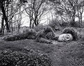
Thanks all, for the positive feedback on this picture. I'm glad you liked it.
Murat, I'm still around here - but I'm in the middle of (slowly) building a new darkroom in my attic, so I haven't been able to make any prints for a while!
I recently went back to the gardens at Helligan - my 'Sleeper' was still there, but looking a little more overgrown now. I found out she is actually called the 'mud maiden'.
|
| Photo By: Andy Jones
(K:536)
|
|
|
Critique By:
Andy Jones (K:536)
12/24/2002 1:41:07 AM
Superb! Perfect timing. Great composition. The look on their faces says it all!! This shot really makes me smile 
|
| Photo By: Jim Fuglestad
(K:1564)
|
|
|
Critique By:
Andy Jones (K:536)
10/11/2002 12:11:51 AM
I really like this shot. You've got the lighting spot on - I especially like the lighting on her hair - and the soft focus is just right. The narrow crop holds the picture together nicely.
|
| Photo By: dennis chapin
(K:6)
|
|
|
Critique By:
Andy Jones (K:536)
9/13/2002 4:19:29 AM
Nice shot Sarah! I think you've got the composition absolutely spot-on with this one. I really like everything about this image. Good stuff!
|
| Photo By: Sarah Needham
(K:2482)
|
|
|
Critique By:
Andy Jones (K:536)
9/13/2002 4:11:52 AM
wow! that's cool!
|
| Photo By: A.M. Lidkus
(K:293)
|
|
|
Critique By:
Andy Jones (K:536)
7/19/2002 9:46:38 AM
my god! They're levitating! Is that ancient pagan magic?
|
| Photo By: Tony Winfield
(K:0)
|
|
|
Critique By:
Andy Jones (K:536)
7/18/2002 6:07:08 AM
great shot Jamie. This really reminds me of that scene at the end of "Close Encounters of the Third Kind"!!
|
| Photo By: Jamie Armes
(K:7)
|
|
|
Critique By:
Andy Jones (K:536)
7/18/2002 6:02:42 AM
great shot Jamie. This really reminds me of that scene at the end of "Close Encounters of the Third Kind"!!
|
| Photo By: Jamie Armes
(K:7)
|
|
|
Critique By:
Andy Jones (K:536)
7/11/2002 5:34:26 AM
It certainly has that 1940's hollywood film star feel to it. Great lighting and composition.
|
| Photo By: Terry Drymon
(K:154)
|
|
|
Critique By:
Andy Jones (K:536)
7/10/2002 6:00:14 AM
wow! Outstanding. Incredible.
|
| Photo By: Andrew Polushkin
(K:311)
|
|
|
Critique By:
Andy Jones (K:536)
7/10/2002 5:47:38 AM
I love this shot. The composition is very strong and there's a nice strong tonal range. As Eric commented, the face is a little burnt out on the left, but I think that works ok for this image. You've successfully captured some of the models own personality with her expression - and for me this is the most important part of any portrait. Good stuff!
|
| Photo By: Elisa Hipolito
(K:32)
|
|
|
Critique By:
Andy Jones (K:536)
6/26/2002 6:04:31 AM
Not sure about alone... but I'm certainly lost... :-)
Seriously though, I'd love to see the photoshop enhanced version. Will you be posting the whole series on the net when it's complete? I'd be interested to see the images in context.
|
| Photo By: William R Eastman III
(K:2141)
|
|
|
Critique By:
Andy Jones (K:536)
6/26/2002 5:39:05 AM
What a great shot! Sorry to disagree with Max, but I really like the dark area at the top - for me it helps balance the picture tonally. Good stuff!
|
| Photo By: Chris Whaley
(K:3847)
|
|
|
Critique By:
Andy Jones (K:536)
6/20/2002 4:15:59 AM
I get what your trying to do here Tim. I just think maybe the visual clues are a bit too subtle to make the kind of impact that you're looking for. Perhaps you could try just focussing on one visual trigger instead of many, to get the response you're after. It's a good idea - you just need to push it harder to the viewer.
|
| Photo By: Tim Lawrence
(K:0)
|
|
|
Critique By:
Andy Jones (K:536)
6/14/2002 6:19:39 AM
Nice shot - personally I would have cropped it slightly differently, with the subject off-centre to the right and up a little, looking into the picture. I feel it would make the picture a bit more dynamic.
I like the way my eye is drawn towards her watch, it gives me the impression that maybe she's waiting for someone. That's a nice touch.
|
| Photo By: S Salazar
(K:2)
|
|
|
Critique By:
Andy Jones (K:536)
6/5/2002 7:53:01 AM
Thanks for the positive feedback. It's always nice to get comments, especially from people whose own work is of such a high standard.
Stephen - Once I've built up a collection of images that I'm happy with I might consider trying to sell them in small editions (of 25 or so), but at the moment it's just for the fun of it.
Happy shooting!
|
| Photo By: Andy Jones
(K:536)
|
|
|
Critique By:
Andy Jones (K:536)
5/30/2002 5:47:41 AM
Nice work Rene! This shot is full of charm. I think you've captured the moment perfectly and printing is beautiful.
|
| Photo By: Rene Asmussen
(K:138)
|
|
|
Critique By:
Andy Jones (K:536)
5/27/2002 5:45:57 AM
That's fantastic! Have you considered trying it as black and white shot? Or a cyanotype?
|
| Photo By: Przemyslaw Piwowar
(K:136)
|
|
|
Critique By:
Andy Jones (K:536)
5/24/2002 9:41:44 AM
nice work Bruno. I really like this shot, it's got it all - excellent composition, very well printed and it tells a story too.
|
| Photo By: Bruno Espadana
(K:326)
|
|
|
Critique By:
Andy Jones (K:536)
4/4/2002 7:48:48 AM
What a great picture! I really like the composition, it portrays a real sense of calm and quiet, and keeps drawing my eye back to explore the bench in the foreground (maybe you should have called it "The Bench" instead of "The River" :-) For a first attempt at darkroom work this is excellent - you should be very pleased with yourself.
|
| Photo By: Julien Marchand
(K:80)
|
|
|
Critique By:
Andy Jones (K:536)
12/10/2001 10:03:56 AM
Nice shot Carlos! My only criticism would be that I'd make the sky a little darker in the top left corner, just to hold the edge of the picture.
Andy
|
| Photo By: Carlos Cravo
(K:6)
|
|