|
|
Critique By:
oeyvind toft (K:307)
10/10/2003 9:32:51 PM
Beautiful lady, beautiful image, beautiful portfolio, beautiful website.
|
| Photo By: Cheryl Jacobs
(K:122)
|
|
|
Critique By:
oeyvind toft (K:307)
10/10/2003 3:00:26 PM
Very beautiful capture.
|
| Photo By: david malcolmson
(K:4145)
|
|
|
Critique By:
oeyvind toft (K:307)
10/10/2003 7:15:45 AM
Took the liberty to crop your fine pic. In my mind the intimacy is enhanced with a tighter crop. Good capture and fine moment.
|
| Photo By: Chris Nichols
(K:7068)
|
|
|
Critique By:
oeyvind toft (K:307)
10/10/2003 7:00:43 AM
Fresh colors and good capture. Have to admit I find this sort of framing pretty ugly thou.
|
| Photo By: David Rozenblyum
(K:3)
|
|
|
Critique By:
oeyvind toft (K:307)
10/10/2003 6:54:36 AM
Not Hockney quality here but still well done.
|
| Photo By: Franck Dormoy
(K:997)
|
|
|
Critique By:
oeyvind toft (K:307)
10/6/2003 9:32:10 AM
Very good capture. Perhaps there should be a tiny bit more contrast between the left side of his hat and the tree. Now they sort of grow together.
|
| Photo By: Felipe Rodríguez
(K:9200)
|
|
|
Critique By:
oeyvind toft (K:307)
10/3/2003 6:08:28 AM
Hi Pat,
Just wanted to say I think you have a fantastic collection
of great shots of those beautiful kids of yours.
Oeyvind
|
| Photo By: Pat Fruen
(K:12076)
|
|
|
Critique By:
oeyvind toft (K:307)
10/3/2003 5:29:07 AM
Freske farger, fin bruk av svart bakgrunn over det hele.
Legger ved et forslag til litt annen cropping. Etter mitt syn er formatet du har valgt litt midt imellom (ikke kvadratisk nok og heller ikke tilstrekkelig høyt til å være et markert høydeformat).
Håper du sender flere eksempler på denne typen eksperimenter.
Øyvind
|
| Photo By: Reidar Olsen
(K:144)
|
|
|
Critique By:
oeyvind toft (K:307)
10/3/2003 4:13:06 AM
Fine image. I miss some more tonal range thou. And I would remove the thing in the lower right corner of the pic (in particular, if you place the image on a darker background it is very obvious and in my mind disturbs the composition a lot)
|
Photo By: Roger Williams
(K:86139)

|
|
|
Critique By:
oeyvind toft (K:307)
10/3/2003 3:31:57 AM
Good capture. In my view the B&W/color combination seldom works. I think this image would be better in all B&W. I would also have removed the thing on the lower right edge.
|
| Photo By: Jamie Ferguson
(K:6284)
|
|
|
Critique By:
oeyvind toft (K:307)
10/3/2003 3:11:08 AM
Good teaching is about sharing knowledge and EXPERIENCE, not assumptions.
|
| Photo By: ppdix
(K:17069)
|
|
|
Critique By:
oeyvind toft (K:307)
10/2/2003 6:34:42 PM
Altur T
I think you have misunderstood my part in this "fight" as you call it.
My fight isnt for auto levels or whether an image should have an ugly yellow tone or not. If there is a fight it is against ridiculous ARGUMENTATION like:
My favorite: "I never even considered using AutoLevels. They always(!!!) ruin the pictures."
Also a nice one: "Any(!!!) Professional Photoshop user will never(!!!) resort to a mathematical guess like Auto Levels."
And if the arguments stinks, throw in the certificates: "because I am Adobe certified(Wow!! Impressive !!!) on Photoshop, Illustrator, GoLive and InDesign".
If Mr.ppdix had said: "Yes, I have ACTUALLY USED(!!!) auto levels on many of my images and found it to be useless for my purposes", no problem.
But when this Mr.ppdix, because he cant handle critique tries to render everyone finding auto levels useful as idiots, presenting outright selfcontradictory arguments and pretty grand conclusions, as well as his certificates, I find it hard to avoid responding.
If you fancy grand conclusion and talking on behalf of the entire pro PS community, you better speak from EXPERIENCE.
|
| Photo By: ppdix
(K:17069)
|
|
|
Critique By:
oeyvind toft (K:307)
10/1/2003 5:22:37 PM
Mr.ppdix
What versiont you prefer is obviously totally up to you. In my mind your version doesnt work due to the yellow tone. So be it.
However, to other users I highly recommend trying auto level before anything else. In my experience it is yes, sometimes useless. And other times it removes color cast completely, restores whitebalance, and therby freshens the colors considerably. It may not be the last thing you do with an image, but very often I find it useful as a start.
Using adjustment layers you can also dampen the effect if desirable.
To doom auto levels when you have never even considered using it seem to me to be a bit silly, certificates or not.
BTW, my image is a 3D rendering. I use other tools to manipulate 3D stuff.
|
| Photo By: ppdix
(K:17069)
|
|
|
Critique By:
oeyvind toft (K:307)
10/1/2003 4:25:51 PM
Mr.ppdix,
if you have never even considered using auto levels, how do you know it always ruins the picture?? And do you know every pro PS user there is??
|
| Photo By: ppdix
(K:17069)
|
|
|
Critique By:
oeyvind toft (K:307)
10/1/2003 10:33:53 AM
Heavy yellow cast. Put it through a auto level in PS.
|
| Photo By: ppdix
(K:17069)
|
|
|
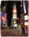
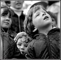
Critique By:
oeyvind toft (K:307)
10/1/2003 3:04:18 AM
Very good shot.
(I think there is a strange sort of conflict in this image. The dominant subject is excited kids staring at something. But still, to me, the REAL subject is the beautiful little girl staring into the camera).
|
| Photo By: david malcolmson
(K:4145)
|
|
|
Critique By:
oeyvind toft (K:307)
9/30/2003 9:23:39 AM
Very good portrait, fine toning. Fine light-modelling of his face. Beautiful background. Dont know if its a good idea to let his head and shirt touch the edges thou. In my eyes those things reduce the quality here.
|
| Photo By: dwight Marshall
(K:326)
|
|
|
Critique By:
oeyvind toft (K:307)
9/30/2003 9:08:56 AM
This is a beautiful dogportrait. Fine compo. Perhaps a tiny bit more contrast would do. Would remove the dots from scanning(?).
Beautiful eyes on that lady.
|
| Photo By: Beth Callahan
(K:966)
|
|
|
Critique By:
oeyvind toft (K:307)
9/30/2003 3:09:52 AM
My pleasure. You have a great shot there A.
|
| Photo By: Annika Lund
(K:170)
|
|
|
Critique By:
oeyvind toft (K:307)
9/30/2003 3:00:27 AM
There is a heavy yellow cast in this image. After a trip to PS-levels it looks better.
Fine compo.
|
| Photo By: kris saint
(K:5)
|
|
|
Critique By:
oeyvind toft (K:307)
9/30/2003 2:51:53 AM
Very fine shot. (I took it into PS and tried a auto-level. It made the colors a little bit deeper and cleaner)
|
| Photo By: Annika Lund
(K:170)
|
|
|
Critique By:
oeyvind toft (K:307)
9/28/2003 12:44:18 AM
I think this is better in all B&W. The color looks too painted on the image, not as if it was painted on the model.
Without the color you have a very beautiful portrait.
|
| Photo By: Brad Morris
(K:3307)
|
|
|
Critique By:
oeyvind toft (K:307)
9/28/2003 12:35:49 AM
There is a heavy colorcast here. A trip to PS (or whatever) and you could spice up those colors and get rid of the yellow cast. I dont think darkening the edges is a good idea.
The composition is fine, the girl is beautiful, the moment is fine, no need to focus by darkening. No need to add anything extra here. To me it would be natural to have a DOF that included her hands as the story in this pic is her DOING something.
You have a wonderful model.
|
| Photo By: Peter Skjold Petersen
(K:971)
|
|
|
Critique By:
oeyvind toft (K:307)
9/28/2003 12:08:44 AM
Hello Brad.
Good capture. Fine composition. I find the whites in her eyes and lips and necklace a bit harsh. Perhaps some softening? There is some competing between her face and body. In my mind her face is most important here but her body claims a tad too much attention. There is a thingy in the left bottom corner, would remove that, probably also her underarm.
The light models her body very good but I`m not sure about the light in her face. Perhaps some more light should be reflected on to it.
ex oneoftheothersitesmember ;o)
|
| Photo By: Brad Morris
(K:3307)
|
|
|
Critique By:
oeyvind toft (K:307)
9/27/2003 3:46:16 PM
Way too many stripes.
Tested levels - auto on this one, colors got much clearer/cleaner.
Good capture...
|
| Photo By: Peter Amber
(K:58)
|
|
|
Critique By:
oeyvind toft (K:307)
9/27/2003 7:50:23 AM
Miss a bit more contrast. Perhaps a level adjustment in PS. I also think the image would be better if a large part of the bottom were removed. In my mind a fine, promising capture, but not all the way there.
|
| Photo By: Philip Coleman
(K:1628)
|
|
|
Critique By:
oeyvind toft (K:307)
9/27/2003 5:51:01 AM
Perfect !! Thanks ;o)
I think it has much better distribution of those juicy, fresh colors now.
It really is a wonderful shot.
|
| Photo By: Hollow Eye
(K:1306)
|
|
|
Critique By:
oeyvind toft (K:307)
9/27/2003 4:14:15 AM
I love the colors in this one. However, I think the right side of the image is too dull compared to the rest. The colors are so strong and focused on the left. Perhaps some cropping would do.
|
| Photo By: Hollow Eye
(K:1306)
|
|
|
Critique By:
oeyvind toft (K:307)
9/27/2003 3:00:59 AM
The main focus of interest here is this fella`s eyes. Therefore I find that the thing in his mouth is a distraction in this image. In addition, with better focusing and a tad more saturation this could be a winner (the image that is, not your visitor ;o)
|
| Photo By: Antonio Trincone
(K:23167)
|
|
|
Critique By:
oeyvind toft (K:307)
9/27/2003 2:47:39 AM
Good capture. Would remove the kid`s knee thou. And perhaps cropped it on the right. The dark area there seem to big/dominant.
Good work...
|
| Photo By: anabela oliveira
(K:514)
|
|