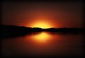
|
|
Critique By:
Joshua Koh (K:181)
11/27/2003 3:36:04 PM
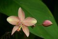
Great colours. Maybe they lack a foreground interest? Like a couple walking.
Nice shot anyways!
|
| Photo By: Teunis Haveman
(K:37426)
|
|
|
Critique By:
Joshua Koh (K:181)
11/23/2003 5:54:15 AM
Great Shot.
|
| Photo By: Teunis Haveman
(K:37426)
|
|
|
Critique By:
Joshua Koh (K:181)
11/21/2003 10:29:42 PM
I have no experience with PS so all i can say is to wipe your lens with some lens tissue before you shoot!!
=)
|
| Photo By: Dennis Wiener
(K:236)
|
|
|
Critique By:
Joshua Koh (K:181)
11/21/2003 10:07:08 PM
Would have liked it better if the horse was in a diff position. Maybe a side view in the same position? Like the compostition however...
well done alex
|
| Photo By: Alex Avilov
(K:634)
|
|
|
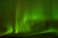
Critique By:
Joshua Koh (K:181)
11/21/2003 8:08:37 PM
Is this what they call aura or something like that?
like the feel of the photo anyohow. What ISO u use?
|
| Photo By: Derek Kennedy
(K:2270)
|
|
|
Critique By:
Joshua Koh (K:181)
11/21/2003 5:09:29 PM
Great use of symmetry and colour!
|
| Photo By: Christine Campbell
(K:2693)
|
|
|
Critique By:
Joshua Koh (K:181)
11/21/2003 5:08:07 PM
Interesting photo!!
|
| Photo By: Ed Konczal
(K:267)
|
|
|
Critique By:
Joshua Koh (K:181)
11/21/2003 5:06:46 PM
Great b&w. Compostition is perfect.
i like!
|
| Photo By: Duane Holmes
(K:61)
|
|
|
Critique By:
Joshua Koh (K:181)
11/21/2003 4:59:49 PM
Great Sunset!!!!
|
| Photo By: Barry Kusuma
(K:11)
|
|
|
Critique By:
Joshua Koh (K:181)
11/21/2003 4:59:00 PM
Doesn't seem too sharp to me. Or are my eyes decieving me? A tighter crop would be nice. Still a good photo though!
|
| Photo By: James Burnett
(K:370)
|
|
|
Critique By:
Joshua Koh (K:181)
11/21/2003 4:49:21 PM
I feel that there's no real focal intrest in the picture and it's kinda messy. The reflection on the top right hand side is also distracting. Hope i'm making sense...
=)
|
| Photo By: Ferran Lacruz
(K:5466)
|
|
|
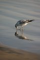
Critique By:
Joshua Koh (K:181)
11/21/2003 4:46:23 PM
Great shot! However, maybe it'll look nicer if the bird was a little more off centre. just my 2cents...
well done
i give you full marks!
|
| Photo By: Morgan Elliott
(K:364)
|
|
|
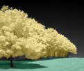
Critique By:
Joshua Koh (K:181)
11/21/2003 4:44:17 PM
Nice and simple. but i feel that the small branch in the left hand corner is a little distracting. doesn't really add to the mood of the scene! just my thoughts! good job though! =)
|
| Photo By: Marcell Paal
(K:24)
|
|
|
Critique By:
Joshua Koh (K:181)
11/21/2003 4:42:30 PM
Great shot!
Perfect!
|
| Photo By: Harry Eggens
(K:14804)
|
|
|
Critique By:
Joshua Koh (K:181)
11/21/2003 9:41:37 AM
Greag lighting, DOF. but it'll be nicer to have a slightly side view of the fish.
good job
Finding nemo!
=Y
|
| Photo By: Miguel Lasa
(K:62)
|
|
|
Critique By:
Joshua Koh (K:181)
11/21/2003 8:21:49 AM
Nice landscape! /the birds give a feeling of depth, but next time perhaps you can wait for them to get into a more appealing posstion!
just my 2c!
|
| Photo By: matthew kinslow
(K:2525)
|
|
|
Critique By:
Joshua Koh (K:181)
11/21/2003 6:23:38 AM
Nice photo! Well done jon!
The gradually changing colour from top to bottom of the photo is really nice, and so is the formation of the birds(are they ducks?)
=)
|
| Photo By: jon parsons
(K:13639)
|
|
|
Critique By:
Joshua Koh (K:181)
11/21/2003 5:10:48 AM
Great photo! It's a really nice landscape! May i know if the flare was done up in PS?
Or any other touch-up done?
|
| Photo By: Tommaso Razzano
(K:8073)
|
|
|
Critique By:
Joshua Koh (K:181)
11/21/2003 5:08:11 AM
Great DOF! It's a really nice potrait. The nice blurred background really does it for me!
Catchlight in the eyes are also great!
=)
|
| Photo By: Dan Arthur
(K:4280)
|
|
|
Critique By:
Joshua Koh (K:181)
11/21/2003 5:06:47 AM
Nice shot! It is very alluring! Care to share how u made it?
|
| Photo By: * kees *
(K:2357)
|
|
|
Critique By:
Joshua Koh (K:181)
11/20/2003 5:55:23 AM
Email me at joshkoh@hotmail.com, i think it's better we discuss it there then here, it doesn't seem appropriate here! =)
|
| Photo By: Joshua Koh
(K:181)
|
|
|
Critique By:
Joshua Koh (K:181)
11/20/2003 4:00:21 AM
I was hoping to do something like that!!! But i have no idea how to do it! Unsharp Mask has too many options!
Daniel-Do you mind if i send you a very large file and help me touch it up? Like the TIFF file?
Or if someone could guide me along using PS Elements would be pretty fine.
|
| Photo By: Joshua Koh
(K:181)
|
|
|
Critique By:
Joshua Koh (K:181)
11/18/2003 10:06:59 PM
Would you please give me a step by step way on how to improve it in PS Elements? Cos thats the only software i have and i have no experience with it whatsoever! But if you're not famillar with PS elements please leave down some tips to improve it anyway
Thanks for looking!
|
| Photo By: Joshua Koh
(K:181)
|
|
|
Critique By:
Joshua Koh (K:181)
11/10/2003 2:33:06 AM
Sky is a little plain but the composition is nice. There's also quite a bit of noise in the picture. Like the low viewpoint giving a majestic feel to photo. Maybe you can try early morning or late evening or some dramatic lighting.
Keep on trying
Regards
|
| Photo By: ati metwaly
(K:1378)
|
|
|
Critique By:
Joshua Koh (K:181)
11/10/2003 1:40:19 AM
Nice catchlight from the eyes! beautiful picture though its a little soft...
|
| Photo By: Brenda Sellers
(K:322)
|
|
|
Critique By:
Joshua Koh (K:181)
11/10/2003 1:34:55 AM
Nice colours and pattern!!
|
| Photo By: Marco Vredegoor
(K:7301)
|
|
|
Critique By:
Joshua Koh (K:181)
11/9/2003 3:47:21 AM
Nice composition!
josh
|
| Photo By: John Seymour
(K:218)
|
|
|
Critique By:
Joshua Koh (K:181)
11/9/2003 1:10:14 AM
Nice nice nice!
|
| Photo By: John White
(K:76)
|
|
|
Critique By:
Joshua Koh (K:181)
11/9/2003 1:09:09 AM
Nice colours! Well done!
|
| Photo By: Antonella Nistri
(K:21867)
|
|
|
Critique By:
Joshua Koh (K:181)
11/7/2003 5:18:57 PM
Good use of PS. Wish i could do the same!
|
| Photo By: Thomas J. Jordan
(K:0)
|
|

 talukder")