|
|
Critique By:
Judy Kessler (K:6316)
6/29/2003 8:55:35 AM
Wonderful work. Very eye catching and fun to see... well done.
|
| Photo By: Ken Richardson
(K:1381)
|
|
|
Critique By:
lowell whipple girbes (K:13151)
6/29/2003 5:56:48 AM
me like it
great portrait
|
| Photo By: Ken Richardson
(K:1381)
|
|
|
Critique By:
j w (K:12641)
6/28/2003 6:50:42 PM
You are to be congratulated on your control with the Velvia -- nice cubtle colors and good, light just about exactly right for my eye. The patina's wonderful, and any time I see anything like this, I think of all the hands . . .
I like the crop, myself. the jutting-out bit on the left gives it a diagonal (at least for my peculiar eye it does)
Nice job!
|
| Photo By: Ken Richardson
(K:1381)
|
|
|
Critique By:
Kostas Tzanetos (K:22012)
6/28/2003 1:19:46 PM
Why so small,Ken? Anyway,this is a beautiful photograph,and although I like the contrast of the biker with the black door I wouldn't mind to see him in front of the white wall.I also think that this image would be interesting in colour,as well. Regards,Kostas
|
| Photo By: Ken Richardson
(K:1381)
|
|
|
Critique By:
Sarah Moustafa (K:4456)
6/28/2003 10:42:53 AM
wonderful portrait, beautiful eye, good lighting, and excellent crop.
|
| Photo By: Ken Richardson
(K:1381)
|
|
|
Critique By:
Rhonda Prince (K:17687)
6/28/2003 8:30:24 AM
I love the patina of the wood. Wonderful lighting, especially to be shot through a window! Great job. I might question the crop just a tad, but what do I know? See you, Rhonda
|
| Photo By: Ken Richardson
(K:1381)
|
|
|
Critique By:
Rhonda Prince (K:17687)
6/28/2003 4:43:58 AM
Very minimal and effective. Oh, and by the way, I really love it! 
|
| Photo By: Ken Richardson
(K:1381)
|
|
|
Critique By:
Rhonda Prince (K:17687)
6/28/2003 4:41:42 AM
Keep the really bad flatbed, this really tugs at the heart strings in a must exquisite way!
|
| Photo By: Ken Richardson
(K:1381)
|
|
|
Critique By:
Rhonda Prince (K:17687)
6/28/2003 4:39:37 AM
You are back!!! I almost emailed you to see what happened to you but didn't want to be intrusive. This is great! Love the title! Thanks for the comments.
|
| Photo By: Ken Richardson
(K:1381)
|
|
|
Critique By:
Mattias Holgersson (K:38)
6/28/2003 12:14:28 AM
Just too good. Love this one!
|
| Photo By: Ken Richardson
(K:1381)
|
|
|
Critique By:
Mattias Holgersson (K:38)
6/28/2003 12:10:49 AM
Beautiful shot. You have captured the bicycleboy in an excellent way.
|
| Photo By: Ken Richardson
(K:1381)
|
|
|
Critique By:
edom ehceped (K:485)
6/27/2003 11:47:11 PM
good work!!!
|
| Photo By: Ken Richardson
(K:1381)
|
|
|
Critique By:
j w (K:12641)
6/27/2003 11:22:14 PM
oh my head!!! What a great title, Ken -- I love a good Floyd, and this one's stellar. I love his pose, like a wild animal about to strike with the clippers and comb. . .
Tones are great -- Floyd's got a touch of a halo, but that may be from the compression -- or maybe he really has one -- always hard to say with Floyds, you know . . .
|
| Photo By: Ken Richardson
(K:1381)
|
|
|
Critique By:
Giorgio Cardoni (K:2191)
6/27/2003 9:50:13 PM
very nice shot
|
| Photo By: Ken Richardson
(K:1381)
|
|
|
Critique By:
Lukasz Gladki (K:1101)
6/27/2003 10:00:54 AM
what a beautiful eyes...great portrait..
|
| Photo By: Ken Richardson
(K:1381)
|
|
|
Critique By:
j w (K:12641)
6/27/2003 10:00:54 AM
I'll echo Marcin on this one, Ken -- the composition's so perfect, really wonderful, that I like the lack of "true to life" deatil. Which I guess leads to the whole question of what a photograph is . . .
I know this one's a beauty.
|
| Photo By: Ken Richardson
(K:1381)
|
|
|
Critique By:
Mário Sousa (K:16985)
6/27/2003 10:00:54 AM
Excellent
|
| Photo By: Ken Richardson
(K:1381)
|
|
|
Critique By:
Marcin Gorski (K:12388)
6/27/2003 10:00:54 AM
such a bad treatment didn't worsen this image imo. Maybe opposite - you created original graphic based on grey tones with most impactful dominanta of white eyes. Beautiful square.
|
| Photo By: Ken Richardson
(K:1381)
|
|
|
Critique By:
j w (K:12641)
6/27/2003 10:00:54 AM
Hi Ken, good to see you again, and thanks for stopping by the dog palace . . .
I wish this were bigger. If wishes were horses, you know -- but that's my conplaint. Here are my compliments: I can't believed you caught him perfectly in the doorway while panning. The black doorway shows off his white pants and face perfectly -- and I'll bet that larger, there's some interesting stuff going on where the black shirt and black doorway meet.
On the gut/visual level, this is wonderful -- he's going somewhere, really going, and the sense is well conveyed.
|
| Photo By: Ken Richardson
(K:1381)
|
|
|
Critique By:
Hakan Aker (K:14146)
6/5/2003 5:41:34 PM
Very nice shot Ken
|
| Photo By: Ken Richardson
(K:1381)
|
|
|
Critique By:
Hakan Aker (K:14146)
6/1/2003 7:05:03 PM
Beautiful shot and camera angle Ken
|
| Photo By: Ken Richardson
(K:1381)
|
|
|
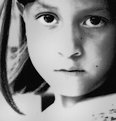
Critique By:
Hakan Aker (K:14146)
6/1/2003 6:54:47 PM
Excellent shot,the girl's looks and your croppingis first class.My best regards,Hakan
|
| Photo By: Ken Richardson
(K:1381)
|
|
|
Critique By:
Hakan Aker (K:14146)
6/1/2003 6:52:28 PM
Excellent shot,her looks are expressive,your croping is very nice i also loved her hair so much,beautiful photo Ken
|
| Photo By: Ken Richardson
(K:1381)
|
|
|
Critique By:
Amy Drake (K:996)
5/28/2003 8:09:42 PM
Striking.
|
| Photo By: Ken Richardson
(K:1381)
|
|
|
Critique By:
Amy Drake (K:996)
5/28/2003 8:06:06 PM
What a capture! She's gotta be saying, "I'll show you 'throws like a girl, jerk.'" That's perfect, it looks technically flawless to me - wonderful.
|
| Photo By: Ken Richardson
(K:1381)
|
|
|
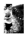
Critique By:
Rhonda Prince (K:17687)
5/24/2003 6:35:24 PM
Love this composition. Great detail. The little sparkle on the handle is exquisite. Regards, Rhonda
|
| Photo By: Ken Richardson
(K:1381)
|
|
|
Critique By:
j w (K:12641)
5/24/2003 12:15:22 AM
Everything a photograph should be (in my opinion): great tones, fabulous textures, a dynamic composition, and an unnameable element of beauty and mystery. Nicely done!
|
| Photo By: Ken Richardson
(K:1381)
|
|
|
Critique By:
Daniel Knutsen (K:3871)
5/23/2003 12:24:23 PM
Excellent!!! I love the tones!
|
| Photo By: Ken Richardson
(K:1381)
|
|
|
Critique By:
Marcin Gorski (K:12388)
5/23/2003 12:20:48 PM
I'd make it maybe even more sloped, but I am radical sometimes Excellent contrast, pleasing my engineering eye shapes and textures and above it terrific sky with the titled moon. Very well thought and executed. Regards
|
| Photo By: Ken Richardson
(K:1381)
|
|
|
Critique By:
Harlan Heald (K:15732)

5/23/2003 11:46:45 AM
Nicely composed with the strong diagonal. Great perspective and capture.
|
| Photo By: Ken Richardson
(K:1381)
|
|