|
|
Critique By:
l v (K:3830)
6/2/2003 2:57:22 PM
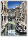
Naty, points are subjective and it's often hard to assign them, just look at the comments  I look at this picture and I don't go:"wow, I love it", hence the relative low score in appeal for me. I look at this picture and I don't go:"wow, I love it", hence the relative low score in appeal for me.
Luca
|
| Photo By: Uldra Johnson
(K:683)
|
|
|
Critique By:
l v (K:3830)
6/2/2003 2:55:49 AM
... and you did well. The shapes and colors are very pleasant to the eye, the only thing I don't like is the reflection on the top left.
Bye,Luca
|
| Photo By: Russ Pollanen
(K:275)
|
|
|
Critique By:
l v (K:3830)
6/2/2003 2:19:49 AM
Devo dire che a me la luce non piace tantissimo. Forse in bianco e nero mi piacerebbe, invece. La composizione e' molto bella, in particolare la direzione delle ombre.
Ciao,Luca
I must say that I don't like the light that much. Maybe in B/W I would have like it more. The composition is very nice, in particular the direction of the shadows.
|
| Photo By: paola f. casali
(K:7301)
|
|
|
Critique By:
l v (K:3830)
6/2/2003 2:14:29 AM
Continuo a pensare che queste non siano fotografie .... e che siano 'cose' (per mancanza di una definizione migliore) bellissime. Il cielo stona un po', sono d'accordo con l'altro commento.
Perche' non scrivi un articolo sui passaggi che fai per andare dalla foto digitale a queste composizioni?
Ciao,Luca
I still think that these are not pictures ... and that they are wonderful 'things' (for lack of a better word). The sky is not the best here. Why don't you write an article about your tecnique?
|
| Photo By: Alberto Agnoletti
(K:12811)
|
|
|
Critique By:
l v (K:3830)
6/2/2003 2:08:19 AM
Questa non mi piace troppo. La composizione e' molto bella, con il sentiero e la palizzata che portano alla costruzione (stalla? cos'e' di preciso?) e l'albero sulla destra. Il paesaggio pero' e' un po' troppo scuro, mentre il cielo e' sovraesposto. Avevo anch'io questi problemi con la fuji 2600, la 602 e' un po' meglio perche' ha piu' controllo. Il cielo sembra anche un po' rumoroso.
Ciao, LUca
Sorry for the Italian, I hope the translator works fine
|
| Photo By: Maurizio Savini
(K:2174)
|
|
|
Critique By:
l v (K:3830)
6/2/2003 2:03:02 AM
A really strange composition ! I like the colors and 'confused' look a lot, whereas I don't like the statue in the right: I keep focusing on it instead of the rest of the picture.
Bye,Luca
|
| Photo By: Uldra Johnson
(K:683)
|
|
|
Critique By:
l v (K:3830)
6/2/2003 1:56:01 AM
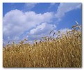
I agree: the sharp grain and soft, paint-like clouds are very well done. I also like how the line of the grain and the clouds have the same direction.
Bye,Luca
|
| Photo By: John Charlton
(K:5595)
|
|
|
Critique By:
l v (K:3830)
6/2/2003 1:44:04 AM
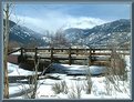
I am not sure I like a place where you can have a snowstorm in spring ... but it makes for a nice picture. I agree with Kristina about the exposure. I particularly like the way you tilted the bridge, making it much more interesting than in a straight-on view.
Bye,Luca
|
Photo By: Jim F
(K:8859)

|
|
|
Critique By:
l v (K:3830)
6/2/2003 12:08:30 AM
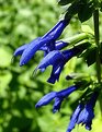
The flower is nice and I like the colorful background. I think that there is far too much light, though, which makes the picture really looks bad. It could be a little sharper, as well, but it's no big deal
Bye,Luca
|
| Photo By: Kye Emrys
(K:134)
|
|
|
Critique By:
l v (K:3830)
6/1/2003 11:51:44 PM
The shot is ok, if maybe a little soft. The eagle has a very fierce expression and it suits her. The black background is really bad, in my opinion, since it blends with the dark feathers. It might give more result to the head, but I don't think it's worth it.
Bye,Luca
|
| Photo By: Richard Lynch
(K:0)
|
|
|
Critique By:
l v (K:3830)
6/1/2003 2:32:59 PM
I think that the picture is rather soft, but it works in this scenario. THe lines are very pleasing to the eye.
Bye,Luca
PS: which settings do you use with the 602?
|
| Photo By: Mark McGloughlin
(K:437)
|
|
|
Critique By:
l v (K:3830)
5/31/2003 7:34:35 PM
Sorry for not answering directly earlier, I checked the cropped photo and thought I liked it more, but didn't think to leave a 2nd comment. Looking at them side by side, though (i had to download them), the uncropped version is overall more pleasing. I still find the out of focus flowers disturbing, though.
Luca
|
| Photo By: Heidi Hart
(K:853)
|
|
|
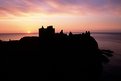
Critique By:
l v (K:3830)
5/31/2003 6:32:25 PM
I was looking at this picture and thinking that the silhoutte doesn't work here ... than I noticed the cropped one in the comments: much better; there just is too much black, as you say. The colors are wonderful, instead. Where is this place?
Bye,Luca
|
| Photo By: Howard Kennedy
(K:420)
|
|
|
Critique By:
l v (K:3830)
5/31/2003 6:27:47 PM
It is a fine picture with excellent lighting (7 for me), sharpness and color. It doesn't give me any particular feeling, though. What did you want to represent? I am afraid your point doesn't come across to me (I am probably just dumb ).
Bye,Luca
|
| Photo By: Adam Burton
(K:90)
|
|
|
Critique By:
l v (K:3830)
5/31/2003 5:56:56 PM
Nice picture. How large is this 'giant' ? You can't really guess from the photo. There is a little too much blue in the picture to make it really attractive, in my opinion.
Bye,Luca
|
| Photo By: Subha Pindiproli
(K:10108)
|
|
|
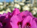
Critique By:
l v (K:3830)
5/31/2003 12:07:16 PM
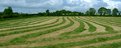
The flowers are nice and the dof effective, but I believe that the wall behind grabs too much attention.
Bye,Luca
|
| Photo By: Peter De Rycke
(K:41212)
|
|
|
Critique By:
l v (K:3830)
5/31/2003 2:38:34 AM
A nice picture, with excellent light. It would look better if the colors of the flowers weren't so lost in the middle of all that green.
Bye,Luca
|
| Photo By: Ersan Yuksel
(K:917)
|
|
|
Critique By:
l v (K:3830)
5/31/2003 2:36:12 AM
A simple but effective picture, I like it. A pity the flowers don't stand out more against the green; the dark shadow in the bottom left is a little distracting as well.
Bye,Luca
|
| Photo By: Studio East
(K:3349)
|
|
|
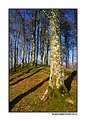
Critique By:
l v (K:3830)
5/31/2003 2:31:05 AM
Molto bella ! Credo mi piacerebbe di piu' se l'albero fosse 'spinto' dentro la foto e non fuori da essa. Mi riferisco all'inclinazione dei rami e dell'albero stesso verso sinistra.
Ciao,Luca
PS: ho anch'io la 602, che settings usi? Io 3Mp fine, soft sharpening
Very beautiful! I think I would like it even more if the tree wasn't pushed out of the picture. I am referring to the fact that the branches and the tree itself lean to the left.
|
| Photo By: lucio brando
(K:2295)
|
|
|
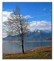
Critique By:
l v (K:3830)
5/31/2003 2:20:41 AM
Un pochino troppo bianca e con luce troppo forte per i miei gusti. La nebbiolina crea molta atmosfera, pero'. Che lago e'?
Ciao,Luca
A little too much bright for my taste. The fog gives a nice feeling.
|
| Photo By: lucio brando
(K:2295)
|
|
|
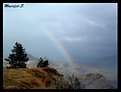
Critique By:
l v (K:3830)
5/31/2003 2:15:40 AM
Molto bella anche questa, si' ... e poi qualcuno dice che non si possono fare belle foto con una macchina semplice
A me da' un po' fastidio la tua 'firma digitale' proprio all'inizio dell'arcobaleno, ma non e' niente di grave.
Dove hai scattato queste foto?
Ciao,Luca
Very nice picture ... and somebody says you can't take nice photos with a point and shoot I find the digital signature right at the beginning of the rainbow a little annoying, but no big deal.
|
| Photo By: Maurizio Savini
(K:2174)
|
|
|
Critique By:
l v (K:3830)
5/31/2003 2:03:59 AM
I don't think comments are needed, either !
I don't like the framing and maybe the rocks in the foreground take some attention away from the rest of the picture; everything else (expecially colors and mood), are very nice.
Bye,Luca
|
| Photo By: Kaj Nielsen
(K:15279)
|
|
|
Critique By:
l v (K:3830)
5/31/2003 1:48:20 AM
Beautiful, relaxing colors. I believe that the picture is a little soft but maybe making it sharper would spoil the mood a little. I probably would have preferred less 'open space' on the left side.
Bye,Luca
|
| Photo By: Cedric Sims
(K:3259)
|
|
|
Critique By:
l v (K:3830)
5/31/2003 1:38:43 AM
Nice atmosphere, I think you rendered the 'foggy morning' well. I also like how the path leads you into the woods. The top is maybe a little overexposed.
CIao,Luca
PS: fammi sapere se preferisci i commenti in italiano
|
| Photo By: Maurizio Savini
(K:2174)
|
|
|
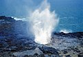
Critique By:
l v (K:3830)
5/31/2003 1:19:12 AM
An interesting rock formation and composition. The light on the rock itself let you see a lot of details, but the sky/background is overexposed, giving the picture a rather washed out look (at least on my monitor).
Bye,Luca
|
| Photo By: John Jackson
(K:1738)
|
|
|
Critique By:
l v (K:3830)
5/31/2003 1:13:40 AM
A very nice perspective of a rather unusual architecture (for me!). I find it a little dark and would have maybe preferred more saturated colors. It makes me think it's a cold place, whereas I like to imagine it in the middle of a hot desert battle. I like it.
Bye,Luca
|
| Photo By: Musabah Almarar
(K:866)
|
|
|
Critique By:
l v (K:3830)
5/31/2003 1:11:24 AM
I believe that it could be a little sharper. I find that the large white cloud takes a lot of attention away from the scene, which is a pity. Nice picture, a part from the above
Bye,Luca
|
| Photo By: Jun Ma
(K:511)
|
|
|
Critique By:
l v (K:3830)
5/31/2003 1:00:31 AM
I like the color contrasts in this photo, as well. It might have been better without the dark shadow in the bottom left and (maybe) the sky at the top corner.
Bye,Luca
|
| Photo By: Eric Goldwasser
(K:4294)
|
|
|
Critique By:
l v (K:3830)
5/31/2003 12:56:59 AM
I like the color combination, the DOF works nicely and the crop is very interesting. A wonderful picture overall.
Bye,Luca
|
| Photo By: Eric Goldwasser
(K:4294)
|
|
|
Critique By:
l v (K:3830)
5/31/2003 12:50:30 AM
A very nice and soothing composition. I like the line of pink in the middle of the green. I am not a fun of this kind of postprocessing but the blur/dream feeling is very effective here.
|
| Photo By: Eric Goldwasser
(K:4294)
|
|