|
|
Critique By:
l v (K:3830)
6/16/2003 3:38:58 AM
I like this photo; the only comment I have is that it seems a little dark. It might be a little sharper, but nothing important.
Bye,Luca
|
| Photo By: Syl F Greg
(K:529)
|
|
|
Critique By:
l v (K:3830)
6/16/2003 3:34:21 AM
I like the simplicity and the DOF effect of this picture, whereas the horizon seems tilted to the right and I find it slightly disturbing.
Bye,Luca
|
| Photo By: Jacek Kasperczyk
(K:9)
|
|
|
Critique By:
l v (K:3830)
6/12/2003 3:27:19 AM
Butterflies are usually photographed with the wings open, but I like this 'pose' too and it add something a little different; I also like the slightly tilted orientation. Sharpness and definition are excellent. I believe it would have been better if the whole body was in focus, but I know you have very narrow DOF in these macro shots. The yellow flower and green background work well. I am giving it a 6, which is a very high score for me.
Bye,Luca
|
| Photo By: Marja Konimaki
(K:178)
|
|
|
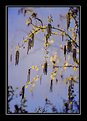
Critique By:
l v (K:3830)
6/11/2003 12:25:27 AM
Trovo i riflessi un po' fastidiosi. La composizione, invece, mi piace molto, anche se forse avrei preferito un soggetto diverso da un albero sulla sinistra.
Ciao,Luca
|
| Photo By: Oreste Antignano
(K:1898)
|
|
|
Critique By:
l v (K:3830)
6/10/2003 1:53:22 AM
Il voto di 'appeal' sale perche' conosco il posto  Tra l'altro hai preso un buon angolo! Mi piace il riflesso, cosi' come l'albero sulla destra in primo piano. Non mi piacciono tanto i due rami sulla sinistra, invece, il cielo e lo sfondo, un po' piatto e 'foschioso'. Tra l'altro hai preso un buon angolo! Mi piace il riflesso, cosi' come l'albero sulla destra in primo piano. Non mi piacciono tanto i due rami sulla sinistra, invece, il cielo e lo sfondo, un po' piatto e 'foschioso'.
Ciao,Luca
|
Photo By: Roberto Arcari Farinetti
(K:209486)

|
|
|
Critique By:
l v (K:3830)
6/10/2003 1:44:47 AM
Bella composizione; prende anche molti punti in appeal perche' mi piacciono molto le foto controsole (ne ho moltissime anch'io). I riflessi sono davvero un po' troppi e troppo intensi; i due piu' in alto ci sarebbero anche potuti stare, ma gli altri forse no. Io non ho ancora capito come fare ad evitarli sistematicamente, se qualcuno volesse insegnarmi ...
Ciao,Luca
PS: uploadi molte piu' foto di quante riesca a commentarne, sono rimasto indietro !
|
| Photo By: Roberto Arcari Farinetti
(K:209486)
|
|
|
Critique By:
l v (K:3830)
6/10/2003 1:11:59 AM
A very sharp image with a great '3d view' to it! I like the composition, too, with the trees on each side creating a path for you to get into. It might have been even better if the gate were open. The only minor problem might be the dark shadow on the trees on the left. I am giving it a 6, which is a very high score in my view
Bye,Luca
|
| Photo By: Thomas Schwalk
(K:9)
|
|
|
Critique By:
l v (K:3830)
6/10/2003 12:57:34 AM
OK, la foto e' un po' mossa (in senso orizzontale, intendo), ma immagino che sia stata fatta da un auto ed e' quindi gia' venuta bene cosi'. Rimane pero' molto interessante e attraente.
Ciao,Luca
PS: ho continuato la nostra conversazione sui colori nella mia foto del tramonto.
|
| Photo By: Oreste Antignano
(K:1898)
|
|
|
Critique By:
l v (K:3830)
6/9/2003 10:23:39 PM
Beh, caro Oreste, sembra che sia io ad avere un'idea diversa dagli altri .. .ti fa vedere quanto capisca di fotografia
Ciao,Luca
|
| Photo By: Oreste Antignano
(K:1898)
|
|
|
Critique By:
l v (K:3830)
6/9/2003 10:22:04 PM
David, I would have just waited until later in the day .... I could never push myself to wake before sunrise ! Next time fold your tent before you take the picture 
Luca
|
| Photo By: David Tasker
(K:4281)
|
|
|
Critique By:
l v (K:3830)
6/9/2003 10:19:46 PM
I believe that the version in your added comment is better. Still a little uninspiring and with too much 'empty' sky, but the row of lights on the right add somethings.
Bye,Luca
|
| Photo By: Irenka Daniluk
(K:8011)
|
|
|
Critique By:
l v (K:3830)
6/9/2003 10:14:47 PM
I am glad you appreciate it, Karl. I always try to describe what I see/feel; I don't think one can always say a picture is perfect, we all know that perfect pictures are rare. I am not good at giving marks, but you will find that my ratings at least try to mean something, as well.
I myself prefer a comment explaining why a picture of mine is bad rather than no comment at all
Luca
|
| Photo By: karl magnuson
(K:373)
|
|
|
Critique By:
l v (K:3830)
6/9/2003 3:17:09 AM
Very nice capture. I think its only problem is that the colors are not vivid, thus the thumbnail suffer. I like the DOF, it's just a pity that the 3rd biker is partly covered by the 1st, but no big deal.
Bye,Luca
|
| Photo By: Luc Weyers
(K:49)
|
|
|
Critique By:
l v (K:3830)
6/9/2003 1:24:27 AM
Good color combination and composition; the DOF works nicely. I agree that it needs to be sharpened.
Bye,Luca
|
| Photo By: Marcelo Aveiro
(K:22)
|
|
|
Critique By:
l v (K:3830)
6/8/2003 11:06:35 PM
The flowers is nice, but I don't like the strong blue background. It looks like a kid painting, which could make a different story, i guess . Given the strong contrast, the main flower seems almost pasted into the picture. I like the composition and blurred background.
Bye,Luca
|
| Photo By: karl magnuson
(K:373)
|
|
|
Critique By:
l v (K:3830)
6/8/2003 11:02:48 PM
The scanner doesn't have to be broken to give a blue cast, not optimal settings could do it. Easy to tell though: was the original picture blue ?
There are plenty of online tutorials on photoshop which explain things much better than I could. I can tell you, though, that I used levels and curves (both on the individual color channels) to adjust your picture; the aim was to have the lighthouse white (grey in the shadow). The sand is probably too red this way, but I just did a quick fix.
I finally applied unsharp masking, settings about 55%, 1, 3
Bye,Luca
|
| Photo By: Mark Peterson
(K:3452)
|
|
|
Critique By:
l v (K:3830)
6/8/2003 10:56:47 PM
Wonderful. I like the composition and sharpness and DOF are very good, although the lowest flower is a little out of focus. The lowest flower could also be cropped a little more or a little less, it looks incomplete as it is. I don't know what the spots on the inside are but I like them.
Bye,Luca
Which settings do you use? I have the 602 and use 3Mp fine, soft sharpening.
|
| Photo By: Mavis Dean
(K:3962)
|
|
|
Critique By:
l v (K:3830)
6/8/2003 10:49:55 PM
It's a little grainy and not very sharp, but these are minor details. It's a nice sunset, although the red cloud on the left feel almost out of place, being so different from the others.
Bye,Luca
|
| Photo By: Ronald Allen
(K:2934)
|
|
|
Critique By:
l v (K:3830)
6/7/2003 4:04:00 AM
Hi Mark, did you want the picture to have a blue cast or is it a scanner problem? I don't like it this way, altough the composition looks nice to me (I am putting the color problem into the lighting score)
I quickly adjusted the colors (assuming the buildings were white) and applied some USM; it looks like this.
Bye,Luca
|
| Photo By: Mark Peterson
(K:3452)
|
|
|
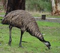
Critique By:
l v (K:3830)
6/7/2003 3:10:45 AM
Another interesting and unusual (for me) animal in your portfolio I like the balanced pose of the emu,whereas the dark tree behind it is not the best of things. The colors are a little unactractive, but I prefer realistic images to surreal, saturated ps alterations. Not a masterpiece but a nice photo.
Bye,Luca
|
| Photo By: John Jackson
(K:1738)
|
|
|
Critique By:
l v (K:3830)
6/7/2003 3:05:12 AM
You are right: there is something very captivating about this picture. I don't know if it's the intricated shapes, the wheel or the shadows ... a combination of everything, probably. Lighting is very good and the sky looks very effective.
Bye,Luca
PS: I am giving it a 6 and 7 in some categories, which is a very high score for me.
|
| Photo By: George Fay
(K:262)
|
|
|
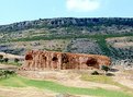
Critique By:
l v (K:3830)
6/7/2003 3:00:08 AM
A beautiful sky, with good lighting and color. Unfortunately, though, I find this picture rather uninspiring, it doesn't move me or make me think about anything in particular.
Bye,Luca
PS: what are those strange diagonal lines in the bottom left? Electric cables?
|
| Photo By: Irenka Daniluk
(K:8011)
|
|
|
Critique By:
l v (K:3830)
6/7/2003 2:53:59 AM
Can you tell us something about what they are doing? The colors are the striking part of the picture and they are beautifully rendered. There is no definition in the white parts of the hats and I find the strong white just a little disturbing; a very minor point though. The movements you can see are nice.
Bye,Luca
|
| Photo By: necati uyar
(K:497)
|
|
|
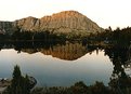
Critique By:
l v (K:3830)
6/7/2003 2:47:33 AM
About the grain: did you try some 'denoise filter' in photoshop or similar programs ? The reflection is great and the composition is fine, with the small exception of that blue thing (boat?) on the right. The orange cast on the rock is very nice, but the trees are too dark and the sky really looks bad, in my view.
Bye,Luca
|
| Photo By: David Tasker
(K:4281)
|
|
|
Critique By:
l v (K:3830)
6/7/2003 2:44:32 AM
Spero di poter dire che non penso sia eccellente, come gli altri sembrano indicare, senza offenderti. Il cielo soprattutto, ma un po' l'intera foto, e' sovraesposto; la fotografia appare molto statica e, almeno a me, non da' alcuna particolare emozione. Non e' che sia orribile, ma non e' neanche niente di speciale Hai altre foto molto migliori, lascero' qualche commento nei prossimi giorni.
Ciao,Luca
I hope I can say it's not an excellent picture, as the others state, without offending you. The sky and the picture in general seems overexposed; the photo is very static and doesn't give any particular feeling to me. It's not an horrible picture, but it's nothing special either. Others pictures in the portfolio are much better IMO.
|
| Photo By: Oreste Antignano
(K:1898)
|
|
|
Critique By:
l v (K:3830)
6/7/2003 2:36:40 AM
This picture is not sharp at all ... but the snow is supposed to be soft ! I would have called it 'silence', since this is the feeling I have when looking at it. It might have been even better if there was a little more detail in the snow behind the bench (on the right) to give some more impression of depth: it looks a little flat to me. A very minor point, anyway.
Bye,Luca
|
| Photo By: Irenka Daniluk
(K:8011)
|
|
|
Critique By:
l v (K:3830)
6/7/2003 2:31:28 AM
Just another sunrise, sure, but a well executed one ! I particularly like how the different colors form a funnel that leads you to the sun. The picture is a bit soft, but it probably works here by smoothing the water out. In this particular picture I feel that the clouds are a disturbing agent, since they brake the regularity and simmetry (well, almost simmetry ) of the rest of the composition.
Bye,Luca
|
| Photo By: Richard Wells
(K:310)
|
|
|
Critique By:
l v (K:3830)
6/7/2003 2:14:31 AM
Dear Laurens, I hope you don't mind if I am a little harsh on this picture. The curved path leading into the picture and the lamppost are fine, the fence on the left looks bad but you could do nothing about it. Lighting is really bad, though, spoiling the whole picture. The white, overexposed, sky looks terrible, and the rest of the picture is too dark. DOF and sharpness are well controlled.
Bye,Luca
|
| Photo By: Laurens Cerdi
(K:467)
|
|
|
Critique By:
l v (K:3830)
6/6/2003 1:46:14 AM
Fine capture, but I like the previous one much more: the bird had a much better pose/expression.
Bye,Luca
|
| Photo By: John Jackson
(K:1738)
|
|
|
Critique By:
l v (K:3830)
6/6/2003 1:44:34 AM
The wings are wonderful and DOF very well controlled. Composition is fine, but I think it would have been better to have the branch on the other side of the picture. The photo is too dark, though. I also believe that the lack of color makes for an unattractive thumbnail, which is a pity.
Bye,Luca
|
| Photo By: Henrik Gerdemann
(K:448)
|
|