|
|
Critique By:
sibheen s. apel (K:401)
10/6/2003 6:03:03 AM
You talk about "visual speech" in your profile. Indeed - a strong speech you have Your folio is talking "in motion" - sth you have to look for in the usual "taste" for photographic imagery. Your folio is talking "in motion" - sth you have to look for in the usual "taste" for photographic imagery.
|
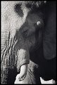
| Photo By: ana ribeiro
(K:21290)
|
|
|
Critique By:
sibheen s. apel (K:401)
10/6/2003 6:00:03 AM
I'm a sucker for old hands! They are as good as a portrait of a certain person.
|
| Photo By: Damir Cudic
(K:2558)
|
|
|
Critique By:
sibheen s. apel (K:401)
8/18/2003 4:55:02 AM
Enrica, is that YOU??? LOl, surfing your folio there seems to be no doubt about it!
This is a wedding pic that brought a smile onto my face You really grabbed a memorable situation! You really grabbed a memorable situation!
Hmmm, cutting the trees at the top is a bit harsh for my liking, but well - still an appealing image!
|
| Photo By: kita mcintosh
(K:18594)
|
|
|
Critique By:
sibheen s. apel (K:401)
7/11/2003 3:09:35 PM
Terry I love the duality of this image! You did well not to show too much of the upper part to let the reflection tell the story Though I even might have cropped more from the top... Though I even might have cropped more from the top...
|
| Photo By: Terry Irwin
(K:979)
|
|
|
Critique By:
sibheen s. apel (K:401)
7/11/2003 2:42:51 PM
Bob Great textures! It's like with old people - this skin can tell you stories. Hmh, I miss a bit of depth though, not sure, if it's a tad lack of focus or dof - maybe jpeg compression.
Oh, by the way, my harddrive had a breakdown and I lost your email addy. Would you be so nice to email me? Then I could add you to my info email list - well, if you want...
|
| Photo By: Bob Stapleton
(K:575)
|
|
|
Critique By:
sibheen s. apel (K:401)
6/12/2003 10:34:46 AM
You caught her expression well! Not sure about the grain here - though I love textures like those. In this case it gives her an unnecessary touch of "age" kinda I also might have avoided her square earring. The edgy form does not correspond with the more dominant round forms.
|
| Photo By: Luigi Scuderi
(K:4407)
|
|
|
Critique By:
sibheen s. apel (K:401)
4/24/2003 10:42:37 AM
Zosia I can imagine why you love it - it brings back childhood memeries to me. Great use of MF - I'm just again back into that myself. And you made the best of the tonal possibilites of the Delta 400 as I see
|
| Photo By: zosia zija
(K:11106)
|
|
|
Critique By:
sibheen s. apel (K:401)
4/24/2003 10:32:51 AM
Jay Still one of the best portraits you have! The dramatic use of light really kicks butt. And the weird atmosphere really haunts you and lets you watch this image again and again. I can imagine this in 16x20 - phew!
|
| Photo By: Jay Gumm
(K:3084)
|
|
|
Critique By:
sibheen s. apel (K:401)
4/24/2003 10:29:05 AM
Andy You know I always loved your "Axel" series - this image is no exception. I especially like how you combine static elements with motion. The pose of his arms and legs is greatly juxtaposed to the motion of that kilt. And that colour really "kills"
|
| Photo By: Andrew Caldwell
(K:18307)
|
|
|
Critique By:
sibheen s. apel (K:401)
4/7/2003 5:03:15 AM
Autumn You seem to be on a good way to become "famous"
Seriously: this is a good portrait. Appealing tonality and wise choice of dof. Lays definitely emphasis onto her gloomy eyes. I also like her hair kinda crossing her face. Gives a more vivid expression.
Though I like you rough approach of presentation I have to agree with comments burining in that top left corner. It's too bright and attracts the viewers eyes too much
Slán!
P.S.: And you were right about your dof suggestion on "sense of age"
|
| Photo By: Autumn Ruhe
(K:993)
|
|
|
Critique By:
sibheen s. apel (K:401)
4/6/2003 12:19:35 PM
Wojciech You created a stimulating, surreal kinda image - good sense for composition, no doubt. And I like grain What keeps my mind boggling still is the contrast. There are areas definitely too dark for my liking, e.g. the horizontal line, formed by those bushes, ending up at that mountain. I miss more "inbetweens" concerning tonality - though I see you love stark contrasty imagery. Hmh, in this case the image appears like having a grey overcast. Get what I mean? By the way: what paper did you use? The choice of gradation might be of help aswell.
Slán!
|
| Photo By: Wojciech Wrona
(K:2)
|
|
|
Critique By:
sibheen s. apel (K:401)
4/6/2003 7:24:02 AM
United colours of...you know! Sorry, couldn't resist. Great portraiture, technically well executed. Excellent dof. Prooves your profession as "commercial" phtographer - in a positive sense!
Slán!
|
| Photo By: Siddharth Siva
(K:3327)
|
|
|
Critique By:
sibheen s. apel (K:401)
4/6/2003 4:32:06 AM
Rui This one is still one of my favourites Angle of view, composition, textures - to name just a few ingredients of the "recipe of success" concerning this image. You know I'm not easy to impress - and I do not like all stages of postproduction regarding your other pieces of work - but here you really show us a great photo
Slán!
|
| Photo By: Rui Palha
(K:13624)
|
|
|
Critique By:
sibheen s. apel (K:401)
4/6/2003 4:25:35 AM
Aiman Well, thumb reminded me of somewhere down in London tube, lol - and now look at your comment! You made a good job concidering the tricky lighting situation at places like those. I agree - composition is on spot - great use of leading lines.
Slán!
|
| Photo By: Aiman Nassar
(K:11961)
|
|
|
Critique By:
sibheen s. apel (K:401)
4/5/2003 8:18:40 AM
Martin I see you are for portraits aswell. And shooting kids - lol, in the metaphorical sense - is a challenge on it's own. I think you caught her character quite well. Every girl in that age likes to look like a princess Hmh, maybe you've overdone it a tad with the make up, especially the Rouge. It's too visible imho.
Not sue about the dark backrop aswell. Ok, it adds depth, but gives the whole image also sth "heavy" and dark. If you consider her nice blue jean shirt I might have chosen a lighter blue scale or white background. That also might have stressed her skin textures and eyes.
I hope I didn't sound too picky
Slán!
Sib, CC
|
| Photo By: Martin Fisher
(K:5393)
|
|
|
Critique By:
sibheen s. apel (K:401)
4/5/2003 4:23:41 AM
Dia dhuit, Arthur I just joined. Good to see you here You already know what I think about this shot Have to get used to this system here I think So be sure I will tear your next pic into pieces
Slán! Sib, CC
|
| Photo By: Arthur Sevestre
(K:552)
|
|


")