|
|
Critique By:
Fred Buckley (K:437)
5/8/2003 10:59:37 AM
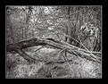
Great work Kevin. Your photos are very well seen, and the tones in your B+W's are perfect. I'm impressed with your whole portfolio. To answer your question, Ebb Tide was shot in Spiddle, Ireland. Thanks, and keep up the great work.
|
| Photo By: Kevin Salter
(K:649)
|
|
|
Critique By:
Fred Buckley (K:437)
5/8/2003 10:49:57 AM
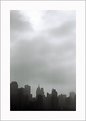
Thanks for the wonderful comment. This photo was made in Spiddle, Ireland.
|
| Photo By: Fred Buckley
(K:437)
|
|
|
Critique By:
Fred Buckley (K:437)
5/7/2003 7:08:00 PM
John,
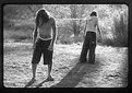
I continuously come back to this image. There is just something about it. It's so emotionally charged. The shape of the woman's calf kills me in this one. And the static nature of her among all the noise. Every time I look at this image, I find myself standing in New York. Suddenly the world goes silent, and the only thing that exists is this pair of legs. The best part about it is, nobody else sees them. Thanks. -Fred
|
| Photo By: John Strazza
(K:11535)
|
|
|
Critique By:
Fred Buckley (K:437)
4/28/2003 4:49:47 PM
Yes I agree. It's almost always about emotions. Great work as usuall.
|
| Photo By: John Strazza
(K:11535)
|
|
|
Critique By:
Fred Buckley (K:437)
4/24/2003 11:02:29 PM
This is a beautiful photo. There's a great story within it. However, I do wish the lighting was a bit more natural looking. I think that it would add to the honesty of the image.
|
| Photo By: Surajit Mukerji
(K:3889)
|
|
|
Critique By:
Fred Buckley (K:437)
4/24/2003 10:30:50 PM
I love the legs coming out from under the sign. You are very adept at communicating your vision. I feel like I can see what you are seeing. Great work.
|
| Photo By: John Strazza
(K:11535)
|
|
|
Critique By:
Fred Buckley (K:437)
4/15/2003 9:48:59 PM
So far my favorite out of this series. Great warm feeling.
|
| Photo By: Karen Johnson
(K:2951)
|
|
|
Critique By:
Fred Buckley (K:437)
4/14/2003 1:45:28 PM
perfect.
|
| Photo By: Aurore Lynch
(K:1687)
|
|
|
Critique By:
Fred Buckley (K:437)
4/13/2003 9:10:00 PM
Thank you for the inspirational comments on my work. I think yours is some of the best street photography that I've seen in a while. Recieving positive critique from someone whos work I admire, is encouraging. Unfortunately so many photographers today have fallen into the trap of being nothing more than equipment operators. Their eyes are not open to the world that they are recording. There is something that I always try to remember not only when making photographs, but also when viewing them. It is that every photograph is in some small way a self portrait of the artist. I look forward to seeing your work as you post it.
|
| Photo By: John Strazza
(K:11535)
|
|
|
Critique By:
Fred Buckley (K:437)
4/13/2003 9:49:29 AM
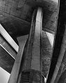
The lighting and contrast are intentional. This isn't really an architectual image. What I was trying to do was show the juxtaposition of the beautiful arrangement of shapes, and the darker reality of what it represents(traffic, overpopulation, societal problems, destruction of the environment.....). I toyed with naming it "Babylon" but went with interchange instead. Maybe "Babylon" would have made my intentions a little clearer. Just thought I would clear that up.
|
| Photo By: Fred Buckley
(K:437)
|
|
|
Critique By:
Fred Buckley (K:437)
4/9/2003 4:33:24 PM
Alex,
Both of the playground photos that you have posted so far are brilliant. Great traditional B+W work. I hope that you have more of these to share with us.
|
| Photo By: Alex Shapiro
(K:-7)
|
|
|
Critique By:
Fred Buckley (K:437)
4/9/2003 4:17:57 PM
Great composition. You captured the emotion of the moment very well.
|
| Photo By: Kathleen McGivney
(K:112)
|
|
|
Critique By:
Fred Buckley (K:437)
4/8/2003 10:24:15 AM
I don't know if I would consider the soft focus and the harsh lighting technical problems. Those are decisions that the photographer made at the time of shooting based on what he/she wanted the final image to look like. I think it looks good. However I do wish that you would translate these for us. You translated one for someone on another image, and I like it a lot better when I know what is written. Great work.
|
| Photo By: Beth Lasoff
(K:539)
|
|
|
Critique By:
Fred Buckley (K:437)
4/5/2003 1:31:53 PM
Excellent exposure. I can feel the crispness in the air.
|
| Photo By: Kathleen McGivney
(K:112)
|
|
|
Critique By:
Fred Buckley (K:437)
4/5/2003 1:13:59 PM
Mr Arrey,
Thanks for the comment. Your right about the size. Unfortunately, computers and digital stuff are still a mystery to me. I don't really understand sizing and scanning. I always just guess and hope for the best. -Fred
|
| Photo By: Fred Buckley
(K:437)
|
|
|
Critique By:
Fred Buckley (K:437)
4/5/2003 11:52:53 AM
Martin, I see what you mean about these photos. I think all these shots have nice elements to them. Like all other photos that have ever been shot, they also have things that could be improved upon. What I like best about this series, is that you took a lot of shots with a lot of different lighting ideas; instead of the standard "Color by numbers" photography style. Alfred Stieglitz didn't go through all that trouble to fuse art and photography, just so that we can plug in the strobes and photograph with blinders on. keep seeing and experimenting. -Fred
|
| Photo By: Martin Fisher
(K:5393)
|
|
|
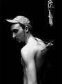
Critique By:
Fred Buckley (K:437)
4/4/2003 2:23:34 PM
Hi Kathleen. I just wanted to say that I like the use of negative space on this one. I don't have a problem with the face being soft. Instead I would have liked to see the hooks and the equipment that he was suspended from be a little sharper. Interesting how we both shot a similar event, but our photos are very different. I'm having great fun looking at your work. -Fred
|
| Photo By: Kathleen McGivney
(K:112)
|
|
|
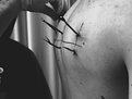
Critique By:
Fred Buckley (K:437)
4/4/2003 2:17:20 PM
Great shot Kathleen. I'll enjoy looking at your suspension photos as you post them. I have about 170 images from mine. I wont post all of them, but enough to show a complete documentory of the event. Also, I appreciate your comments. There are lots of things that I would have done differently if I had it to do over again. I guess hind sight is always 20/20. In the meantime I would love to hear your comments as I post them. Keep up the good work.
|
| Photo By: Kathleen McGivney
(K:112)
|
|
|
Critique By:
Fred Buckley (K:437)
4/2/2003 4:47:09 PM
The subtle tones that you have brought out in the model's hair are amazing. It looks like her hair was painted on the paper. I think that I agree with the comment about what she is wearing though. Her skin tones are so perfect, that I hate to see it broken up with clothing. I think that this is a beautiful portrait, but I'd like to see it as a nude study. Either way, it does my eyes good to look at it.
|
| Photo By: Karen Johnson
(K:2951)
|
|
|
Critique By:
Fred Buckley (K:437)
3/27/2003 9:12:22 AM
I love this whole series that you have shot with this girl. Your decision to cover her eyes was perfect. My only problem is with the background. Maybe if you moved the model away from the wall a little bit. That way the texture on the wall would drop out of focus a little more, and maybe be less distracting. Other than that, they are done to perfection. Bravo.
|
| Photo By: Odin Arti
(K:0)
|
|
|
Critique By:
Fred Buckley (K:437)
3/25/2003 3:10:19 PM
Great lighting. Also I like the expression of the model. Her eyes are very engaging. Nicely done.
|
| Photo By: Karen Johnson
(K:2951)
|
|
|
Critique By:
Fred Buckley (K:437)
3/25/2003 3:09:30 PM
Great lighting. Also I like the expression of the model. Her eyes are very engaging. Nicely done.
|
| Photo By: Karen Johnson
(K:2951)
|
|