|
|
Critique By:
Richard Walters (K:480)
2/3/2003 2:22:19 PM
So ... how many prints did you have to make?
I cant get my family members to pay for my work ... let me know if you had better luck than I. ( Ha! Ha! )
|
| Photo By: Kevin Garrett
(K:8)
|
|
|
Critique By:
Lisa Howeler (K:3706)
2/2/2003 3:10:36 PM
I've created a monster -- now my dad says your photo has good contrast and he likes the fact that there is not a border on this photo because he thinks it would be distracting. (good grief -- hope that is all he has to say about how good this photo is :-) Just kidding.)
|
| Photo By: Kevin Garrett
(K:8)
|
|
|
Critique By:
Lisa Howeler (K:3706)
2/2/2003 3:06:45 PM
My dad who says he is not a photo expert -- and is joining me in looking at this site today -- would like to say he really likes this photo. He said it is well composed, has depth, is well lined up, the photo is full of attractive people and is just nice, he says. And well, I tend to agree! NIce job.
P.S. Dad said to write "Could you make my family look this good?" THen told me not to, but I did anyhow... ha, ha!
|
| Photo By: Kevin Garrett
(K:8)
|
|
|
Critique By:
Stephen Rogers (K:3370)

2/2/2003 7:27:59 AM
This is a good picture as the warmth of the subjects can be felt. They look very relaxed and natural. I too would have removed the plant from the right and maybe had a little less DOF to soften the background as there are some plant growths that are in focus just behind the subjects. Still, a great photo.
|
| Photo By: Kevin Garrett
(K:8)
|
|
|
Critique By:
Mike Scott (K:1817)
2/2/2003 7:10:29 AM
Very nice. Would be perfect if the woman on the right was looking at the camera and maybe standing feet apart so not to repeat the woman on the left (who looks so comfortable in this pose).
And the dog - he should be looking at the camera too. This of course, isn't easy to accomplish. First you need a cat and some duct tape...
|
| Photo By: Kevin Garrett
(K:8)
|
|
|
Critique By:
Andy Eulass (K:13435)
2/2/2003 7:04:26 AM
Very nice portrait that has a lot of warmth to it. Both of them look pretty relaxed and their facial expressions don't look stiff at all. As a matter of personal taste, I would have removed the stalk that you see in front of mom's arm, but it really doesn't harm the work that much. Well done.
|
| Photo By: Kevin Garrett
(K:8)
|
|
|
Critique By:
Vivek Gopal (K:134)
2/1/2003 11:32:13 PM
cool potrait.
did everyone agree to wear black?
surreal if not.
|
| Photo By: Kevin Garrett
(K:8)
|
|
|
Critique By:
M.M. Meehan (K:3751)
1/30/2003 2:37:17 PM
Good colors. Nice silhouette. Very serene.
|
| Photo By: Kevin Garrett
(K:8)
|
|
|
Critique By:
Bart Aldrich (K:7614)
1/29/2003 12:03:00 PM
Square is also good, but this fine too.
|
| Photo By: Kevin Garrett
(K:8)
|
|
|
Critique By:
Kevin Garrett (K:8)
1/29/2003 11:56:38 AM
Both are good! Thanks again Anindya and Petra!
|
| Photo By: Kevin Garrett
(K:8)
|
|
|
Critique By:
Kevin Garrett (K:8)
1/29/2003 11:54:06 AM
Thanks for the suggestion. I made my post before I had seen yours!!!
|
| Photo By: Kevin Garrett
(K:8)
|
|
|
Critique By:
Anindya Maity (K:7880)
1/29/2003 11:53:26 AM
But I like this crop most
|
| Photo By: Kevin Garrett
(K:8)
|
|
|
Critique By:
Kevin Garrett (K:8)
1/29/2003 11:51:54 AM
Is this a better crop???
|
| Photo By: Kevin Garrett
(K:8)
|
|
|
Critique By:
Anindya Maity (K:7880)
1/29/2003 11:49:23 AM
One possibility
|
| Photo By: Kevin Garrett
(K:8)
|
|
|
Critique By:
Petra Engle (K:1282)
1/29/2003 11:40:07 AM
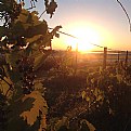
Not Anindya, but I think you can crop till just below the top of the bushes, so you have a fringe frame. The dark part on the bottom make the black too heavy and detracts from the sunset colors.
|
| Photo By: Kevin Garrett
(K:8)
|
|
|
Critique By:
Kevin Garrett (K:8)
1/29/2003 11:34:32 AM
Thanks for the comment. How much do you think I should crop off of the bottom??
|
| Photo By: Kevin Garrett
(K:8)
|
|
|
Critique By:
Anindya Maity (K:7880)
1/29/2003 11:25:24 AM
Maybe u should crop off a little from the bottom
|
| Photo By: Kevin Garrett
(K:8)
|
|
|
Critique By:
Deleted User (K:4598)
1/24/2003 7:10:08 AM
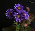
I think this might have been more powerful if you just showed the one leaf and had the whole keaf in focus. Against a plain BG this would really shine. Keep shooting!
|
| Photo By: Kevin Garrett
(K:8)
|
|
|
Critique By:
Todd Miller (K:16464)
1/23/2003 8:45:20 PM
kevin, really great shot. aptly titled as well.
|
| Photo By: Kevin Garrett
(K:8)
|
|
|
Critique By:
AJ Haselwood (K:2148)
1/23/2003 12:48:51 PM
Looks like a painting, very well done. I know some will think there is too much blue in the top 3/4's, I think it is really essential to the image. Again, nice job,
aj
|
| Photo By: Kevin Garrett
(K:8)
|
|
|
Critique By:
José Lins (K:1544)
1/23/2003 11:52:40 AM
what a nice shot, Kevin...congrats
|
| Photo By: Kevin Garrett
(K:8)
|
|
|
Critique By:
Elizabeth van Hulst (K:283)
1/20/2003 3:52:04 PM
Rock on Kevin!
This image is great! It's nice to see people thinking in design terms and using negative space to their advantage!
|
| Photo By: Kevin Garrett
(K:8)
|
|
|
Critique By:
Larry Edwards (K:843)
1/20/2003 12:45:08 PM
Although I probably wouldn't hang this on my wall, this is a great 'negative space' shot. You've perfectly conveyed an idea and feeling with very little visal data, which is hard to do.
The closest we get to see to this in southern California is during the last two weeks in December, when people hang phony icicle lights on their houses.
|
| Photo By: Kevin Garrett
(K:8)
|
|
|
Critique By:
Lisa Howeler (K:3706)
1/20/2003 12:03:48 PM
I'd actually like to see more of the ice-cycles. It seems like a bit of a bare photo to me with so much space.
|
| Photo By: Kevin Garrett
(K:8)
|
|


