|
|
Critique By:
no no (K:184)
2/16/2004 11:20:27 PM
you're so talented, its nuts.
|
| Photo By: Kostas Tzanetos
(K:22012)
|
|
|
Critique By:
no no (K:184)
1/6/2004 11:53:02 AM
the explanation helps greatly, so thank you. and as for the photo, i think it speaks for itself on how unique and well done it is. great job Kostas.
|
| Photo By: Kostas Tzanetos
(K:22012)
|
|
|
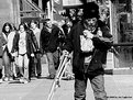
Critique By:
no no (K:184)
8/7/2003 7:10:22 PM
thats really good. i like that you shot b&w and that its not digital, haha. but really, it shows great perspective, and the composition is wonderful too. great job again.
|
| Photo By: paul shappirio
(K:-7)
|
|
|
Critique By:
no no (K:184)
8/5/2003 9:54:27 PM
ooooh, the photo is definitely great, but this one, with sepia, is by far my favorite. great job elizabeth.
|
Photo By: Elizabeth Miller
(K:2766)

|
|
|
Critique By:
no no (K:184)
8/4/2003 4:30:21 PM
wow, excellent picture. i really like the composition, and the black background brings out each of the other elements in the photograph.
|
| Photo By: Luis Vieira
(K:1772)
|
|
|
Critique By:
no no (K:184)
8/1/2003 5:12:44 PM
wow, you really put the right ingredients together for a great shot. i think it could be a little better if the tank in the background wasnt there, but overall, its real good.
|
| Photo By: John Myers
(K:4308)
|
|
|
Critique By:
no no (K:184)
7/27/2003 4:57:33 PM
that really is a great shot. i think you did a great job with the composition and existing light. i really do love it. the only thing i'd like to see different is for the right side to be burned in a little; i think if its a little darker over there, it could help close the picture in, and keep the viewer's attention on your subject, because my eye sort of trailed off to the right. but besides that richard, great job once again.
|
| Photo By: R S
(K:294)
|
|
|
Critique By:
no no (K:184)
7/27/2003 4:37:33 PM
i think it'd be better if it wasnt over-exposed.
|
| Photo By: Jorge Vasconcelos
(K:33746)
|
|
|
Critique By:
no no (K:184)
7/27/2003 4:31:11 PM
wow, youre a very talented artist; i'm absolutely in love with both pictures you've posted and plan on taking a look at your site. both had original, creative ideas, and were very well composed. to put it simply, youre great, and i'm envious.
|
| Photo By: jenni tapanila
(K:21)
|
|
|
Critique By:
no no (K:184)
7/27/2003 1:44:34 AM
wow, great job with composition. i really like the flare on the grafitti, and with the sky being darker, i think it really gives it more depth. the silhouette is awesome too.
|
| Photo By: Brett Gundlock
(K:6)
|
|
|
Critique By:
no no (K:184)
6/23/2003 6:48:25 PM
great great idea, its very innovative, and in this day in age, its becoming more rare to ever see something original. great job.
|
| Photo By: Cristiano Corte
(K:10836)
|
|
|
Critique By:
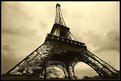
no no (K:184)
2/22/2003 4:41:39 PM
wow, not to sound redundant, but it truly is great. i really like the fact that its a horizontal composition instead of vertical, which one would expect for the eiffel tower. the floodlighting, toning, and sky enhance the tower quite well; excellent composition.
|
| Photo By: Darrin James
(K:3944)
|
|
|
Critique By:
no no (K:184)
2/19/2003 8:13:26 AM
great tonal ranges here, and wonderful job showing texture.
|
| Photo By: sean slavin
(K:3488)
|
|
|
Critique By:
no no (K:184)
2/16/2003 5:22:02 PM
the play with lighting works very well here. the only thing i'd like to see different is to have the grille cropped out of the bottom right corner. otherwise, good shot.
|
| Photo By: Rachel Radcliffe
(K:17)
|
|
|
Critique By:
no no (K:184)
2/4/2003 10:16:21 PM
the shadows look good on the wall, but next time, i think the model's legs should either be in so that they're not visible, or farther out, so that they're more apparent. it seems like when they're where they are now, they take away from the model's nice, curving figure.
|
| Photo By: Mietek Kalinowski
(K:181)
|
|
|
Critique By:
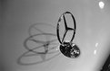
no no (K:184)
2/4/2003 9:44:51 PM
wow, great use of the holga. a simple composition, with vibrant colors, and the low angle is a nice effect.
|
| Photo By: Ian T
(K:114)
|
|
|
Critique By:
no no (K:184)
1/23/2003 8:41:57 PM
interesting shot. the landscape looks extraterrestrial, and the sky came out well to. i dont know if you printed this yourself or not, but i'd like to see a little more contrast, or maybe just the sky to be darker, burned in more.
|
| Photo By: Scott Sarver
(K:178)
|
|
|
Critique By:
no no (K:184)
1/21/2003 9:42:22 PM
wow, such a precious moment captured, and able to be kept and reflected on for the rest of life. it reminds me very much of a picture my father took of me when i was about that big.
|
| Photo By: Bart Pogoda
(K:0)
|
|
|
Critique By:
no no (K:184)
1/18/2003 4:29:54 PM
You did a great job in doing backwards what thousands of people do instintively - not focusing on the face was a great choice, and it makes the picture stand out from the average conception of how a picture like that should be taken. great job in having an truly innovative eye.
|
| Photo By: Bruno Espadana
(K:326)
|
|
|
Critique By:
no no (K:184)
1/18/2003 4:04:28 PM
excellent use of vanishing point too. i dont think you could've asked for a better sky that day either. great picture chris.
|
| Photo By: Chris Wenzel
(K:1165)
|
|
|
Critique By:
no no (K:184)
1/13/2003 10:23:11 PM
Wow, great picture Jim. The composition shows such a great contrast, excellent example of the project, excellent.
|
| Photo By: Jim Fuglestad
(K:1564)
|
|
|
Critique By:
no no (K:184)
1/7/2003 10:20:07 PM
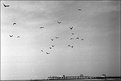
The short DOF and selective area in focus really work to bring the plane out; it's a great composition.
|
| Photo By: Travis Donovan
(K:259)
|
|
|
Critique By:
no no (K:184)
12/20/2002 10:48:44 PM
i wouldn't change a thing. everything about the composition is great; the tones and contrast, depth of field/vanishing point, the detail, the subject placement. its a great shot.
|
| Photo By: LAVRESHKIN Ilia
(K:30)
|
|
|
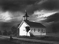
Critique By:
no no (K:184)
12/20/2002 10:19:16 PM
its a good picture. the dark, looming sky is real dramatic. i think you might have just got a bad scan though.
|
| Photo By: Rogério Simões da Cunha
(K:59)
|
|
|
Critique By:
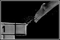
no no (K:184)
12/20/2002 10:13:05 PM
wow, i couldn't think of a better way to capture the poem. not only is the shot so fitting, but the composition is great.
|
| Photo By: tess campbell
(K:515)
|
|
|
Critique By:
no no (K:184)
12/20/2002 9:47:46 PM
i really like all the different lines and shapes, and how its somewhat symmetrical. i think you could lose the curb on the bottom, but its still a pretty good picture.
|
| Photo By: Con Tendem
(K:269)
|
|
|
Critique By:
no no (K:184)
12/20/2002 9:42:27 PM
oh, the black and white is such a better effect; the picture is much more dramatic. it's a great composition to begin with, and trying the change to black and white was a good choice. the detail and depth of field stand out most as the strong traits of the photo - good job.
|
| Photo By: Peter Daalder
(K:21)
|
|
|
Critique By:
no no (K:184)
12/1/2002 7:00:46 PM
The picture itself isn't too bad. I really agree though that the subject should be offset, as I can't tell whether i should look in front of or behind him. The picture also seems to throw the title off, as the man is stepping in the "boiling river" and looks carefree, while I would expect him to be taking the utmost care to keep out of the water. In that sense, the picture doesn't seem to jump into the category "decisive moment" as it doesn't seem like the subject was caught in a climatic, decisive, or vuenerable moment. Good quality though, its a perfect vacation shot.
|
| Photo By: Kim Barke
(K:278)
|
|
|
Critique By:
no no (K:184)
11/25/2002 8:25:38 PM
wow, haha, great idea, its very original of you.
|
| Photo By: Lukasz Rzepinski (Łukasz Rzepiński)
(K:1211)
|
|
|
Critique By:
no no (K:184)
11/17/2002 8:00:30 PM
great composition marty. the color is nice, but you just cant beat black and white! for everyone else's questions, he used fuji 400 film.
|
| Photo By: Martin Mora
(K:4666)
|
|