|
|
Critique By:
Betsy Hern (K:12872)
12/11/2003 5:28:35 PM
I love your photos, they are so cold. And I mean that in a warm way. They convey such a feeling of bitter cold, and any photo that evokes such an intense physical sense, so much wo that I shiver looking at your portfolio, is wonderful. Your images are what I imagine Moscow in the winter should be, and this is from one who only knows Russia from the images in movies such as Dr. Zhivago. Yes, that's it! Your photos are so Yuri Zhivago! It's so wonderful to be able to communicate, in a limited way, with photographers from all over the world at a site such as this. This is my favorite, it is such a simple, stark, cold image and very powerful.
|
| Photo By: Grigory Ivaschenko
(K:458)
|
|
|
Critique By:
Betsy Hern (K:12872)
12/11/2003 1:21:40 PM
INCREDIBLE!
|
| Photo By: Barry Walthall
(K:5312)
|
|
|
Critique By:
Betsy Hern (K:12872)
12/7/2003 9:38:17 PM
Another interesting rangefinder, love those old cameras. I have a Lubitel I got from the Ukraine. There's another Fed-2 photographer here:
http://www.usefilm.com/image/254110.html
This photo tells a wonderful story, a mystery I think. I don't know if it's because it's b/w or the figure cannot really be seen but I imagine it as someone hiding in the sahdows, maybe some kind of foreign spy. Like your title it's probably just somebody out shopping but I prefer to make up a more romantic story. I guess that's what street photography is all about so you've certainly succeeded here.
|
| Photo By: paul shelasky
(K:1211)
|
|
|
Critique By:
Betsy Hern (K:12872)
12/7/2003 9:25:14 PM
I love to read about cameras I've never heard of before, which Yashica Electro do you have? Are you familiar with this site?
http://www.yashica-guy.com/
I have a Yashica Mat 124G and it is the best for b/w. I add Rolleinar close-up lenses for some very cool dof. Thanks for the holga comment, and yes, I do print my own. Or should say I did as I took a class with the holga and used the art school's darkroom. But I'm hooked and looking into setting up my own as soon as I decide where to put it. I almost got a set-up on ebay but bought another camera instead. I can use the school's darkroom if I haul my cookies into the city. When I can't get there I scan the negatives but there's nothing like the real print to bring out the best of a holga shot.
Sorry if I snapped about the whole street photography thing, I do love the genre if done well. This is my favorite of yours, so far. As one who frequents Borders on a Sunday morning I appreciate all the others who sit and read the paper, a magazine, a book (or listen to music) and completely lose themselves. What a great place to shoot pics, never thought of it. I admire those who do a good job with street or slice of life photos, I can never get up the courage to photograph strangers. This is a good print, great range of tones, super composition. Check out Andy and Ulf's photos. I know that Andy is heavy into doing his own prints and is very generous with his info, as is Chris Lauritzen.
|
| Photo By: paul shelasky
(K:1211)
|
|
|
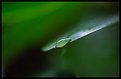
Critique By:
Betsy Hern (K:12872)
12/7/2003 12:48:33 PM
This one is sure different than your first photo. This gives me the feel of a photo taken with a medium format camera with real b/w film in it. Very simple and artistic result. This is a very soothing image, I can imagine walking in this forest early in the morning (with a cup of coffee and a donut of course). Nice dof with the emphasis on the dew. Have you figured out all that this camera can do yet? I have a couple of Fuji digicams and am still reading the manuals and experimenting after almost 3 years, and having a grand time to boot.
|
| Photo By: martin wright
(K:5)
|
|
|
Critique By:
Betsy Hern (K:12872)
12/7/2003 12:41:59 PM
This would make a wonderful cd cover. Whether you planned the unusual color cast or it is a digital white balance setting gone screwy it gives the image interest and goes well with the brown of the singer's shirt. I guess I might clean up the dark background by taking out the spots of blue, or I might add a few more spots to simulate background stage lighting, but I like to play in Photoshop and that's just me. Your choice of compostion with the main area of interest off to the right side was a wise choice. I also admire the amount of detail you were able to capture in a poorly lit situation. Welcome.
|
| Photo By: martin wright
(K:5)
|
|
|
Critique By:
Betsy Hern (K:12872)
12/6/2003 7:33:34 AM
This is my favorite of your recent uploads, Ron. Don't know what it is about b/w images, maybe it's because they enable the viewer to create their own interpretation. If this were a color shot, it could be a stunning sunset/sunrise but my mind sees an ominous incoming storm (as you've named it). You've done your job well as an artist in this one, there's a real mood and definite visual appeal. The fact that you've chosen to include human figures is what makes this image so impactful to me. The sense of power inherent in the natural elements juxtaposed with the wee things we humans truly are (although we think of ourselves as much more important) comes to the front in this image. Although it is sometimes said too often and an easy observation to make, your tones here are wonderful -- just look at the shadows of the figures on the sand! Really nice capture here. Into my Favorites.
|
| Photo By: Ron Browne
(K:1282)
|
|
|
Critique By:
Betsy Hern (K:12872)
12/3/2003 8:48:08 PM
You do a beautiful job with shadows, I'm drawn to this photo (you have a very nice portfolio here). I think you excel at simple images and do an especially good job when shooting (or converting to) black and white. You look into and under things and see how they are anchored, what makes them special when light hits them. But, it's all about light, isn't it? You have a good eye, I'm jealous.
|
| Photo By: Ursula I Abresch
(K:6515)
|
|
|
Critique By:
Betsy Hern (K:12872)
12/3/2003 8:41:58 PM
It's very refreshing to see something out of the ordinary, even if you took the idea from Wellman, a great digital photographer with a background in architecture. She concentrates on structure and her photos are very pure, I like them too. It's great that you are noticing the work of others and learning from them, that's one of the teaching techniques often used in photography school. Although many might say that you should find your own style, I believe you can only do so after you explore the style of others. If nothing else, this will increase your technical knowledge. Another great exercise is to find the work of a painter or sculptor and try to recreate some of their work in the medium of photography.
I like the clarity and simplicity of this photo. In this sparse creation, you've captured the shine of metal, a perspective that illustrates a third dimension, and wonderful shadows. This is a very crisp image, the lack of grain, or noise since it's digital, makes this image even more effective. This is either a brand new fork or you've repaired the nicks and wear marks of the typical fork. The only thing I would clean up is the faint shadow on the left - erase it altogether and you've got a perfect and very "graphic" image. Well done!
|
| Photo By: Ursula I Abresch
(K:6515)
|
|
|
Critique By:
Betsy Hern (K:12872)
12/1/2003 8:58:56 PM
I just did some research on your city and Almaty appears to be a very pretty place. It looks like a big modern city with mountains nearby, or so the website I found says. Do you live where you can see the mountains? Your country has such a magical name. I found out that The Republic of Kazakhstan is roughly half the size of mainland America. I also notice that it is very cold there now, just like many parts of the US (it is very cold and windy where I live). So, where do you find all of these beautiful flowers to photograph? Do you have a green house, or is there an indoor garden nearby? You certainly have some beautiful images in your portfolio. This is one of my favorites. It looks as if it is glowing from within. You took your time lighting it and your patience paid off with a wonderfully dramatic and oh, so lovely photo.
|
| Photo By: Alexey Sapa
(K:27174)
|
|
|
Critique By:
Betsy Hern (K:12872)
11/29/2003 11:40:58 PM
Stunning effect and the lady has just enough detail to pull her out of the zoom. You caught her in a place with many nice colors surrounding her, too. Umbrellas are fascinating things and, for some odd reason, always add interest to photos. Perhaps we should have a project titled "Umbrellas" -- I bet we would get many fun and wonderful images. I think this is one of my favorites of yours. You have many fine shots but I like the ones that are a bit more experimental, the ones with a little edge to them. You've tried something different here, stretched and the results are amazing. Lei sono un fotografo molto buono.
|
Photo By: Roberto Arcari Farinetti
(K:209486)

|
|
|
Critique By:
Betsy Hern (K:12872)
11/28/2003 8:36:18 PM
Ah, this makes me dizzy (and I'm not even blonde). Great perspective and interesting choice of color to tone with, I like the results. I guess we should all look up more often. The big city is a wonderful place to look, in all directions for many a unique shot. Nice.
|
| Photo By: Claude H.
(K:1560)
|
|
|
Critique By:
Betsy Hern (K:12872)
11/28/2003 8:30:40 PM
Hmmm, interesting camera. The only thing I could find out about it is that it shoots 6 x6 (love it), is cheap and simple. Toy camera? Light leaks like a holga? Ooo, I want one. Love this photo, very spooky, I expect to see Vincent Price peeking through the gate. The darkness gives this image a wonderful mood and you've chosen a good subject for the capabilities of the camera. I want to see more.
|
| Photo By: Claude H.
(K:1560)
|
|
|
Critique By:
Betsy Hern (K:12872)
11/26/2003 10:22:27 PM
Mark I just saw this photo in Shutterbug, congrats! I turned the page, looked at it and thought, I know that photo, and was pleased to see your name on it. It remains one of my favorites of yours because of it's mystical calmness. It reminds me of the island associated with King Arthur, Avalon I believe. What a mood it conveys and the colors are glorious.
|
| Photo By: Mark Peterson
(K:3452)
|
|
|
Critique By:
Betsy Hern (K:12872)
11/26/2003 8:19:29 PM
Beautiful in its simplicity. I especially like the few stalks in the background that are just barely visible, they add depth. The golden glow of this makes me think of an early morning with the first fog of the day in the background. I picture a really hot day and the steam is rising off the damp field. I can dream (it's below zero degrees here in the US Midwest, frost on the grass). Composition in this is especially nice, gives the hint of what it represents, just enough to be striking. Lovely.
|
| Photo By: In Transit
(K:29432)
|
|
|
Critique By:
Betsy Hern (K:12872)
11/26/2003 8:11:09 PM
Beautiful treatment, good choice of background. The fabric you chose would make a great background for a rose or, how about a thistle - a juxtaposition of harsh and soft. I like this because of that contrast between soft and hard, the focus on the gerbera is sharp as a tack, simply lovely. And those colors, very rich and the touches of green are a nice accent. A wonderful thanksgiving to you, too.
|
| Photo By: Elizabeth Miller
(K:2766)
|
|
|
Critique By:
Betsy Hern (K:12872)
11/22/2003 10:23:30 AM
Eveline, I just wanted to say thanks for all the information you volunteer in the forums, you really know your photography! I've taken some of the info you've provided and dug deeper in books and on photo sites and have to say your advice is right on. Again, thanks for sharing your knowledge.
This is one of my favorite images of yours, love the black and white and the detail is wonderful. I think the bride who I'm sure agonized over choosing just the right gown really liked the fact that this is not your usual wedding shot, but so much more. This will be a happy memory for her (especially as she ages and her waist widens, ha). You've presented this with a rich tonal range, slightly warm and your choice of color, or lack thereof adds to the delicacy and detail of the shot.
|
| Photo By: Eveline Shih-Pitcairn
(K:4406)
|
|
|
Critique By:
Betsy Hern (K:12872)
11/18/2003 5:32:04 PM
Cool. I want one.
|
| Photo By: michaelle .
(K:3807)
|
|
|
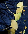
Critique By:
Betsy Hern (K:12872)
11/17/2003 7:43:21 PM
Isn't it amazing what even a 2MP camera can produce in the right hands. This is so much more than a typical photo of fall leaves. First, you've managed to find leaves that are not the usual ones most often associated with Fall. Second, you've captured them in a setting that one might not consider - not in a forest, in a pile of leaves in the front yard, or in the gutter of a house (where most of mine are right now). The details in the veins of the leaves, the water, and the reflections make such rhythmic patterns, almost lyrical. Your composition includes a wonderful variance of the key element, the shape of the gingko repeats itself with just enough difference in size, and subtlety of color (love the bit of green in the middle leaf). And the colors are fantastic. Without realizing it you've captured two colors that are directly opposite each other on the color wheel - yellow and blue - this creates natural tension and vibrancy. All the elements of this image have come together to produce something simple, but very memorable. This would make a wonderful image in a color photography book illustrating all the right things to do.
|
| Photo By: Steve Rosenbach
(K:8338)
|
|
|
Critique By:
Betsy Hern (K:12872)
11/15/2003 5:41:55 PM
I agree with Naty, you'll never finish if you stop to take pictures. And shouldn't you smooth this out? I hope it didn't dry waiting for you to get it to smile. So, you can solder, spackle and take pictures, I'm impressed. You are truly a Renaissance man. I sure can't wait to see the finished project.
|
| Photo By: Gregory Fiedler
(K:15439)
|
|
|
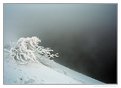
Critique By:
Betsy Hern (K:12872)
11/10/2003 10:05:02 PM
Needs just a bit of snow on the tips. Again, simple is the key here. I think your talents lean more towards color. You know how to go after the essence of an image, no frills but the colors say it all.
|
| Photo By: Christopher Cato
(K:311)
|
|
|
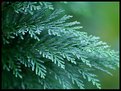
Critique By:
Betsy Hern (K:12872)
11/10/2003 10:01:38 PM
Exquisite in its simplicity. Presents a sense of calm, early morning dew, onely walk in the woods on a rainy day. DOF is perfect and the greens are so rich. Into my Favorites. Rules say not to center main area of interest but it works here. I don't like to simply leave a fast "love it," but I do.
|
| Photo By: Christopher Cato
(K:311)
|
|
|
Critique By:
Betsy Hern (K:12872)
11/9/2003 9:22:00 PM
Thanks, from all of us who were too lazy to go out, had bad weather or just simply forgot. I forgot.
|
| Photo By: Bill Ciavarra
(K:10216)
|
|
|
Critique By:
Betsy Hern (K:12872)
11/8/2003 7:41:20 PM
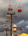
I've been looking at your portfoilio, you certainly shoot with a lot of different cameras. Well, I should say different Nikons. This one is my favorite so far, although I do like that spider. The colors here really glow against that wonderful sky, and the yellow roof, American flag and clock tower are all so crisp and clear. You have them all placed well in the shot and I like the vertical cropping. Not many riders, was a storm coming?
|
| Photo By: Harry Brown
(K:817)
|
|
|
Critique By:
Betsy Hern (K:12872)
11/8/2003 5:45:20 PM
Welcome Marie. You've captured a nice range of colors in this simple composition. I was out raking my lawn this morning and even though it was hard work, the leaves were lovely, lots of yellows. I did get out my camera, but have to have the negs developed. This would make a wonderful fabric pattern and has a textile feel to it, maybe a scottish plaid. Nice first upload, you'll like it here.
|
| Photo By: Marie G. Nuzzi
(K:0)
|
|
|
Critique By:
Betsy Hern (K:12872)
11/2/2003 8:56:41 AM
How cool is this? A holga and a holga-wannabe next to each other! Again, this turned out to be a great experiment, you picked the right photo to apply the filter to. I'd like to see more of these. I know that you think it's cheating but hey, whatever gets the results (we both know that from being designers, if some here only knew the manipulations we had to do to get the jobs). Nice to see you on the same page!
|
| Photo By: heather martino
(K:3648)
|
|
|
Critique By:
Betsy Hern (K:12872)
11/1/2003 8:50:02 PM
Although this is very painterly I think I like the original color photo better - it is stunning! Somehow the warmer colors in the original and especially that vibrant yellow jump out and accent the beautiful face of the dancer so well. The blue version is too cold, the face takes on a dull, slightly greenish cast from all that blue and you lose the central focus of the event - the swirling scarf. I could see either version as a wonderful oil painting with swirling strokes. Please post the color version larger so I can really compare the two.Wonderful composition and clarity and you got the face in just the right spot, good job!
|
| Photo By: Carol Watson
(K:5185)
|
|
|
Critique By:
Betsy Hern (K:12872)
10/23/2003 6:11:50 PM
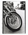
Isn't it fun to print your own black and white? I think you've done a wonderful job here, I like the angle you chose to shoot this at, I can see you on your knees close to the ground trying to get just the right shot, and hoping that no one would come by and remove their bike before you're done. There's a lot to see in this if you take the time to look around. The circles, diagonals of the spokes, perspective fade to the back. And, I'm most impressed that you got such a nice compsoition without cropping, as evidenced by the negative frame you chose to leave on the print. I think this adds to your assignment's subject, evidence of man - you not only got the man-made bikes but the man-made film. I'd give you an A+.
|
| Photo By: Melisa Taylor
(K:89)
|
|
|
Critique By:
Betsy Hern (K:12872)
10/22/2003 1:30:55 PM
You certainly have a beautiful garden. I really like the color relationships here but I guess we have to credit Mother Nature for that. You've taken her handiwork and showcased it well. I always have a problem with knowing what to crop when I have a pic like this but your addition of a soft border makes the crop not as harsh as it might be if simply, well, cropped. this would make a great clanedar pic, as would many of your flowers.
|
| Photo By: Lucas Macedo
(K:12843)
|
|
|
Critique By:
Betsy Hern (K:12872)
10/22/2003 11:38:11 AM
Yes, you're welcome. Chris is a good teacher. Take little steps at first and soon you will be a pro Photoshop user (but don't overdo it).
|
| Photo By: James McGinnis
(K:6045)
|
|