|
|
Critique By:
Betsy Hern (K:12872)
7/9/2003 9:06:58 PM
You see with a creative eye. This is composed well and the water looks as smooth as silk. This is almost a b/w but it really needs the bits of color to give it punch. I also like the nice simple frame. Lovely
|
| Photo By: michaelle .
(K:3807)
|
|
|
Critique By:
Betsy Hern (K:12872)
7/9/2003 8:57:49 PM
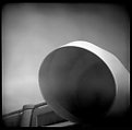
Cool optical illustion. I'm into b/w lately (I work on color photos all day so b/w is a bit of a relief) and this caught my eye because of the great range of tones and visual interest as a design, as opposed to a place. I can't tell which rock is in front so I could look at it all day and still find it intriguing (yeah, I know, I have to get a life).
|
| Photo By: andrew vonbank
(K:2811)
|
|
|
Critique By:
Betsy Hern (K:12872)
7/9/2003 9:50:15 AM
... its symmetry. Would a dead body fit in it, could I lift her up high enough by myself? I was no Charles Atlas, but merely the "before," the skinny man who had sand kicked in his face by all the bullies at the beach.
(this is fun)
|
| Photo By: Robert Fox
(K:208)
|
|
|
Critique By:
Betsy Hern (K:12872)
7/8/2003 9:43:53 PM
Plastic cameras rock. Love the pics on your site (watch out for snow sliding off roof). Welcome and hope to see more of your exotic cam pics, we need more loons here to brighten things up, too much analyzing of technical details. It's all about the finished product, who cares how you got there (sorry, didn't mean to kvetch).
|
| Photo By: Ju-Lie McReynolds
(K:2)
|
|
|
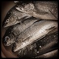
Critique By:
Betsy Hern (K:12872)
7/8/2003 9:16:20 PM
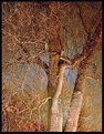
No fish was harmed in the filming of the holga cannon shot (you were the first one to guess how it was done). This photo reminds me of the trees in the Wizard of Oz and I'm glad they are not in MY backyard. Cottonwood is one of the more demented breeds but watch out for the sycamores, they are really nasty.
|
| Photo By: andrew vonbank
(K:2811)
|
|
|
Critique By:
Betsy Hern (K:12872)
7/8/2003 2:24:51 PM
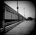
...this vehicle, this cheesy, soccer-mom, suburban-kid shuttler that should have been a T-bird. It would have been a T-bird if SHE hadn't walked into my life that fateful day.
|
| Photo By: Robert Fox
(K:208)
|
|
|
Critique By:
Betsy Hern (K:12872)
7/6/2003 9:36:26 PM
I like this one the best of the 3 (I do like them all as I studied them over and over, but was ultimately drawn to this one). Color is not needed to bring out its beauty, it would distract. There are so many wonderful areas that draw you in and the soft parts are just as interesting as the sharp ones. Fascinating and creative vision you have, being able to take a color pic and creating a b/w that, I believe, is more interesting than the original.
|
| Photo By: michaelle .
(K:3807)
|
|
|
Critique By:
Betsy Hern (K:12872)
7/6/2003 9:23:30 PM
Welcome, nice start. Amusement rides are great places to shoot. The angle on this one is intriguing and I like all the feet hanging down. Colors are crisp and clean. I suspect this was taken on a very bright day and since there were no clouds in the sky it made for a cool effect, almost a knock-out of the ride and riders. I might try adding a thin border to anchor the bottom and right side, but maybe not.
|
| Photo By: Jen Jesseph
(K:9)
|
|
|
Critique By:
Betsy Hern (K:12872)
7/6/2003 12:28:42 PM
8 exposures, handheld -- you have a steady hand. I tried this inside in a room with all the windows open, all lights on and 4 exposures... still came out way too dark. You've inspired me and I will try it again, maybe not handheld though. Love the holga and am continually amazed at the results.
|
| Photo By: Michael Klemmer
(K:725)
|
|
|
Critique By:
Betsy Hern (K:12872)
7/2/2003 9:37:16 PM
This is kind of scary, in a very cool way. I think he is a stalker and she has no idea that he is following her. Did either of them know that you were taking their pics? Great use of b/w and unusual eye you have. I like it.
|
| Photo By: Marcin Gorski
(K:12388)
|
|
|
Critique By:
Betsy Hern (K:12872)
7/2/2003 7:25:05 PM
Very appropriate, as well as crisp, clear, great colors, stick-straight (since it is so symmetrical I guess it could be flopped to change the direction of the flag to please Volker, but then the dude on the roof would be facing the wrong way). The Fourth of July is a big thing in my village of Hales Corners. I am on the festival committee so I am busy getting all the flags ready for the 500 or so little kids who decorate their bikes and wagons for our morning parade. Maybe I'll take time off from my duties to snap some pictures this year.
And thanks for the pic of the Tasmanian Devils, they are kind of cute but appear to have a wicked look in their eyes. Not much like Taz, but that's the real world I guess.
|
| Photo By: Carole Bradford
(K:10715)
|
|
|
Critique By:
Betsy Hern (K:12872)
7/1/2003 7:20:21 PM
Great dancing bird here, looks like he (she?) could be a cartoon character. I too, like Lucas, would love to see a Tasmanian Devil though I suspect I would be disappointed if it wasn't like the Looney Tunes Taz. The colors here are wonderfully pure and clean, great green in the leaves and yellow in the eye. A little hot on the nose (do birds have noses, I guess I mean beak). Nice to see something other than a morning dove, crow or a sparrow. I have boring birds here although I sometimes have a cardinal or goldfinch at my birdfeeder.
|
| Photo By: Carole Bradford
(K:10715)
|
|
|
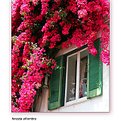
Critique By:
Betsy Hern (K:12872)
6/28/2003 7:34:40 PM
Well. We have an Uncle Frank here at Usefilm and now we have a Grandpa Frank. And, they both seem to take wonderful floral photos. This one reminds me of a colored pencil sketch, it even looks like it has been sketched, or printed, on paper with some tooth to let the grain of the paper show through. It is soft like an artist's rendering which makes it a somewht unique photo in this land of many floral macros. The pinks and peaches and magentas all compliment each other quite nicely. Nice shot, and welcome.
|
| Photo By: Grandpa Frank
(K:31)
|
|
|
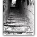
Critique By:
Betsy Hern (K:12872)
6/27/2003 10:00:54 AM
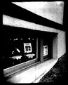
The composition here is wonderful, you have taken this photo from such an intriguing angle. You make the viewer want to climb the stairs to see what is above. I agree that b/w was the right choice, the tones, textures and perspective need no color to express the warmth of this shot. Please give us some details, such as camera used and film as there are many beginning b/w shooters who would benefit from the great results that you have achieved here.
|
| Photo By: donato r.
(K:16361)
|
|
|
Critique By:
Betsy Hern (K:12872)
6/24/2003 11:17:41 AM
Here's another keeper! I've gone from shooting vivid color digital photos to square format black and white (and oh, what you can do to them in Photoshop). This is the ultimate with great tones from white to black and all that great stuff inbetween. And, to top it off it's from Ireland, my travel destination of choice. doesn't get any better than this.
|
| Photo By: Bernt Carlzon
(K:554)
|
|
|
Critique By:
Betsy Hern (K:12872)
6/24/2003 11:13:39 AM
I prefer the b/w version over the color because of the great textures, values, grit and grain. Love the square format - your Hasselblad, or a Photoshop facsimile (either one is fine with me)? Wouldn't this be cool printed black with silver ink? I'd hang it on my wall (in the living room, not the fishing shack, well, I don't really have a fishing shack).
|
| Photo By: Bernt Carlzon
(K:554)
|
|
|
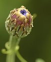
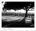
Critique By:
Betsy Hern (K:12872)
6/23/2003 9:01:38 PM
Bob, I just found this and think it's really super! I admire your attempt to get the shot no matter what the conditions. So many times I see something that would make a wonderful photo and don't even have my camera with me. This past weekend I went to an art show where the Oscar Meyer Weinermobile was, and didn't have my camera, what a missed opportunity! There is an incredible amount of detail in this small bud and the background is perfect. Too bad you didn't go back when it bloomed to take another pic, but it would be hard to top this.
|
| Photo By: Bob Tomerlin
(K:5460)
|
|
|
Critique By:
Betsy Hern (K:12872)
6/23/2003 8:41:24 PM
Bev, I see a holga convert lurking in this photo. You really should give it a try since the camera is a whopping $16.99, and 120 roll film can be had for $2.99 or so. Check it out at http://www.freestylephoto.biz/e_main.php. There are lots of holga sites on the web, just do a search. And funny you should ask about color, I just ordered some color film from bhphoto and it should arrive any day, can't wait to see how it performs. You get 12, 6x6 shots from a roll of 120 so the roll shoots fast. If you can't develop/print your own film, some photo processing places (even the quick ones) will develop b/w though prints can be pricey at around 50 cents a print. You can just get the negs and scan them if you have a scanner that will do transparencies. Give it a try, it's much different than digital, I find it very liberating. The trick to b/w holga is the same as any b/w photo -- look for shots with a wide range of tones. Deep shadows with bursts of things lit by the sun are best. Come on and join the plastic camera club!
Oh, and I love this shot, the shape of the tree is great for the composition, nice range of tones, a little bit of mystery to it, love the softness created by the fog.
|
| Photo By: Beverly Gustafson
(K:1572)
|
|
|
Critique By:
Betsy Hern (K:12872)
6/23/2003 4:48:28 PM
Michaelle, thanks for your encouragement on the Holga. You are right, I'm realllllllllly having fun. The Ilford 3200 film was a suggestion from a photographer that teaches at a nearby art school. He also suggested HP+ 400, which I seem to have better luck with. I tried the TMax but results were too grainy for me.
I just got a Lubitel in the mail from Russia (www.quadrobuy.com) for less than $50 and tried one roll of film over the weekend. The negs that did turn out (I was pushing the wrong buttons and this one actually has some aperture and shutter speed settings -- better get out Photography for Dummies book, again) were worse than my Holga. I'll get it though, eventually. I've been processing my own prints and that is a real joy. I go for heavy contrast and am very picky on focus as I do that all day for a living with color digital images. I love a black black and a white with a hint of gray. I'm such a geek I even look at the numbers (ink density) in Photoshop.
This photo of yours seems to have the same area of light leak as my holga and because different holgas leak differently I'm told that many shooters have more than 2 or 3 plastic boxes. They use the one that leaks in the best spot for the shot they're after.
Also, love your website.
|
| Photo By: michaelle .
(K:3807)
|
|
|
Critique By:
Betsy Hern (K:12872)
6/19/2003 10:05:27 PM
A plastic camera and expired film -- does it get any better than that?! I just stumbled upon your work and you have a number of really interesting shots. I like your viewpoint and your sense of adventure. As I always say with these toy cameras, you point, click and hope something emerges (and hope you remembered to wind the film). I haven't tried color film in my holga yet, but this photo makes me want to run right out and pick some up. Great result!
|
| Photo By: Robert Fox
(K:208)
|
|
|
Critique By:
Betsy Hern (K:12872)
6/18/2003 5:43:24 PM
This is my favorite photos of yours. I'm just starting to appreciate black and white and this is what I'm striving for. It has such energy and the central figure is so crisp and clear to anchor the photo -- great contrast to all the background motion. Can't say enough.
|
| Photo By: Mietek Kalinowski
(K:181)
|
|
|
Critique By:
Betsy Hern (K:12872)
6/18/2003 5:40:31 PM
Another wonderful fog shot. John says it reminds him of California and Ingrid of the Black Forest. I imagine the northern forests of my state, Wisconsin, midwest USA. I can feel the humidity in this one. Super colors and mood.
|
| Photo By: Mietek Kalinowski
(K:181)
|
|
|
Critique By:
Betsy Hern (K:12872)
6/18/2003 5:26:42 PM
Wow, you've gotten a lot of comments on this one, and they are well-deserved. How you can get these birds to pose so well is beyond me. Clarity is wonderful (Fuji's rock), and the range of tones is great. Great companion to the other gull pic, frame them and hang them up together.
|
| Photo By: Carole Bradford
(K:10715)
|
|
|
Critique By:
Betsy Hern (K:12872)
6/18/2003 5:18:57 PM
Of all your fly parts photos I think I like this one the best (I wish you hadn't said what it was, yuck). Wonderful colors, lovely flowing sense of motion and mystery. I remember taking fruit flys home from school to study eye colors and such and I even looked at them under the scope, but not this close! I will never think of them the same again.
|
| Photo By: andrew vonbank
(K:2811)
|
|
|
Critique By:
Betsy Hern (K:12872)
6/18/2003 5:13:11 PM
Molto e ricco colori ed io ama l'angolo che lei ha scelto sparare questo da. Lei fa la fotografia di colore molto buona come pure annerisce e bianco. Non dolente se questo è il vero italiano, ho usato una traduzione.
|
| Photo By: donato r.
(K:16361)
|
|
|
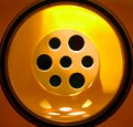
Critique By:
Betsy Hern (K:12872)
6/18/2003 12:00:01 PM
Strong graphic, colors are rich and it leaves a lot to the imagination -- would make a great "can you guess what this is" contest. You have a good eye for finding the extraordinary in the ordinary. Looks like the sun was in just the right spot. And, you should spring for a Holga, it's so much fun. You can impress people by telling them that you were really trying hard to get the shot just right when they don't know it's all a crap shoot with those crummy things. I had a good laugh at your the Wisconsin reference, not many know how cheap we are -- I prefer to call it frugal, nah, it's cheap.
|
| Photo By: Gregory Fiedler
(K:15439)
|
|
|
Critique By:
Betsy Hern (K:12872)
6/17/2003 9:39:23 PM
This is a perfect subject for a b/w. It's a little burned out on the top of the angel's head but I don't mind. I like the way you've placed her in the composition, crop is nice. I had a calendar last year that was all stone angels taken in various countries all over the world and this reminds me of that. It could have been shot in Rome.
|
| Photo By: Chuck Freeman
(K:13616)
|
|
|
Critique By:
Betsy Hern (K:12872)
6/17/2003 8:44:23 PM
Very creative, and the title is so appropriate. I like the crop, it works well with the subject. Good use of b/w. I love spider webs and this is a new perspective, great use of IR. I love it!
|
| Photo By: Beverly Gustafson
(K:1572)
|
|
|
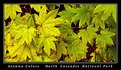
Critique By:
Betsy Hern (K:12872)
6/17/2003 7:52:10 PM
Looks like a photo that the Sierra Club would publish on one of their calendars. I like the format. Simple colors, red and green, and the stems are the high points. Love the 2 shades of green, adds interest. Simple but very effective composition.
|
| Photo By: andrew vonbank
(K:2811)
|
|
|
Critique By:
Betsy Hern (K:12872)
6/15/2003 9:33:59 PM
Wow, that's a great camera -- not taking anything away from you and your creative eye, I really should be saying wow, that's a great photographer. I just mean it can really get in there close and hold detail and not increase noise. I really have to get myself a better lens. Beautiful.
|
| Photo By: Beverly Gustafson
(K:1572)
|
|