|
|
Critique By:
RC. Dany (K:64104)
2/24/2004 10:40:54 PM
Excellent !!!!!!!!!
|
Photo By: Terry Drymon
(K:154)

|
|
|
Critique By:
Hanna Segal (K:13469)
1/4/2004 4:20:41 PM
Fantastic! really happy this popped up in random shots. well done.
|
| Photo By: Terry Drymon
(K:154)
|
|
|
Critique By:
Tony P (K:5)
12/29/2003 7:24:50 PM
Ugh---was this from a 1947 version of Little Mermaid??
|
| Photo By: Terry Drymon
(K:154)
|
|
|
Critique By:
Mark Beltran (K:32612)
10/21/2003 11:05:48 PM
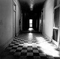
I like the hot spots. I can't help but visualize all the people who've gone back and forth in that hallway, like reverberations long gone. It is a lonely place, but hauntingly beautiful.
|
| Photo By: Terry Drymon
(K:154)
|
|
|
Critique By:
Paolo De Maio (K:34932)
10/17/2003 2:10:50 AM
Spectacular mood and wonderful seascape.
Nice idea and lovely model
Superb Terry!!!
Paolo
|
| Photo By: Terry Drymon
(K:154)
|
|
|
Critique By:
xxxx xxxx (K:1833)
9/2/2003 9:22:22 PM
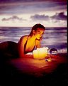
I like the setting, she seems really concentrated.
|
| Photo By: Terry Drymon
(K:154)
|
|
|
Critique By:
M (K:114)
8/27/2003 7:41:45 PM
well done!
|
| Photo By: Terry Drymon
(K:154)
|
|
|
Critique By:
Dez Karpati (K:2237)
4/14/2003 2:05:31 PM
Very nice dramatic work
|
| Photo By: Terry Drymon
(K:154)
|
|
|
Critique By:
Jessica Miles (K:74)
3/22/2003 8:33:57 PM
Awsome picture!
|
| Photo By: Terry Drymon
(K:154)
|
|
|
Critique By:
Kim Culbert (K:37070)
2/28/2003 9:32:25 PM
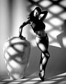
For me there seems to be too much going on in this image... there is a striking woman in a bright blue dress, a heart on the wall, a white vase, a window, and a palm tree branch. These things seem to clash for me... if it was just the woman, vase and window I think it would work a lot better... simple lines for the bg and more power to the woman.
Just my 2 cents...
|
| Photo By: Terry Drymon
(K:154)
|
|
|
Critique By:
Deleted User (K:2231)
2/28/2003 7:44:53 PM
Just saw this in random photos and wanted to bring it up again for comments.
-Dave
|
| Photo By: Terry Drymon
(K:154)
|
|
|
Critique By:
Joe Smith (K:352)
2/25/2003 8:36:31 AM
there's a window?... nice shot but she looks real uncomfortable in her pose. nice shot but she looks real uncomfortable in her pose.
|
| Photo By: Terry Drymon
(K:154)
|
|
|
Critique By:
meprivacynet@meprivacy.net meprivacynet@meprivacy.net (K:3974)
11/25/2002 12:20:19 PM
Made in 1986? Wow! I was 14 Great shot!
|
| Photo By: Terry Drymon
(K:154)
|
|
|
Critique By:
J (K:2647)
11/25/2002 12:03:53 PM
I dont really see how the vase fits the model and her pose. But I do really like the shadowplay and the way her eyes, and lips come out of that. Her pose curves hicely around the vase. Maybe a darker version to make the shadowplay more prominent is good?
|
| Photo By: Terry Drymon
(K:154)
|
|
|
Critique By:
J (K:2647)
11/25/2002 12:00:46 PM
I dont really see how the vase fits the model and her pose. But I do really like the shadowplay and the way her eyes, and lips come out of that. Her pose curves hicely around the vase. Maybe a darker version to make the shadowplay more prominent is good?
|
| Photo By: Terry Drymon
(K:154)
|
|
|
Critique By:
Daniel Saaiman (K:1222)
11/22/2002 11:36:11 PM
magic indeed!! beautiful
|
| Photo By: Terry Drymon
(K:154)
|
|
|
Critique By:
Autumn Ruhe (K:993)
11/1/2002 1:27:09 PM
this is simply perfect.
|
| Photo By: Terry Drymon
(K:154)
|
|
|
Critique By:
Anne E. M. Zang (K:4135)
11/1/2002 11:50:53 AM
This pic gives me a feeling of silence, peace, escape, simplicity. But then it also gives me the feeling of being trapped, cut-off, isolated, depressed....hmmm ... OK, it started out calm and became disturbing...what have you done?! Anyway, I like it with the grain--gives it the look of a painting, but also think it would be interesting to see without so much grain.
|
| Photo By: Terry Drymon
(K:154)
|
|
|
Critique By:
Kim Culbert (K:37070)
9/13/2002 2:21:17 PM
Interesing colour book style, although the original picture doesn't look like it had much of a focus to begin with (other than the fact that it was a naked woman.)
Putting it into simple lines and colours really made it a piece of ass... er, I mean art!
|
| Photo By: Terry Drymon
(K:154)
|
|
|
Critique By:
Buck Parsley (K:40)
8/11/2002 4:02:48 AM
Gorgeous...I would have called it "Goddess"
|
| Photo By: Terry Drymon
(K:154)
|
|
|
Critique By:
Terry Drymon (K:154)
8/4/2002 8:17:14 AM
this is the back of the sales sheet...i put the cigars on a sheet of glass and put the silk fabrick about 1' under the glass
|
| Photo By: Terry Drymon
(K:154)
|
|
|
Critique By:
Dave Holland (K:13074)
8/3/2002 11:32:16 PM
Great lighting. Interesting title, probably a long story. The flowers crossing the margin of her chin outline are mildly distracting. Warm yellow blends throughout.
|
| Photo By: Terry Drymon
(K:154)
|
|
|
Critique By:
Kim Culbert (K:37070)
8/3/2002 9:46:38 AM
It's a shame that this gorgeous field of wild flowers is now a home depot. What a great location for shoots such as this. you've done a wonderful job capturing nice warm light and I like the natural pose of your model.
|
| Photo By: Terry Drymon
(K:154)
|
|
|
Critique By:
Kim Culbert (K:37070)
7/31/2002 5:31:33 PM
There seems to be some weird artifacting going on in this picture, or else the bride and groom are not completely in focus. I find it very hard to see detail in them. I can't tell if the groom is smiling, but it doesn't look like he is.... the positioning of the people is really nice, though!
|
| Photo By: Terry Drymon
(K:154)
|
|
|
Critique By:
Deborah Seitz (K:85)
7/30/2002 7:40:42 PM
A once in a lifetime shot. Nice job.
|
| Photo By: Terry Drymon
(K:154)
|
|
|
Critique By:
Kim Culbert (K:37070)
7/29/2002 11:10:28 AM
What an interesting photo! So much to look at! I love the old fashioned feel of the image (the sepia tone) as it works so well with the idea. Great job with hand colouring the image as well... the colours stand out but not too much.
|
| Photo By: Terry Drymon
(K:154)
|
|
|
Critique By:
John Myers (K:4308)
7/28/2002 12:27:43 PM
i like this effect a lot! very neat-o.
|
| Photo By: Terry Drymon
(K:154)
|
|
|
Critique By:
Ron Browne (K:1282)
7/28/2002 9:54:12 AM
Hi Terry,
Very effective add. Would have caught my attention leafing thru a magazine!
|
| Photo By: Terry Drymon
(K:154)
|
|
|
Critique By:
Dan Minnix (K:180)
7/28/2002 5:22:12 AM
Don't know why it posted my comment twice. Please don't think I have a habit of repeating myself....hehe.
|
| Photo By: Terry Drymon
(K:154)
|
|
|
Critique By:
Dan Minnix (K:180)
7/27/2002 3:14:16 PM
Hi Terry,
Love this pic. The lighting is fabulous which helps emphasize those georgous eyes. I'm sure your model was very pleased with this shot. Congrats and don't change a thing. I would love to see more from this shoot.
|
| Photo By: Terry Drymon
(K:154)
|
|