|
|
Critique By:
Zarazka Zarazkovich (K:1510)
7/14/2003 12:12:40 PM
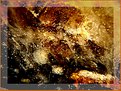
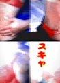
8 pages of boring images before I finally arrived to this one. It is a very interesting work, however it deserves to be named.
|
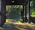
| Photo By: ana ribeiro
(K:21290)
|
|
|
Critique By:
Zarazka Zarazkovich (K:1510)
7/11/2003 8:23:12 AM
Being a big fan of oil prints I must admit, that it's little bit too had to appriciate due to a very small size.
|
| Photo By: Anders Schildt
(K:117)
|
|
|
Critique By:
Zarazka Zarazkovich (K:1510)
7/11/2003 8:19:36 AM
The composition looks little bit too busy, with a shift of ballance to left, the biggest problem for me is that my eyes concentrate on the left part of composition and there is no connection leading them to the right side, which is left half empty. I would like to see the 'stone wing??' on the lower left part to be continued more towards wolf skull as a connecting element. The center seagull looks out of place, I would like the composition more without it.
|
| Photo By: Jim McNitt
(K:11246)
|
|
|
Critique By:
Zarazka Zarazkovich (K:1510)
7/8/2003 8:51:19 AM
It's a good idea, when shooting reflections, to include both reflections and some of the original subjects as a reference point for spectator's eye. I would also saturate the colors even more.
|
| Photo By: Lannie Kelly
(K:71)
|
|
|
Critique By:
Zarazka Zarazkovich (K:1510)
7/3/2003 10:41:40 AM
Soon, this will be tribute to usefilm as well
|
| Photo By: Thomas Rauers
(K:17)
|
|
|
Critique By:
Zarazka Zarazkovich (K:1510)
7/1/2003 8:46:08 AM
Sorry, but this one is defenetly not one of your best. The thing that bothers me most here is the very unnatural pose of a running child (perhaps it is just unfortunate moment and camera positioning for the shot, but the figure seems slightly out of proportions). Also overall sharpness does is too soft in this shot.
A.P.
|
| Photo By: T Glow
(K:14955)
|
|
|
Critique By:
Zarazka Zarazkovich (K:1510)
6/12/2003 5:45:05 PM
Hey, that looks like Berkley 
|
Photo By: Robert Gaither
(K:34128)

|
|
|
Critique By:
Zarazka Zarazkovich (K:1510)
5/22/2003 5:39:24 PM
There is a big problem with DoF, which is hard to correct when you are using any close-up filter. Even with a very small appeture like f/16 the DoF is no more than 2cm which represents a problem for a composition like this. A specialized macro lens will solve the problem in a case like this, when you need a DOF of about 10 cm.
|
| Photo By: Roberto Arcari Farinetti
(K:209486)
|
|
|
Critique By:
Zarazka Zarazkovich (K:1510)
5/21/2003 9:00:29 AM
By far, one of the most interesting works of today.
|
| Photo By: Yuri Bonder
(K:268)
|
|
|
Critique By:
Zarazka Zarazkovich (K:1510)
5/3/2003 2:28:46 PM
The image does strongly reflects the title (I haven't seen #1 & #2 yet) and does create a mood of early morning / late afternoon somewhere on the highway in the middle of nowhere, however, something does not feel right with the picture - not the softness and not the light, but something ,maybe, with a composition itself. Perhaps you should try cropping it just a little bit from both top and bottom?
|
| Photo By: j ruz
(K:1043)
|
|
|
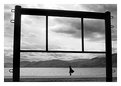
Critique By:
Zarazka Zarazkovich (K:1510)
5/3/2003 9:01:06 AM
This is a great composition that reminds me a bit of eastern philosophy. The ascetism of this picture nicely creates a mood of being small compared to the world.
With all this said. You could have worked a little bit more to enhance mood. I suggest dodging the ground in foreground and mountains (just the ones on the shore directly behind the person)while burning just a little bit the sky on the left.
Regards
A.P.
|
| Photo By: George SPN
(K:370)
|
|
|
Critique By:
Zarazka Zarazkovich (K:1510)
5/2/2003 8:43:19 AM
Good idea, but needs more sharpness to work on all levels
|
| Photo By: jean E marre
(K:1577)
|
|
|
Critique By:
Zarazka Zarazkovich (K:1510)
4/27/2003 12:39:20 PM
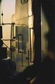
Nice door, I like doors like this one. So what's the story behind the photo & location?
|
| Photo By: Tanya Clark
(K:650)
|
|
|
Critique By:
Zarazka Zarazkovich (K:1510)
4/27/2003 10:26:21 AM
Good emotional appeal, however the title is too straight forward and does not add to the athmosphere of the picture. Perhaps renaming is a good idea.
Regards
A.P.
|
| Photo By: Erkan Gokce
(K:1414)
|
|
|
Critique By:
Zarazka Zarazkovich (K:1510)
4/27/2003 10:17:56 AM
Fun picture, but the framing is somewhat ill chosen. Best thing - leave it without frame!
Regards
A.P.
|
| Photo By: Mark McGloughlin
(K:437)
|
|
|
Critique By:
Zarazka Zarazkovich (K:1510)
4/17/2003 8:24:25 AM
Great work. My only suggestion is to burn little bit a stone wall, left from opening filled by light, to make accent on that opening. Five for lighting, six for everything else.
|
| Photo By: Onur Aydin
(K:9815)
|
|
|
Critique By:
Zarazka Zarazkovich (K:1510)
3/15/2003 7:52:45 AM
I like the picture a lot, however I think the choice of framing is unsuccessful (which can be easily corrected)
|
| Photo By: Jytte Kristensen
(K:446)
|
|
|
Critique By:
Zarazka Zarazkovich (K:1510)
2/9/2003 3:02:15 PM
Great capture Ken! I have been there six years ago, and it seems that the place remains the same. Regarding the crop, the only thing that comes to my mind is to remove 1 cm from the left - the brighter stones might cause some minor distraction.
|
| Photo By: Ken Alexander
(K:3905)
|
|
|
Critique By:
Zarazka Zarazkovich (K:1510)
2/9/2003 2:06:02 PM
I like the light setup and slightly suppressed dark red. The background imho does not "play" with this red. Not that it is unmatching, but perhaps a slight tonal change in the background would make an picture event better.
|
| Photo By: Phillip Filtz
(K:1792)
|
|
|
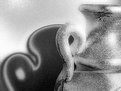
Critique By:
Zarazka Zarazkovich (K:1510)
2/5/2003 8:15:00 PM
I like what you did to the vase. I also completely dislike what you did to the shadow. Having a more realistic shadow would yield a great picture. But this is just my opinion.
|
| Photo By: Danica Dubovina
(K:-105)
|
|
|
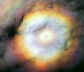
Critique By:
Zarazka Zarazkovich (K:1510)
2/5/2003 8:11:37 PM
I like noisy version more. Also, the photo is too focused on the prism itself - I would like to see a version where more sky is included
|
| Photo By: Petra Engle
(K:1282)
|
|
|
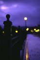
Critique By:
Zarazka Zarazkovich (K:1510)
1/17/2003 7:49:11 PM
Great work John, very mood setting picture! I can feel I I am there.
|
| Photo By: John Myers
(K:4308)
|
|
|
Critique By:
Zarazka Zarazkovich (K:1510)
1/16/2003 3:33:46 PM
Still playing around with that cool mask of yours? I would call it Indian Phantom of the Opera ))
|
| Photo By: Michal Wojciechowski
(K:1279)
|
|
|
Critique By:
Zarazka Zarazkovich (K:1510)
1/14/2003 8:11:14 AM
Great photo, worth hanging on the wall!
|
| Photo By: Michal Wojciechowski
(K:1279)
|
|
|
Critique By:
Zarazka Zarazkovich (K:1510)
1/12/2003 8:45:42 PM
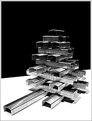
Great abstract, 10/10
|
| Photo By: Sebastian Duda zolo2
(K:41)
|
|
|
Critique By:
Zarazka Zarazkovich (K:1510)
1/12/2003 8:43:32 PM
I think you have an interesting style, but once again, your pictures are very small which makes is hard to understand what's going on!
|
| Photo By: pablo perez
(K:1)
|
|
|
Critique By:
Zarazka Zarazkovich (K:1510)
1/11/2003 9:38:45 PM
Great capture!
|
| Photo By: Scott J Machalk
(K:173)
|
|
|
Critique By:
Zarazka Zarazkovich (K:1510)
1/11/2003 9:36:58 PM
Make it more sharp and you got a great abstract!
|
| Photo By: Michael Harp
(K:9)
|
|
|
Critique By:
Zarazka Zarazkovich (K:1510)
1/11/2003 9:43:10 AM
I like this work. Have you tried a straight face shot rather than profile shot?
|
| Photo By: Michal Wojciechowski
(K:1279)
|
|
|
Critique By:
Zarazka Zarazkovich (K:1510)
1/11/2003 9:38:46 AM
Seems to me like a good composition. I wish I could see a larger version.
|
| Photo By: pablo perez
(K:1)
|
|