|
|
Critique By:
Ken Masters (K:408)
6/25/2006 10:49:02 PM
Oh yea this is awesome dude. Like if i was going to take a picture I would take one like this. Great picture its like candy.
your cali bro ken!
|
| Photo By: Dr. Hellno
(K:362)
|
|
|
Critique By:
Ken Masters (K:408)
6/17/2006 4:51:36 AM
Oh yea dude...You know 
|
| Photo By: Ken Masters
(K:408)
|
|
|
Critique By:
Ken Masters (K:408)
6/16/2006 9:56:36 PM
Thank you Ahmad. I am glad you enjoyed this. I was a bit timid on using the lighting I did, but after all the hussle, I went with the flow, and coincidentally this was the result.
|
| Photo By: Ken Masters
(K:408)
|
|
|
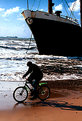
Critique By:
Ken Masters (K:408)
6/16/2006 9:54:28 PM
Great shot here Ahmad. The beach is looking beautiful, but biking next to a big rig like that one, is a bit dangerous.
Great shot!
Ken~
|
| Photo By: Ahmad Hasan
(K:4164)
|
|
|
Critique By:
Ken Masters (K:408)
6/16/2006 7:39:24 PM
Oh what beautiful dynamics represented in this photo Nicola. It is entrancing, just the kind of thing to expect from Verona Italy 
Excellent job,
Ken
|
| Photo By: Nicola Barbieri
(K:18000)
|
|
|
Critique By:
Ken Masters (K:408)
6/16/2006 7:37:24 PM
I am really enjoying this piece here, especially because of the articulate design put in the architecture. The dome looks fantastic as do most within Islamic Architecture, but it seems the centering of the photograph is a bit off. Nevertheless it looks terrific. Keep up the great work Maryam!
Best Regards Ken~
|
| Photo By: Maryam Shokri
(K:3545)
|
|
|
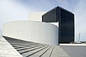
Critique By:
Ken Masters (K:408)
6/16/2006 7:34:10 PM
Wow this architectural piece here looks fantastic. I especially enjoy the curves and banks incorporated here adding a lot of flavor.
Well done, the library looks splendid, JFK would be proud.
Awesome Ken keep up the good work!
Ken~
|
| Photo By: Kenneth Roine
(K:3538)
|
|
|
Critique By:
Ken Masters (K:408)
6/16/2006 7:32:20 PM
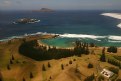
Oh wow! This picture is just captivating. The perspective you attained here is beautiful. Brilliantly executed here Bruce, freakin excellent job!!
Ken
Looks like an awesome place to surf
|
| Photo By: Bruce Harper
(K:5305)
|
|
|
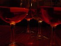
Critique By:
Ken Masters (K:408)
6/16/2006 7:30:09 PM
Thanks for the Comments Nicola and Arnee.
I worked semi-hard for that reflection and had to take several pictures to get that drop just right. I'm not sure if you noticed it, but essentially it is supposed to be the dropping point of the picture from which the eye wanders out.
Thanks again!
Ken
|
| Photo By: Ken Masters
(K:408)
|
|
|
Critique By:
Ken Masters (K:408)
6/15/2006 4:08:18 PM
Wow, Just astounding. The quality within the photograph is beautiful not to mention unique. Well done here!
I enjoy the statistics you include with your photographs, it gives a bit of insight on how you executed such a well developed photograph.
I enjoy the depth and focusing of the composition, allowing one to view the Minimal depth of field.
Great job!
|
Photo By: Sam Graziano III
(K:14064)

|
|
|
Critique By:
Ken Masters (K:408)
6/15/2006 4:01:13 PM
Thankyou Terry. I am glad you liked it
|
| Photo By: Ken Masters
(K:408)
|
|
|
Critique By:
Ken Masters (K:408)
6/15/2006 3:21:49 PM
Oh what a tasty little picture here. Way to go my Japanese Bro, Keeping the blue skies alive.
Certainly a keeper, great job Terry!
|
| Photo By: Terry Surugy
(K:704)
|
|
|
Critique By:
Ken Masters (K:408)
6/15/2006 3:16:39 PM
Middle Eastern Architecture is some of the best to marvel at, and you certainly proved that with this photograph.
The tones and lighting effects used on this, I believe push the dynamis of the building against the blue night sky. Its very calming and certainly a splendor of Middle Eastern Architecture.
Well Executed Rasheed.
Ken
|
| Photo By: Ayman Hammad
(K:1267)
|
|
|
Critique By:
Ken Masters (K:408)
6/15/2006 3:13:37 PM
WOW...... This is a very powerful piece you have here Riham.
The architecture represented here, with the arcs, clean design, and Arabic Calligraphy, is the essence of Islamic Architecture. I think that this piece is beautiful. The individual bowing seperatley exactally parallel adds an enhancment of spirituality, showing the innerness. I love this piece it is extremely well executed.
By the Way, what type of lighting did you use for this. It seems natural, but did you enhance with spepia toneing?
Splendid Photograph!
Ken
|
| Photo By: Riham Essam
(K:4931)
|
|
|
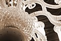
Critique By:
Ken Masters (K:408)
6/15/2006 2:53:57 PM
I would assume that is some sort of fan or chandalier, am I correct?
This is a nice photograph, but the bluriness, I cannot tell if it is intentional or an accident. Regardless very creative, I enjoyed how you isolated only a certain aspect of the item and detailed the specific things you wanted. Good job!
Keep up the shootin!
|
| Photo By: Riham Essam
(K:4931)
|
|
|
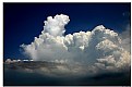
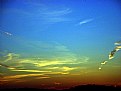
Critique By:
Ken Masters (K:408)
6/15/2006 2:46:34 PM
Oh, the tint of the blue is excellent, but more importantly I enjoy the contrast between the blue and white. It is done almost in perfect harmony except for the smudge on the right, which gives the photo a very natural look.
Beautiful Composition!
|
| Photo By: Nuno Milheiro
(K:453)
|
|
|
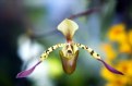
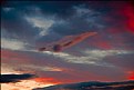
Critique By:
Ken Masters (K:408)
6/15/2006 2:45:12 PM
I enjoy the captured tint of red and blue in this composition. The formation you have is certainly unique and very developed. I would only wish that the photograph was a bit more crisp. I'm surprised a Nikon D200 couldn't handle the saturations of the sky, although it is an immense task to over-take. This piece is full of drama, I enjoyed it very much.
Great Job!
|
| Photo By: Kenneth Roine
(K:3538)
|
|
|
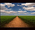
Critique By:
Ken Masters (K:408)
6/15/2006 2:41:42 PM
The contrast and saturation done in this piece is one of the many things to marvel over.
Not only is the placement of the tree so beautiful, but you have also capture the essence of the sky. The beackground water adds more depth and vision, while the blending is done perfectly to add that pro touch. What a photo.
Excellent Job Mr. Harper!
|
| Photo By: Bruce Harper
(K:5305)
|
|
|
Critique By:
Ken Masters (K:408)
6/15/2006 2:38:22 PM
Haha, that is excellent. I love it, talk about the having issues
This is an excellent photo, and certainly one of the most creative. Very well done!
|
| Photo By: Nicola Barbieri
(K:18000)
|
|
|
Critique By:
Ken Masters (K:408)
6/14/2006 9:40:37 PM
Ah great composition here. Beneficio!
Excellent abstract on that chair, must be Itallian design
Great job, keep up the work!
Ken Masters~
|
| Photo By: Alessandro Capelli
(K:34805)
|
|
|
Critique By:
Ken Masters (K:408)
6/14/2006 9:36:11 PM
Oh nice adjustment. Really adds some depth to your photograph.
Like the idea, great composition!
|
| Photo By: Timothy R
(K:3028)
|
|
|
Critique By:
Ken Masters (K:408)
6/14/2006 9:34:07 PM
Whoa bro talk about beauty. Excellent composition man.
10++++!
What did you use to edit, and how did you go about doing so?
Do you have the raw image by any chance?
|
| Photo By: brian underdown
(K:-960)
|
|
|
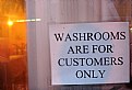
Critique By:
Ken Masters (K:408)
6/14/2006 9:31:56 PM
Haha so true!
Way to go Bro talk about reality!
I need to use the washroom......
|
| Photo By: Dr. Hellno
(K:362)
|
|
|
Critique By:
Ken Masters (K:408)
6/14/2006 8:49:01 PM
This is an interesting photo, but I feel you had trouble capturing the essence of the birds due to the deepness of the sky. This can be resolved by setting your shutter speed a bit higher.
Good job Aya keep up the good work!
|
| Photo By: Aya Ali-Mohamad
(K:128)
|
|
|
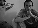
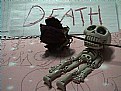
Critique By:
Ken Masters (K:408)
6/14/2006 8:45:41 PM
Well....Very creative!
I think this crude representation of death can really be enhanced if you were able to grow some different perception and perhaps used a different set of aperture. The contrast seems to be lacking in a lot of ways, but it is certainly one of the more creative pieces. Yea, you always gotta work with what you got right!
Good job bro, keep shootin!
|
| Photo By: Luby Adam
(K:1366)
|
|
|
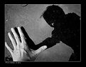
Critique By:
Ken Masters (K:408)
6/14/2006 8:16:40 PM
Oh what a splendid shot dude. Lovin this, certainly one of the greats.
The shadow behind the hand really adds a lot of depth.
Keep it up bro!
|
| Photo By: Real Gone
(K:-3747)
|
|
|
Critique By:
Ken Masters (K:408)
6/14/2006 8:10:47 PM
Hey thanks for the comments all you guys. And phil really, I doubt that this piece (Compared to yours) is anything relative to award material
Thanks everyone else for your regards
|
| Photo By: Ken Masters
(K:408)
|
|
|
Critique By:
Ken Masters (K:408)
6/14/2006 7:31:03 PM
At first it looks like a pie, until I looked at it further did I realize it was a pie.
Haha great photo man loving the lemon M.
Without the blur, I would rate this as award material!
|
| Photo By: Dr. Hellno
(K:362)
|
|
|
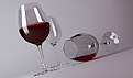
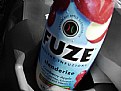
Critique By:
Ken Masters (K:408)
6/14/2006 7:28:47 PM
Whoa whats that? I've never heard of Fusion the drink...I guess it never got past west of Montana.
Great picture, gives a new perspective to thirst.
Way to go Bro, very abstract!
|
| Photo By: Dr. Hellno
(K:362)
|
|
|
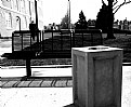
Critique By:
Ken Masters (K:408)
6/14/2006 7:26:12 PM
Whoa bro, no way! This totally reminds me of a skate park here in Cali outside of the court room. Great composition, loving the contrast.
Anyways dude, great work on this photo, keep shootin!
|
| Photo By: Dr. Hellno
(K:362)
|
|